Showing posts with label color. Show all posts

Thursday, February 20, 2014

How to Color a Daisy With Colored Pencils

How to Color a Daisy With Colored Pencils

By Derrick Bruno

Http://HalfEvil333.com

Support & Donate by clicking the button below.
Thank you Very Much.

https://www.pinterest.com/pin/60869032437031919/


Let us begin the lesson, and thank you for your support. 

Welcome to the next lesson in colored pencil drawing. In the last lesson we learned how to layer different colors to create a solid multi-colored pink lady apple. In this lesson I will teach you how to train your brain to see your drawing as different individual pieces. The perfect way to do this is with the daisy. We will focus more on directional shading and coloring in this lesson, and how to obtain textures using different strokes.

Grab your box of Colored Pencils out and grab the following colors; Pale pink, Pink, Cerise, Ruby, Light Brown, Golden Yellow, Grass Green, Black, and White. These will be the 9 colors we will be using for this lesson.

Tip: If you would like to change the color of your flower, you may substitute the petal colors (Pale Pink, Pink, Cerise, & Ruby) to another four colors. Just make sure you go from light to dark. For example a purple flower you could use Light Lavender, Lavender, Purple, & Orchid. 

Step 1: Lightly draw your daisy using faint strokes of a pencil, or light grey colored pencil. Start with the circle in the middle of the flower. Follow that with about six individual petals all roughly the same length, but different characteristics. If you note each petal has two fold lines going down the, and the ends are jagged. Behind these petals you will draw more petals. Continue layering your petals until you are satisfied with the shape of your daisy. Now use the Grass Green colored pencil and draw two curved lines for the stem.

Tip: If you would like to skip ahead and focus on the coloring lesson. You may download the sketched out image seen below. Click the link Below.


Step 2: We are going to put down the base color for the flower. Take the Pale Pink Colored Pencil and start coloring in each petal. Now to do this we are going to use a fun technique. The reason I chose a daisy is because it’s a circle shape. You will want to color in the direction of each petal; to do this can get frustrating because you have to contort your hand into uncomfortable positions. So what we are going to do is keep our hand in the same position and rotate the paper. Use light gentle strokes across each petal evenly, and use more pressure on the lines, and towards the center of the flower. Continue rotating the paper and coloring each petal until they are covered.
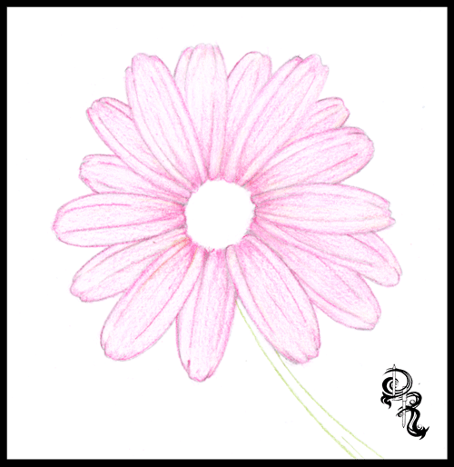

Step 3: Practice Makes Perfect. Find a petal to start with, and start adding the next layer of color. Using the Pink we will start off at the base of the petal and color in the direction of the petal. Color only the base of the petal and the center area of the petal. Again rotate the paper as you go and color in a position that is most comfortable for you and your wrist. This will allow smoother lines and more control.


Tip: Treat each petal as a new drawing. Taking your time and giving attention to each one will allow your brain to see shapes that you would otherwise over look. Remember to draw comfortably, take breaks when you need them, and just have fun.

Step 4: Using the Cerise you will continue adding more color and depth to the flower. We are going to start adding some shadows and curves to the petals. Color from the base of the petal with more pressure and lighten your strokes as you reach the end of the petal. Define the shadows for the petals underneath by using darker strokes where the top petals overlay.


Step 5: We are going to fine tune the shadow by adding one more red color. Using the Ruby Colored Pencil we will once again add more depth the flower petals. Rotating the paper as you go of course, sharpen your lines toward the base of each petal around the circle. Then define the lines of each petal using the Ruby color. Now as you rotate the paper use back and forth strokes to really get the dark Ruby color to make an even shadow on each petal towards the center of the flower to make it look like the petals fold inward.
Step 6: Now we are going to get into the middle of this flower. Don’t worry no more rotating the paper for this one, unless you want to of course. This part is actually kind of fun for me. Making a realistic pollen look is easier than it looks. Using the Light Brown find the center of your circle and make a much smaller circle. This will be your starting point. Now continue making small circles around this circle, and continue until the center is full. Once you get to the edge of the petals, use the Light Brown to fill in any gaps between the flower center and the petals. Now add some of this brown to the stem with some lines dark lines, and we will move on to the next step.


Step 7: Now it’s time to add some color to the center. Using the Golden Yellow make even circular strokes to fill in the center area. Continue going over it until you get a nice even color. Once you are finished use the same Golden Yellow color and very lightly go over the base of each petal. We do this because light reflects colors onto nearby objects. Sometimes it’s not noticeable, but just enough will make your drawing look that much more realistic. Then to finish off this step add some more light stroke lines onto the stem to give it an earthy browning like color when we go over it with the green.


Step 8: Probably the easiest step of the drawing. Take the Grass Green color, and color the entire stem. Be sure to color right over the Golden Yellow and Light Brown colors. Remember to color along with the shape of the stem in the same direction. You can even rotate the paper to give you a comfortable position and clean lines. Color the area by the flower darker show the shadow of the flower covering the stem.

Tip: By now I hope rotating the paper comes to you as a reflex. This will help you draw strait lines and curves, and can be used to draw all sorts of shapes and objects. Draw smarter not harder.


Step 9: Now to cast the final shadows. Use the Black Colored Pencil and outline the base of each petal and the flower center. Next begin shading the top petals lightly just enough to show that they curve inwards towards the center. Add some more black color to the petals underneath using the top petals as a guide. Next tilt the black pencil to the side a bit, and give a shadow to the center of the flower. Use crosshatching strokes towards the bottom of the circle to make it look like a sphere. Finally cast the shadow on the top, and down the side of the stem to finish up the shadows.
Step 10: To finish up our flower take the White Colored Pencil and color the edge of each petal. Next blend together the light and the dark colors by coloring from the edge of the petal down to the middle of each petal. This will even out your colors, and help cast light onto your drawing. Next add white to the cent of your drawing, and to the stem. And there you have it a beautiful flower.
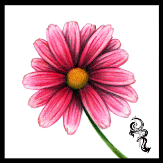

Tip: Find your light source. Sometimes when I draw I will cast a light over my drawing and see which way the paper casts a shadow. Use this as a guide for your shading.
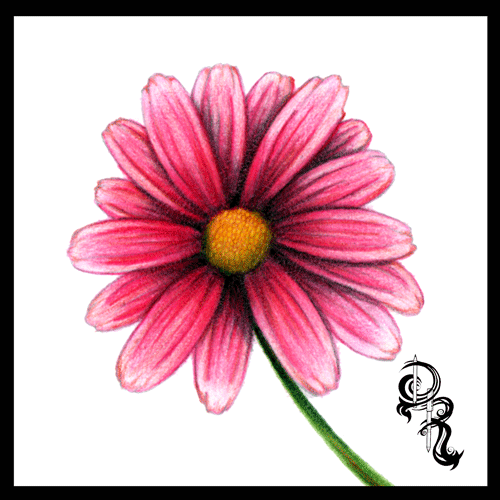
That does it for this lesson. I would love to see your work. Send it to us and we would be glad to share your results on my Facebook page at
 https://www.facebook.com/HalfEvilProductions

More Free art lessons are available on my Pinterest page at: 

If you would like to ask a question or make a suggestion for a drawing lesson email me at DerrickBruno@HalfEvil333.com

Thank you for coming.
Derrick Bruno

Wednesday, October 2, 2013

How to Color a Daisy With Colored Pencils by Derrick Rathgeber

How to Color a Daisy With Colored Pencils
By Derrick Rathgeber


Welcome to the next lesson in colored pencil drawing. In the last lesson we learned how to layer different colors to create a solid multi-colored pink lady apple. In this lesson I will teach you how to train your brain to see your drawing as different individual pieces. The perfect way to do this is with the daisy. We will focus more on directional shading and coloring in this lesson, and how to obtain textures using different strokes.

Grab your box of Colored Pencils out and grab the following colors; Pale pink, Pink, Cerise, Ruby, Light Brown, Golden Yellow, Grass Green, Black, and White. These will be the 9 colors we will be using for this lesson.

Tip: If you would like to change the color of your flower, you may substitute the petal colors (Pale Pink, Pink, Cerise, & Ruby) to another four colors. Just make sure you go from light to dark. For example a purple flower you could use Light Lavender, Lavender, Purple, & Orchid. 

Step 1: Lightly draw your daisy using faint strokes of a pencil, or light grey colored pencil. Start with the circle in the middle of the flower. Follow that with about six individual petals all roughly the same length, but different characteristics. If you note each petal has two fold lines going down the, and the ends are jagged. Behind these petals you will draw more petals. Continue layering your petals until you are satisfied with the shape of your daisy. Now use the Grass Green colored pencil and draw two curved lines for the stem.

Tip: If you would like to skip ahead and focus on the coloring lesson. You may download the sketched out image seen below. Click the link Below.


Step 2: We are going to put down the base color for the flower. Take the Pale Pink Colored Pencil and start coloring in each petal. Now to do this we are going to use a fun technique. The reason I chose a daisy is because it’s a circle shape. You will want to color in the direction of each petal; to do this can get frustrating because you have to contort your hand into uncomfortable positions. So what we are going to do is keep our hand in the same position and rotate the paper. Use light gentle strokes across each petal evenly, and use more pressure on the lines, and towards the center of the flower. Continue rotating the paper and coloring each petal until they are covered.


Step 3: Practice Makes Perfect. Find a petal to start with, and start adding the next layer of color. Using the Pink we will start off at the base of the petal and color in the direction of the petal. Color only the base of the petal and the center area of the petal. Again rotate the paper as you go and color in a position that is most comfortable for you and your wrist. This will allow smoother lines and more control.


Tip: Treat each petal as a new drawing. Taking your time and giving attention to each one will allow your brain to see shapes that you would otherwise over look. Remember to draw comfortably, take breaks when you need them, and just have fun.

Step 4: Using the Cerise you will continue adding more color and depth to the flower. We are going to start adding some shadows and curves to the petals. Color from the base of the petal with more pressure and lighten your strokes as you reach the end of the petal. Define the shadows for the petals underneath by using darker strokes where the top petals overlay.


Step 5: We are going to fine tune the shadow by adding one more red color. Using the Ruby Colored Pencil we will once again add more depth the flower petals. Rotating the paper as you go of course, sharpen your lines toward the base of each petal around the circle. Then define the lines of each petal using the Ruby color. Now as you rotate the paper use back and forth strokes to really get the dark Ruby color to make an even shadow on each petal towards the center of the flower to make it look like the petals fold inward.
Step 6: Now we are going to get into the middle of this flower. Don’t worry no more rotating the paper for this one, unless you want to of course. This part is actually kind of fun for me. Making a realistic pollen look is easier than it looks. Using the Light Brown find the center of your circle and make a much smaller circle. This will be your starting point. Now continue making small circles around this circle, and continue until the center is full. Once you get to the edge of the petals, use the Light Brown to fill in any gaps between the flower center and the petals. Now add some of this brown to the stem with some lines dark lines, and we will move on to the next step.


Step 7: Now it’s time to add some color to the center. Using the Golden Yellow make even circular strokes to fill in the center area. Continue going over it until you get a nice even color. Once you are finished use the same Golden Yellow color and very lightly go over the base of each petal. We do this because light reflects colors onto nearby objects. Sometimes it’s not noticeable, but just enough will make your drawing look that much more realistic. Then to finish off this step add some more light stroke lines onto the stem to give it an earthy browning like color when we go over it with the green.


Step 8: Probably the easiest step of the drawing. Take the Grass Green color, and color the entire stem. Be sure to color right over the Golden Yellow and Light Brown colors. Remember to color along with the shape of the stem in the same direction. You can even rotate the paper to give you a comfortable position and clean lines. Color the area by the flower darker show the shadow of the flower covering the stem.

Tip: By now I hope rotating the paper comes to you as a reflex. This will help you draw strait lines and curves, and can be used to draw all sorts of shapes and objects. Draw smarter not harder.


Step 9: Now to cast the final shadows. Use the Black Colored Pencil and outline the base of each petal and the flower center. Next begin shading the top petals lightly just enough to show that they curve inwards towards the center. Add some more black color to the petals underneath using the top petals as a guide. Next tilt the black pencil to the side a bit, and give a shadow to the center of the flower. Use crosshatching strokes towards the bottom of the circle to make it look like a sphere. Finally cast the shadow on the top, and down the side of the stem to finish up the shadows.
Step 10: To finish up our flower take the White Colored Pencil and color the edge of each petal. Next blend together the light and the dark colors by coloring from the edge of the petal down to the middle of each petal. This will even out your colors, and help cast light onto your drawing. Next add white to the cent of your drawing, and to the stem. And there you have it a beautiful flower.


Tip: Find your light source. Sometimes when I draw I will cast a light over my drawing and see which way the paper casts a shadow. Use this as a guide for your shading.

That does it for this lesson. I would love to see your work. Send it to us and we would be glad to share your results on my Facebook page at http://Facebook.com/DerricktheArtist

Be sure to come back here for more lessons. If you would like to ask a question or make a suggestion for a drawing lesson email me at http://Derricktheartist.com.

Thank you for coming.
Derrick Rathgeber

Sunday, August 25, 2013

"If you can dream it I can draw it."

Art Commission Fees

"If you can dream it I can draw it."

Portraits, Animals, character designs, and a full scale drawing from description. Nothing is out of reach. Contact me today with your ideas and what I can do for you. 

- GREY-SCALE PENCIL ARTWORK -

Size             Price
8" x 10"       $100.00
11" x 14"     $200.00
18" x 24"     $400.00
22" x 28"     $500.00

- COLORED PENCIL ARTWORK -

Size             Price
8" x 10"       $200.00
11" x 14"     $300.00
18" x 24"     $500.00
22" x 28"     $600.00


Contact me today at Derrickr333@gmail.com or visit http://Derrickr.webs.com/.


Thursday, July 25, 2013

How to Draw Glass with Colored Pencils: Erasing to Add Detail

How to Draw Glass with Colored Pencils: 
Erasing to Add Detail
by Derrick Bruno


Thank you for your Donation & Support!


https://www.pinterest.com/pin/60869032437032180/
Thank you for visiting. In this lesson I will teach you how to draw a believable glass texture. Our subject will be a light bulb so we will be using grey colors for this lesson. You’ll even have a small bonus lesson for the metal texture at the base of the bulb. What you will be learning today is how to use your pencils to color smoothly, and how to take away from your drawing to add more depth and detail. Are you ready to get started?

First off the colors I chose for this lesson are as follows: GreyCool GreyDark GreyBlack and White.  Also we will be using an eraser. Preferable a white one, or gum eraser.


 Step 1: Using the Dark Grey draw out your light bulb. You can opt out the details in the middle if you like they are not necessary for this lesson. You do however want to get the bulb shape, and screw at the base. This lesson is more about coloring and texture than copying the image.

Hint: Any time you are drawing from a reference a good fun trick to do is draw the image upside down. It sounds funny but it tricks your brain into drawing what you see, and not what your brain knows.


Step 2: Using the Grey colored pencil you will fill in the lower area of the bulb using medium pressure. Once completed take your pencil and hold it at a slant so the point is flat against the paper. Lightly begin to shade in the rounded bulb area using rounded strokes back and forth. This will give you a smoother fill. Continue to crosshatch and fill in the top of the bulb, and the base of the bulb until you get a good smooth cover.

Hint: Practice, and do not rush. Remember you’re not in a race, and you won’t get a prize for finishing first. This is a technique that you are trying to learn. Take scratch paper and use the side of your pencil lead to make strokes of different lengths, and pressures.


Step 3: Here is where it gets fun. Find a good size eraser, preferably a gum eraser, or white art eraser. Now you can look at a light bulb for reference or visualize where you will see the shines. You can also use mine for reference. Start erasing away where you want to have the shines. Be sure to follow the shape of the bulb, and do not be afraid to erase the details of the center, that just gives it more character. This gives the illusion of a rounded shape that you can now view start viewing as glass.

Hint: We used grey in this lesson because our background is white. This is only to make the 2D object appear three dimensional. Now if you have the bulb in front of an object or let’s say a yellow wall, you would color the bulb the same color as the background, or slightly lighter color of the background depending on how thick you want the glass to appear.


Step 4: Now we have to make the glass shine more prominent. You can now use the Dark Grey color and start shading around the shines. We are going to add more pressure at the top of the bulb, the base of the glass, and around the erased shines. Be sure to blend the Dark Grey and Grey together by adding layers of color from dark to light. Also if you added the middle detail you will use the Dark Grey to define the glass on the inside as shown.


Step 5: In this step we are starting on the metal base. Simply use the Dark Grey again and fill in the areas as shown. It’s okay to make these areas dark as we are going to add black to it later. You want to show the light bending around the metal object. And this object is smooth.

Hint: When you draw metal objects be sure to pay attention to your light sources, and remember that light comes from behind too, as seen here.


Step 6: Using the Cool Grey color begin shading the base filling in the left side darker, and leaving the right side lighter. This shows where your light source is and keeps the color flowing across the object. You can even color up and down the screw base to ensure you get the same dark to light scale going from left to right. And remember this metal is also smooth so it’s a great way to practice your small smooth strokes.

Hint:  A good tool to help you blend your pencil drawing is a “Blinding stump.” They are highly affordable, and easy to use. If not you can always use your fingers to smudge the colors together. I did before I know they existed.


Part 7: To add our finishing touches on this piece we are going to just define the light bulb, and highlight the shines. So let’s start off by grabbing the Black pencil. Start by outlining the bulb, and shading in areas of the bulb close to the base and around the top. Take a step back and look at your image and you can see where the shadows are coming from. Those are the areas you want to darken.  Next you will use the Black to also darken the shadows on the metal base to really make the metal shine, and stand out from the glass. You can also add a layer of shading to make it darker from the glass bulb.

Finally we are going to use the White pencil to color over the middle of the glass and shines to really make the center pop. Almost like the light is starting to light up. And to finish the drawing off add white to the right side of the metal base, and around the sides to show where the light is coming from.

I hope you enjoyed this lesson. Please email any comments or suggestions to DerrickBruno@HalfEvil333.com. Find my new portfolio page at http://HalfEvil333.com

Monday, June 24, 2013

It's time to Rise like an Eagle and Fly

It's time to Rise like an Eagle and Fly

_________________________________________________________________________________

Hello my name is Derrick Rathgeber, and all of you know me as a colored pencil artist. Not only that I am known for using what tools I can find lying around to make big works of art. For years ever since my accident I have been drawing on 32 cent poster board, printer paper, and using a collection of RoseArt pencils donated to me. I am very thankful to the company RoseArt for sending me this great gift, I was completely out of black, and certain reds I needed to finish my last piece. They gave me an opportunity to share my lessons on their blog page and ignited my own blog page here. It's funny I thought that was my ticket to getting more traffic to my website, and possibly sell some work so I can buy frames and do some shows, but people never came. 

Over the last year I have posted my work all over the web in every free way possible. I put in a lot of hours linking these pages together. If you search my name you get pages upon pages of results. I am on Pinterest, Tumblr, DeviantArt, Facebook, Twitter, FineArtAmerica, and the list goes on and on. I have been featured on a few other sites as an artist, and I am currently in a showcase here in Riverside, CA. The problem I am having with all of this work I put in is it seems to go nowhere. I haven't sold one thing. I am literally all over the web, and I am not getting traffic. I wanted to prove to other artists that struggle in ways that I do, that it's possible to make it without putting in money you don't have. In a sense I have been doing well, and I do have a small hand full of great fans, but most of them are other artists that are not into buying work from another artist. I don't blame them it is kind of counter productive. But I have been invited to several shows, and I have had to turn them all down because all of my work is without frames, I don't have setup fees, transportation, or money to give as change for that matter. It's embarrassing to continue putting these shows off, and calling yourself a "professional artist." 

In my own way I do want to continue helping out. So in this case I am going to continue keeping my work FREE to view. I don't have a lot of money, and I know other artists do not either, so I will continue to help all of you for FREE. I will be honest and say this it gives me a great pleasure to see even 1 like on my comic post, or one fellow artist sharing their results from my drawing lesson with a thank you. I get a kick out of it. That money cannot buy. So what will change. 

In my many years, before I was placed on the shelf as a disabled employee, I worked for many different companies and learned a whole lot of trades. I made a lot of companies a great deal of money with innovative ideas, and advertising strategies that placed them on top. It was easy they gave me an amount to use, and I turned it into more. They gave me a product and I sold it. The had a number and I beat it. Recently I fought with myself asking why can I not market myself in the same way. I have placed myself EVERYWHERE, I made contests, I made ideas, and I advertised myself to the brim, so why can I not sell me? It recently dawned on me that I never invested in myself, other than time. I never put in the money. I thought what I was doing was enough. Hell I stood toe-to-toe with big named artists with a pack of $1.29 colored pencils, and a 32 cent poster board and won. It's time for me to rise above my own fear and doubt, and invest in myself. In return when I do that I know this investment will pay off for mine and my families future. 

By the end of this month your going to see a whole lot more of me. Starting with a new Twisted Fate comic strip. As the ink is drying, I want to say come back for that. And before they go "viral" you get to say you saw it here first. Before I get new materials you get to go through my web page and share my work saying check this guy out he didn't need to spend hundreds on art supplies, and he made it. You will be able to say I saw these comics before they were in a book. And I'll remember your faith in me and return it ten fold. Because everything I do on here is meant to be shared with the world. So I will end this as saying thank you for everything, and helping me keep my eyes on the prize. I am going to fly. 

Thank you,
Derrick Rathgeber

Find me on Facebook at Http://Facebook.com/DerrickRathgeber

Wednesday, June 5, 2013

How to Draw Glass with Colored Pencils: Erasing to Add Detail

How to Draw Glass with Colored Pencils: Erasing to Add Detail  
by Derrick Rathgeber

Thank you for visiting. In this lesson I will teach you how to draw a believable glass texture. Our subject will be a light bulb so we will be using grey colors for this lesson. You’ll even have a small bonus lesson for the metal texture at the base of the bulb. What you will be learning today is how to use your pencils to color smoothly, and how to take away from your drawing to add more depth and detail. Are you ready to get started?

First off the colors I chose for this lesson are as follows: Grey, Cool Grey, Dark Grey, Black and White.  Also we will be using an eraser. Preferable a white one, or gum eraser.


 Step 1: Using the Dark Grey draw out your light bulb. You can opt out the details in the middle if you like they are not necessary for this lesson. You do however want to get the bulb shape, and screw at the base. This lesson is more about coloring and texture than copying the image.

Hint: Any time you are drawing from a reference a good fun trick to do is draw the image upside down. It sounds funny but it tricks your brain into drawing what you see, and not what your brain knows.


Step 2: Using the Grey colored pencil you will fill in the lower area of the bulb using medium pressure. Once completed take your pencil and hold it at a slant so the point is flat against the paper. Lightly begin to shade in the rounded bulb area using rounded strokes back and forth. This will give you a smoother fill. Continue to crosshatch and fill in the top of the bulb, and the base of the bulb until you get a good smooth cover.

Hint: Practice, and do not rush. Remember you’re not in a race, and you won’t get a prize for finishing first. This is a technique that you are trying to learn. Take scratch paper and use the side of your pencil lead to make strokes of different lengths, and pressures.


Step 3: Here is where it gets fun. Find a good size eraser, preferably a gum eraser, or white art eraser. Now you can look at a light bulb for reference or visualize where you will see the shines. You can also use mine for reference. Start erasing away where you want to have the shines. Be sure to follow the shape of the bulb, and do not be afraid to erase the details of the center, that just gives it more character. This gives the illusion of a rounded shape that you can now view start viewing as glass.

Hint: We used grey in this lesson because our background is white. This is only to make the 2D object appear three dimensional. Now if you have the bulb in front of an object or let’s say a yellow wall, you would color the bulb the same color as the background, or slightly lighter color of the background depending on how thick you want the glass to appear.


Step 4: Now we have to make the glass shine more prominent. You can now use the Dark Grey color and start shading around the shines. We are going to add more pressure at the top of the bulb, the base of the glass, and around the erased shines. Be sure to blend the Dark Grey and Grey together by adding layers of color from dark to light. Also if you added the middle detail you will use the Dark Grey to define the glass on the inside as shown.


Step 5: In this step we are starting on the metal base. Simply use the Dark Grey again and fill in the areas as shown. It’s okay to make these areas dark as we are going to add black to it later. You want to show the light bending around the metal object. And this object is smooth.

Hint: When you draw metal objects be sure to pay attention to your light sources, and remember that light comes from behind too, as seen here.


Step 6: Using the Cool Grey color begin shading the base filling in the left side darker, and leaving the right side lighter. This shows where your light source is and keeps the color flowing across the object. You can even color up and down the screw base to ensure you get the same dark to light scale going from left to right. And remember this metal is also smooth so it’s a great way to practice your small smooth strokes.

Hint:  A good tool to help you blend your pencil drawing is a “Blinding stump.” They are highly affordable, and easy to use. If not you can always use your fingers to smudge the colors together. I did before I know they existed.


Part 7: To add our finishing touches on this piece we are going to just define the light bulb, and highlight the shines. So let’s start off by grabbing the Black pencil. Start by outlining the bulb, and shading in areas of the bulb close to the base and around the top. Take a step back and look at your image and you can see where the shadows are coming from. Those are the areas you want to darken.  Next you will use the Black to also darken the shadows on the metal base to really make the metal shine, and stand out from the glass. You can also add a layer of shading to make it darker from the glass bulb.

Finally we are going to use the White pencil to color over the middle of the glass and shines to really make the center pop. Almost like the light is starting to light up. And to finish the drawing off add white to the right side of the metal base, and around the sides to show where the light is coming from.

I hope you enjoyed this lesson. Please email any comments or suggestions to DerricktheArtist@Live.com. Find my new portfolio page at http://Derricktheartist.com

I would like to see your work. In fact if you share your results here on my Art Facebook page - HERE -, I will randomly select someone to give the original signed copy to. FREE of charge. I hope to see some of your work. (Feel free to add to it if you have any "bright ideas." 

Again thank you for allowing me to share these tips and tricks with you, and if you have something you would like to learn feel free to suggest it to me anytime. Have a great day!


Friday, May 31, 2013

The Angel of Death - by Derrick Rathgeber


The Angel of Death - by Derrick Rathgeber

The colored pencil illustration of my wife's beautiful poem. She really does bring out the best in me, and inspires my best work. Enjoy her poetry below.

Angel of Death
By Patricia Fernandez-Rathgeber

“Come dance in the moonlight, little sister.” He calls
The blades sheen reflects off my pale skin
His shadow grows up against the dark walls
As we dance, the darkness blends and I don’t know where he ends and I begin
A tear against the flesh gives way to liquid crimson
The blood, it streams down to the ground
I watch my life melt away, a stream that glistens
The silence is so loud even though there is no sound
He turns me, dips me and I feel faint
I float like a feather, so light weight
He kisses me, my metallic Saint
The taste of his victory over me, I’ve met my fate
The nirvana of the spins makes me drunk as I slowly lose life
His wings spread wide like a bird of prey with meat in his sight
I can’t refuse his kiss, no strife
Growing weak, I no longer put up a fight
I allow myself to fade in his arms
Taking it all in, my memories flash by so fast
Soaking up all his whispery charms
His kiss, the sin, is my very last.

Visit me on Facebook at http://Facebook.com/DerrickRathgeber

Thursday, May 30, 2013

The Angel of Death - Day 4


The Angel of Death - Day 4

With the wings added the picture is already telling the story. Today I will be adding the background, and get to the lighting of the moon. The wings were a blend of black, dark grey, metallic silver, and white. I wanted to give it a dark feathery look, while adding the  glimpse of shape and personality to the wings. 

Visit http://derrickr.artist.cm for more. 

Monday, May 27, 2013

Success is not a Dollar Amount

I have come a very long way since I have started drawing again. I have a new website, my own blog page, and my artwork has been seen all over the world, and I am currently in a gallery here in Riverside until August.  To me I feel like I reached the top as an artist. The only thing that would make my journey complete would to be able to live off of my artwork. Being that I have yet to sell more than one print, I can honestly say that is not going to happen. In my entire art career I have only sold one original drawing, and one signed print for $20. Does that make my career in art a large failure?

The answer is heck no. I am sure there are plenty of artists out there who place their work on the web in hopes it will go viral, and sell 1,000s of prints, but only get 5 likes. And maybe you have placed your work in a showcase in hopes people will buy your piece, only to take your card and lose it. Believe me you are definitely not alone. I have found that there are a lot more artists in your position than you think. And each one is more discouraged and ready to quit than the next.  I know I wanted to quit myself quite a few times because my art just wasn’t selling like I wanted to.

Then I woke up one day realizing that I almost quit doing what I love because someone didn’t give me money for it. I felt like an idiot. I almost gave up a talent that others strive for because I was selfish and wanted money. All the new upcoming artists that came to me for help and questions were going to be sent away, and the people that subscribed to my website, and blog, social media sites because they enjoyed my work were no longer going to see it anymore. I almost let my kids down who look up to me because in their eyes I am the best artist in the world. To me that almost made me sick to my stomach that money became that important to me. Has the world broken me down so bad that money took a place hire than a talent that no money could ever buy?

So I decided that I would no longer see success measured with a dollar amount. And no one should. Have I made millions of my artwork? No. Have I hit over 100,000 likes on Facebook? Far from. What I have done is inspire young artists to continue bettering themselves. I made someone laugh with my Twisted Fate comic. My work has been seen by people all over the world without spending one dollar in advertising. I have shown people what you can do if you put your trust and patience in yourself, and really enjoy what you do. That is my greatest successes as an artist. If I can keep going, and push myself to finish piece after piece, comic after comic, share my drawing lessons online free, and just help others, then I feel I have reached a level that I didn’t know existed.

What defines you as an artist? Ask yourself why you started? Why do you love it so much? Why do you or did you want to quit? For me I started because I really enjoyed taking my imagination, and thoughts, then just laying them out all over the paper.  I love it now because I can see things that other people cannot. A gift to see colors that did not exist before and I can share them with all of you. It makes my day. I wanted to quit, well for a reason that wasn’t good enough because I am still here. I am still here drawing, coloring, and sharing it all with all of you, and I hope that as long as I continue to share what I have to give with you, that you return the favor .  I want to see all of your talents, because art, poetry, words, stories, imagination, it makes the world a much better place to live in and enjoy.  

"You are already successful because you picked up the pencil,  and made the world that much more beautiful."

Thank you for reading,
Till next time my friends.


In Feed AD