Showing posts with label learn. Show all posts

Tuesday, March 4, 2014

Derrick the Artist is on the Rise!


Oh what a fantastic start for 2014. Where would I be without family, friends, and my fantastic art community? Not where I am today I can guarantee that. I have some building to do, and a bit further to climb, but the direction I am going is definitely the right one. 

Over the past few months I have had some ups and downs on the course of my art career. I missed a few promotions here and there, and even more shows, but that is all in the past. It's funny how God works. Just when you feel angry with him, and you begin to think that he is not listening, he shows you he is. Last month I wrote about my anger with the world. How I have given all that I can give, and I felt it was my turn to get some help now that I needed it. When that help didn't come right away I was angry. I felt like a spoiled brat, but at the same time I knew it was good to voice my frustrations. A few weeks went by and although nothing had changed I felt a change in the air. It was like the pressure I placed on myself had lifted, and I forgot why I was angry in the first place. And that's when everything changed. 

The name Derrick the Artist was already on the Rise. This year alone I have already started my first large show. The Annual Artscape in Riverside, CA. This show is big, and runs from February to August of 2014, and in May I have been asked to draw a few pieces for the Riverside Prom, and join the committee. My artwork which is produced using RoseArt brand pencils is going to be see by a whole lot of professional artists all over. I have never been able to pay for the expensive brand name pencils and to me that didn't make a difference. I used what I had, and did not understand the impact that would have on the people around me. 

On this blog you will notice that I give art lessons using the RoseArt pencils. Despite the critics the pencils are a great price range that all people can afford, but to me they output fantastic colors. As I started to make more lessons using pencils that more students, and young children were using I found there was a need for these lessons to be accessible. I have been getting a whole lot of thank you letters and messages asking me to make more, and they like to know that because they cannot afford the high priced art supplies they to can produce award winning art as well. They weren't limited to their budget like myself. I like being there for these young adults and artists who have questions. It feels good, and eventually I would like to set up an artist mentoring program on a volunteer basis as one of my goals. For now I'll continue building, and working for it. 

Another big deal for me that I received recently was a donation on my website by a lady from Kentucky. No kidding I was running out of colors to use, and I was seeking donations to purchase new pencils, and paper. My last black had whittled down, and I kid you not that morning I received a donation that allowed me to purchase enough materials for the next few months. I am usually the one outputting all that I can, and I cannot believe that someone felt I was worth investing in. It really brought my soul back to life, and I was lifted up with ambition to do more. I cannot wait to pay it all forward and giving all I can give, and teaching all I can teach to all that will ask or listen. 

So as I am on the rise be sure to continue watching to all that I am putting out. I built a shop to sell my artwork on great gifts. The proceeds go to adding more options and building the Artist Mentoring Network. I will be seeking artists who are willing to chime in voluntarily to help young artists, and student artists.My comic Strip Twisted Fate will be growing, and becoming an animated Flash comic by 2015, and my art lessons will continue to grow. Possibly a book by next year as well. Finally new large pieces of artwork to share with the world. I hope you will continue to join me as I grow as an artist with you. Remember to visit my webpage for news and updates on everything. 
I want to see all of you Rise with me as well. 

Thank you for reading, 
Derrick Rathgeber

Thursday, February 20, 2014

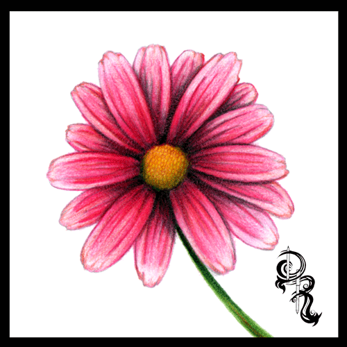
How to Color a Daisy With Colored Pencils

How to Color a Daisy With Colored Pencils

By Derrick Bruno

Http://HalfEvil333.com

Support & Donate by clicking the button below.
Thank you Very Much.

https://www.pinterest.com/pin/60869032437031919/


Let us begin the lesson, and thank you for your support. 

Welcome to the next lesson in colored pencil drawing. In the last lesson we learned how to layer different colors to create a solid multi-colored pink lady apple. In this lesson I will teach you how to train your brain to see your drawing as different individual pieces. The perfect way to do this is with the daisy. We will focus more on directional shading and coloring in this lesson, and how to obtain textures using different strokes.

Grab your box of Colored Pencils out and grab the following colors; Pale pink, Pink, Cerise, Ruby, Light Brown, Golden Yellow, Grass Green, Black, and White. These will be the 9 colors we will be using for this lesson.

Tip: If you would like to change the color of your flower, you may substitute the petal colors (Pale Pink, Pink, Cerise, & Ruby) to another four colors. Just make sure you go from light to dark. For example a purple flower you could use Light Lavender, Lavender, Purple, & Orchid. 

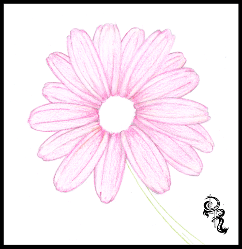
Step 1: Lightly draw your daisy using faint strokes of a pencil, or light grey colored pencil. Start with the circle in the middle of the flower. Follow that with about six individual petals all roughly the same length, but different characteristics. If you note each petal has two fold lines going down the, and the ends are jagged. Behind these petals you will draw more petals. Continue layering your petals until you are satisfied with the shape of your daisy. Now use the Grass Green colored pencil and draw two curved lines for the stem.

Tip: If you would like to skip ahead and focus on the coloring lesson. You may download the sketched out image seen below. Click the link Below.


Step 2: We are going to put down the base color for the flower. Take the Pale Pink Colored Pencil and start coloring in each petal. Now to do this we are going to use a fun technique. The reason I chose a daisy is because it’s a circle shape. You will want to color in the direction of each petal; to do this can get frustrating because you have to contort your hand into uncomfortable positions. So what we are going to do is keep our hand in the same position and rotate the paper. Use light gentle strokes across each petal evenly, and use more pressure on the lines, and towards the center of the flower. Continue rotating the paper and coloring each petal until they are covered.


Step 3: Practice Makes Perfect. Find a petal to start with, and start adding the next layer of color. Using the Pink we will start off at the base of the petal and color in the direction of the petal. Color only the base of the petal and the center area of the petal. Again rotate the paper as you go and color in a position that is most comfortable for you and your wrist. This will allow smoother lines and more control.


Tip: Treat each petal as a new drawing. Taking your time and giving attention to each one will allow your brain to see shapes that you would otherwise over look. Remember to draw comfortably, take breaks when you need them, and just have fun.

Step 4: Using the Cerise you will continue adding more color and depth to the flower. We are going to start adding some shadows and curves to the petals. Color from the base of the petal with more pressure and lighten your strokes as you reach the end of the petal. Define the shadows for the petals underneath by using darker strokes where the top petals overlay.


Step 5: We are going to fine tune the shadow by adding one more red color. Using the Ruby Colored Pencil we will once again add more depth the flower petals. Rotating the paper as you go of course, sharpen your lines toward the base of each petal around the circle. Then define the lines of each petal using the Ruby color. Now as you rotate the paper use back and forth strokes to really get the dark Ruby color to make an even shadow on each petal towards the center of the flower to make it look like the petals fold inward.
Step 6: Now we are going to get into the middle of this flower. Don’t worry no more rotating the paper for this one, unless you want to of course. This part is actually kind of fun for me. Making a realistic pollen look is easier than it looks. Using the Light Brown find the center of your circle and make a much smaller circle. This will be your starting point. Now continue making small circles around this circle, and continue until the center is full. Once you get to the edge of the petals, use the Light Brown to fill in any gaps between the flower center and the petals. Now add some of this brown to the stem with some lines dark lines, and we will move on to the next step.


Step 7: Now it’s time to add some color to the center. Using the Golden Yellow make even circular strokes to fill in the center area. Continue going over it until you get a nice even color. Once you are finished use the same Golden Yellow color and very lightly go over the base of each petal. We do this because light reflects colors onto nearby objects. Sometimes it’s not noticeable, but just enough will make your drawing look that much more realistic. Then to finish off this step add some more light stroke lines onto the stem to give it an earthy browning like color when we go over it with the green.


Step 8: Probably the easiest step of the drawing. Take the Grass Green color, and color the entire stem. Be sure to color right over the Golden Yellow and Light Brown colors. Remember to color along with the shape of the stem in the same direction. You can even rotate the paper to give you a comfortable position and clean lines. Color the area by the flower darker show the shadow of the flower covering the stem.

Tip: By now I hope rotating the paper comes to you as a reflex. This will help you draw strait lines and curves, and can be used to draw all sorts of shapes and objects. Draw smarter not harder.


Step 9: Now to cast the final shadows. Use the Black Colored Pencil and outline the base of each petal and the flower center. Next begin shading the top petals lightly just enough to show that they curve inwards towards the center. Add some more black color to the petals underneath using the top petals as a guide. Next tilt the black pencil to the side a bit, and give a shadow to the center of the flower. Use crosshatching strokes towards the bottom of the circle to make it look like a sphere. Finally cast the shadow on the top, and down the side of the stem to finish up the shadows.
Step 10: To finish up our flower take the White Colored Pencil and color the edge of each petal. Next blend together the light and the dark colors by coloring from the edge of the petal down to the middle of each petal. This will even out your colors, and help cast light onto your drawing. Next add white to the cent of your drawing, and to the stem. And there you have it a beautiful flower.


Tip: Find your light source. Sometimes when I draw I will cast a light over my drawing and see which way the paper casts a shadow. Use this as a guide for your shading.

That does it for this lesson. I would love to see your work. Send it to us and we would be glad to share your results on my Facebook page at
 https://www.facebook.com/HalfEvilProductions

More Free art lessons are available on my Pinterest page at: 

If you would like to ask a question or make a suggestion for a drawing lesson email me at DerrickBruno@HalfEvil333.com

Thank you for coming.
Derrick Bruno

Wednesday, June 5, 2013

How to Draw Glass with Colored Pencils: Erasing to Add Detail

How to Draw Glass with Colored Pencils: Erasing to Add Detail  
by Derrick Rathgeber

Thank you for visiting. In this lesson I will teach you how to draw a believable glass texture. Our subject will be a light bulb so we will be using grey colors for this lesson. You’ll even have a small bonus lesson for the metal texture at the base of the bulb. What you will be learning today is how to use your pencils to color smoothly, and how to take away from your drawing to add more depth and detail. Are you ready to get started?

First off the colors I chose for this lesson are as follows: Grey, Cool Grey, Dark Grey, Black and White.  Also we will be using an eraser. Preferable a white one, or gum eraser.


 Step 1: Using the Dark Grey draw out your light bulb. You can opt out the details in the middle if you like they are not necessary for this lesson. You do however want to get the bulb shape, and screw at the base. This lesson is more about coloring and texture than copying the image.

Hint: Any time you are drawing from a reference a good fun trick to do is draw the image upside down. It sounds funny but it tricks your brain into drawing what you see, and not what your brain knows.


Step 2: Using the Grey colored pencil you will fill in the lower area of the bulb using medium pressure. Once completed take your pencil and hold it at a slant so the point is flat against the paper. Lightly begin to shade in the rounded bulb area using rounded strokes back and forth. This will give you a smoother fill. Continue to crosshatch and fill in the top of the bulb, and the base of the bulb until you get a good smooth cover.

Hint: Practice, and do not rush. Remember you’re not in a race, and you won’t get a prize for finishing first. This is a technique that you are trying to learn. Take scratch paper and use the side of your pencil lead to make strokes of different lengths, and pressures.


Step 3: Here is where it gets fun. Find a good size eraser, preferably a gum eraser, or white art eraser. Now you can look at a light bulb for reference or visualize where you will see the shines. You can also use mine for reference. Start erasing away where you want to have the shines. Be sure to follow the shape of the bulb, and do not be afraid to erase the details of the center, that just gives it more character. This gives the illusion of a rounded shape that you can now view start viewing as glass.

Hint: We used grey in this lesson because our background is white. This is only to make the 2D object appear three dimensional. Now if you have the bulb in front of an object or let’s say a yellow wall, you would color the bulb the same color as the background, or slightly lighter color of the background depending on how thick you want the glass to appear.


Step 4: Now we have to make the glass shine more prominent. You can now use the Dark Grey color and start shading around the shines. We are going to add more pressure at the top of the bulb, the base of the glass, and around the erased shines. Be sure to blend the Dark Grey and Grey together by adding layers of color from dark to light. Also if you added the middle detail you will use the Dark Grey to define the glass on the inside as shown.


Step 5: In this step we are starting on the metal base. Simply use the Dark Grey again and fill in the areas as shown. It’s okay to make these areas dark as we are going to add black to it later. You want to show the light bending around the metal object. And this object is smooth.

Hint: When you draw metal objects be sure to pay attention to your light sources, and remember that light comes from behind too, as seen here.


Step 6: Using the Cool Grey color begin shading the base filling in the left side darker, and leaving the right side lighter. This shows where your light source is and keeps the color flowing across the object. You can even color up and down the screw base to ensure you get the same dark to light scale going from left to right. And remember this metal is also smooth so it’s a great way to practice your small smooth strokes.

Hint:  A good tool to help you blend your pencil drawing is a “Blinding stump.” They are highly affordable, and easy to use. If not you can always use your fingers to smudge the colors together. I did before I know they existed.


Part 7: To add our finishing touches on this piece we are going to just define the light bulb, and highlight the shines. So let’s start off by grabbing the Black pencil. Start by outlining the bulb, and shading in areas of the bulb close to the base and around the top. Take a step back and look at your image and you can see where the shadows are coming from. Those are the areas you want to darken.  Next you will use the Black to also darken the shadows on the metal base to really make the metal shine, and stand out from the glass. You can also add a layer of shading to make it darker from the glass bulb.

Finally we are going to use the White pencil to color over the middle of the glass and shines to really make the center pop. Almost like the light is starting to light up. And to finish the drawing off add white to the right side of the metal base, and around the sides to show where the light is coming from.

I hope you enjoyed this lesson. Please email any comments or suggestions to DerricktheArtist@Live.com. Find my new portfolio page at http://Derricktheartist.com

I would like to see your work. In fact if you share your results here on my Art Facebook page - HERE -, I will randomly select someone to give the original signed copy to. FREE of charge. I hope to see some of your work. (Feel free to add to it if you have any "bright ideas." 

Again thank you for allowing me to share these tips and tricks with you, and if you have something you would like to learn feel free to suggest it to me anytime. Have a great day!


In Feed AD