Showing posts with label illustration. Show all posts

Friday, September 21, 2018

How to Color a Delicious Pink Lady Apple

How to Color a Delicious Pink Lady Apple
by Derrick Bruno

Http://HalfEvil333.com

Thank you for your Donation & Support!


RoseArt Colored Pencils we will be using.
White
Golden Yellow
True Orange
Bronze Yellow
Celery
Cardinal Red
Cherry Red
Raspberry
Brown
Black

Welcome to the great drawing lessons here on Derrick the Artist. Today I will be teaching you how to color your very own delicious pink lady apple. In this exercise I will give you tips on how to over lay colors, blend them to create lights and shadows, as well as textures. So let’s get started shall we.
Step 1: If you are comfortable with your drawing skills start off your picture by drawing the apple shape below with the brown colored pencil. Remember your apple does not have to be a perfect shape because no apple is a perfect sphere.

Tips: A PDF version is available if you would like to skip this step and go right into the coloring.Download the printable version by clicking the link below: 


Step 2: Using the Golden Yellow make dark to light strokes outlining the shine. Start at the base of the step and define the shape of the apple. This color will act as the base and guide for the rest of the colors to come. Next use the Bronze Yellow and darken the yellow areas on the stem and the area around the stem. This will help blend into the green Celery color in the next step.

Tips: Use more pressure on the pencil at the edges and around the shine areas, then slowly raise the pencil up decreasing the pressure of the pencil.


Step 3: Using the Celery color you will go over the Golden Yellow color on the top of the apple. Start from the base of the stem and create line in arcs to the rim of the apple, then fill them in with theCelery green covering a good area of the top, but leave some areas available for the red to come through. Also add some Celery color to the stem as well.
Step 4: Now it’s time to set the base for rest of the apple. Using the True Orange we will start from the stem base and color the apple almost like a pumpkin. Fill in the top half of the apple leaving small empty spaces along the edge, and along the base of the bottom. Keep a white strip-like area empty along the right side of the apple, as this will act as a reflective shine making the apple look more realistic.
Tips: References are great. If you have an apple at home shine a light on it to see how light shines and reflects on it so you can replicate this effect in your drawing.


Step 5: It’s time to watch your apple come to life. Use the Cardinal Red and cover the apple in nice even strokes with the apple from top to bottom and at a curve. Remember to leave the large shine in the center, and on the right clear. I like to rotate the paper so I can keep my hand still and move only the pencil across the paper. Once the apple is covered evenly begin adding pressure and coloring in areas darker near the edges and the top of the apple. Leave the area near the large shine lightened as shown in the picture.
Tips: Try to keep your pencil stokes in one direction. In this case arc them downward creating the illusion of a round object. After you have covered the area you can crosshatch to darken areas of the drawing.


Step 6: The candy apple read that makes you drool. That’s what we are going for. So let’s add the next layer of red. This time we are using Cherry Red to help fill in gaps, smooth out our fruit, and generate a one of a kind look. Starting at the borders of the apple we are going to go over theCardinal Red and start coloring towards the shine lightening our strokes along the way. Also get the top of the apple, and overlay the red partially over the yellows and greens to pull it all together. When you are satisfied with the look of your apple, move on to the next layer of red in the next step. Yep that’s right Three layers of red.

Step 7: This is the last layer of red I promise. Grab the Raspberry Red colored pencil and use heavy pressure along the areas you want to add shadows to. You can use the image as reference or use your gut. Get the areas close to the edges, and highlight the shine on the top near the stem. At this point your apple will have a realistic shine and reflect the paper it is drawn on. As an option also use this color to create a shadow on the floor. Remember where your light is coming from and color your shadow based on that. In this case I have light coming from the rear and the front so the shadow is outlined as shown.
Tips: If your drawing doesn’t look like the image shown do not worry. If I were to draw this again mine would look different too. Remember to enjoy yourself and take your time.


Step 8: Time to give your apple an earthy look, and finally give that stem some color. Reach for theBrown and fill in the stem from base to top leaving some green color. Remember to color with the stem shape, and for an extra measure of realism sketch some harder lines. Next add a layer of brown across the entire apple, and the shadow. Remember to leave the shines white. Adjust your pressure to the level that you want. This gives the apple some more texture, and colors to capture the eye.
Tip: If you would like to color the apple with other colors you can use these techniques with most fruit and objects. Simple adjust your color palette, and have fun.


Step 9: We are now heading to the final touch ups. Get a hold of the Black pencil and we will finalize the shadows. Start off by coloring over the shadow on the ground. Once you are finished start darkening the left side using the shines as a guide to stop. On the right side of the apple you will start from the white strip and go from heavy pressure to light pressure as you meet in the middle. Then add some dark areas in the stem to show that the apple dips in. Once you are satisfied with your look we will move on to the final step.
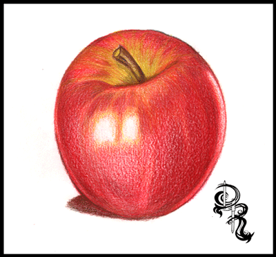
Tips: Black is your friend. With colored pencils you can cover other colors without making over shadowing them completely. If you need to go darker simply add another layer.

Step 10: And we are at the finish line! This step is probably one that most people don’t see coming. Go ahead and take the white pencil, and start coloring over the entire apple. You will notice that as you color the colors will not only lighten up but they will blend together and smoothen out. This is probably one of the greatest kept secrets, and now you know. The white colored pencil is probably the most important pencil in your collection.
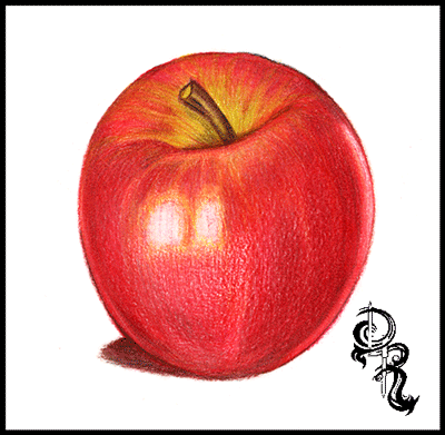
Thank you for visiting and I hope you enjoyed this lesson. More are available right here on my blog page, and at http://RoseArt.com/Blog. Be sure to check out my website for more updates, and upcoming lessons, and new art at Http://HalfEvil333.com

Friday, August 22, 2014

The Flight of The Macaw - by Derrick Rathgeber

The Flight of the Macaw
by Derrick Rathgeber


The Flight of the Macaw was one of my greatest pictures as an artist. I not only completed this piece in a good time-frame but I used over 40+ colored pencils. Composing this image was no easy feat at all either. The reference shot I had was small and blurry, but the pose fit what I was going for. I used other references such as encyclopedias, and zoology books to get the bone structure, and muscle movements down. In this blog I will be giving you a day by day play into the creation of this piece. 


DAY ONE

And the macaw spreads his wings. There is something releasing about sketching the picture on the paper. It can be difficult to start a new project sometimes, and I know once I start to draw the piece I know it's on. I found a good composition in this image that followed a line of action. It gives the illusion of the birds movement, and flight path which is right off the page. I started to color the head and saw the clock, time for a break. 

DAY TWO

I really jumped right into this piece. I felt an immediate connection, and after the success with the Bird in Bloom piece I really wanted to improve more. I used about 4-5 pencils to get a good bone color in the beak. I started to work on the creases and noticed that after I colored in the eye, I felt him staring right at me with almost a grin. Although the camera I used picked up more white than it should have, you can still see the layers of colors I started to put in. I wanted to give this bird a bit of my personality, and you can see that with the yellow to red flame coloring I put in his feathers. 

DAY THREE

Something happened today that was a bit unexpected for me. I found detail that was not in the reference picture. My dad in Costa Rica took a far away shot of this bird in flight and it was very blurry. You could say that I winged it...pun. Seriously though I stopped looking at the photo at this point and just colored. I saw the form of this beautiful bird and knew where I wanted the muscles to flex, and even more I wanted to feathers to fluff out as if he had just flapped his wings, and you get that hint of back-draft. I also went right into the shading too. I don't usually do this until I shaded all the base colors, but like I said something just came over me today, and I was on fire looking forward to tomorrow. 

DAY FOUR

Back to what I was talking about in day three. The muscle definition. I think that was my primary focus on this piece. Not only did I want to see how many colors I could put in it, but I wanted to see how many feathers I could ruffle, and muscles I could flex. The one small challenge I found was the molted white feathers on the legs and by the wings. With colored pencils you cannot just color white over red and expect white. So I had to color around these areas using negative space, and then using small strokes to add the detail of them being white feathers. I did this with grays and browns. After adding some lights and shadows to this point I think I was done for the day. 

DAY FIVE

Today the macaw started to fly. Can I admit one thing, I actually go so nervous before I started the wings that I took a day or two away from this piece. after I put so much detail into the body I couldn't mess up on the wings. That would be the end of it. So I started on the feet. Believe it or not the feet were harder than the wings. I had to get a movement that made sense as well as give them some texture. The color was interesting to, I would say between the blues, grays and tan colors there were about 7-9 colors in the feet alone. That's why I love colored pencils. Just by adding one more color in a different direction or stroke you change the look and feel of what you are coloring. It may take longer, but you have total control. As for the wings I think the most difficult part was the angle of the feathers and showing the wind pushing down on the top feathers, and lifting the bottom. to do that I added a curve at the end of each feather, and moved them as I visualized the bird in motion. You have to do this, create a line of action and engage the audience. You have one image to capture their imagination, by drawing them into yours. 

DAY SIX

Ah the right wing. This wing was killer. I almost made the mistake of thinking the macaw's feathers were blue on the top and bottom. After looking it over I found they were just a darker color of red. The feathers are actually layered, and their blue feathers are on top. That being said I really thought I would have more blue in this picture, but If I am going to make it believable you have to do your research, even if you are making it your own. Now if you are drawing directly from your imagination, which I love, then all bets are off. This is the funny part I made sure that I placed the blue on the second wing anyways. I changed to composition to have this wing come off the border. It solved two problems for me, One I needed the wings to match up in color, and Two this was a perfect line of action that made this draw much more interesting. Now I was ready to move forward. 

DAY SEVEN

This is the phase where most of artists start to crash. The final lap of the finish line, and you fear finishing. Part of you wants to push harder just to end it, and the other halve just wants to put it away and never finish it because you fear the success or failure of possible messing up. This is where you have to be cautious and take breaks. For me I told myself I would just do the log for the day, and as hard as that was I did it. I added the shadows, and different colors of browns to get the color I wanted. A voice poked in to my head saying just color in the shrubs and be done with it, I know that would have been a big mistake. I was tired, and my wrist was hurting, and I know I would have skipped details, and just rushed it. So I gave it one more day. I originally attempted to draw this 18" x 24" colored pencil piece in 7 days, but I would rather add one more day and be happy with it, than ruin it but trying to hit a deadline that I placed on myself. 


DAY EIGHT

And with the large brush in the background with the skyline, this piece is finally completed. I think this piece cemented me into a good spot as an artist. What I accomplished fore myself was just priceless when I finished this macaw piece. I used over forty colored pencils, and I did it in eight days. It was a good feeling to know I did that, and I wanted to do it again. I continued making new portfolio pieces here on out, and rebuilding everything. If you think about it The Flight of the Macaw was me. I was spreading my wings and letting the wind take me. All the way trough I animated him in my head watching him move, and I think that made the picture take form and move with me. 

Thank you very much for following me on this piece, and remember prints are available at http://fineartamerica.com/featured/the-flight-of-the-macaw-derrick-rathgeber.html

Tuesday, April 8, 2014

Traditional Arts: Stepping Away From Technology.

We live in a digital age. A fast paced age. A make more money kind of age. Somewhere along the lines we lost our patience and appreciation for what it can bring us. As I grow more and more as an artist I am finding myself a bit lost in this shift happening in the world of art. We get lost in the new, and forget the old that brought us here. I myself want to take a step back and remember where I came from, and bring it with me. 

All my life I knew I was going to be an artist. In the beginning I drew anything that popped into my head at the moment, wither it be doodles, or characters and creatures. As I grew up as a child I came across these amazing animated movies from Disney's Classic collection, to Fox Animation's Anastasia. And then came a series of films from Don Bluth. I was in a world where people drew pictures and brought them to life. I wanted to do that. I began drawing my own characters, and learning how to move them dynamically on the paper. I even remember creating character models, and story boards at the age of ten. With every new movie I found a respect for these animators that would draw 720 pictures of motion for a minute of film. I even remember training myself to draw faster and faster because I knew I had to. 

Now as an artist this helped me develop really well. I was able to look at an image and visualize it in motion. So when I would replicate it I did not have to copy it off paper, and I could draw the subject in a different form. For example my large piece, The Flight of the Macaw, I studied about 5-6 different shots of the macaw and learned about how the muscles moved, and wings flapped. Then I drew my version of the beautiful bird coming off the paper. It's because of animation that I can picture things moving, and anticipating how they will flow on the paper. I like to use this technique in my artwork so when the audience views my work they find themselves animating the image in their own minds, and feel it come alive. 

Now fast forward a bit further. Now that I am older I found myself at the right level, and age to begin looking for my dream career in the animation field. Can you imagine my disappointment when I find out that Disney Studios is abandoning their traditional animation, and going CG. They claim that the audience did not want to see it anymore. What is even worse is they based this on the strait to DVD Winnie the Pooh films. They laid off 100's of legendary artists and hired computer animators. A growing trend soon followed as studios began popping up all over bringing new CG films across the board. The biggest issue I had with this entire transition is the release of these "special edition" DVDs and Bluerays that feature our classically drawn films "remastered." They digitally painted over all the sketch lines, and backgrounds. How can that be right in any shape or form? Would we digitally clean up the Mona Lisa? Is any art medium safe the the digital world. Disney then goes on to make Princess and the Frog and claim traditional animation is back. They brought in Animators and they were able to hand draw the film. That that is as far as it went. They still used Tablets, and Photoshop for the clean up, effects, and to even digitally paint the backgrounds. 

To me traditional art will always trump CG art. While studios are constantly trying to learn techniques to make emotions more believable in the Computer Generated world, we have already found this emotion in hand drawing this art. I want you to do something for me. Pick up a VCR, and watch a classic film of your choice. A hand drawn, hand painted film. And really watch it. You will notice that no movement is wasted, and no frames are skipped. Traditional animation may take more time, but the result is worth it. Take away the money aspect of it, and really think. Your favorite animated film of all time, and why this movie was so influential to you. The story, the characters, the believably. Moments that stick with you to this day. Moments like Cinderella dropping her shoe, Little Foot chasing his mother's shadow only to find out it was his own, Anastasia dancing with her lost memories in the abandoned ball room. These are the ones that stay with me the most. 

When it comes to art we need to shift our focus from making the most money, and spending less to taking our time, and building a legacy. I hope one day people will respect our traditions of the past more and step away from technology even for a bit. At least just a bit. And if we are truly abandoning Traditional Animation then I hope they leave the legacy intact, and leave the digital out of it. Leave the films how they were created. They were already so beautiful. Every sketch line that wasn't erased from the film showed me how much heart went into making the film. If you have ever watched an animator draw key frames you will know that every frame is important. You will begin to understand that Disney's Sleeping Beauty would not have been a complete masterpiece had 1 page of it's 54,720 images wasn't drawn. 

Thank you for reading, 

Derrick Rathgeber
http://DerricktheArtist.com

Friday, March 21, 2014

It's Imagination that Brings Me Back to Reality

Beyond Imagination 
It's Imagination that brings me back to reality. 

Over the last few years I have been retraining my art style to meet the needs of the art community. I wanted so hard to show that I belonged in the professional world. Growing up when ever someone would introduce me as an artist they would say yeah this is Derrick he draws monsters and characters and stuff. I have heard the phrases weird, odd, strange, goofy, and all I heard was limited. I really felt off because I didn't want to be limited. In a business sense people buy art based on the artist's name. My name was synonymous with the words listed above, and I felt if I was going to sell anything I thought I had to get out of that cage.

I started to draw the large animal pieces like Bird in Bloom, and The Flight of the Macaw using reference shots, and composing them originally. These pieces really hit big with the community, and got my name out. I won my first art show with the Bird in Bloom as best in show, and I was saying to myself, maybe they were right all along. I really limited myself by drawing things I loved all the time. Do I really have to draw from life, and make the images look real to get noticed? Over time I drew more realistic pieces like the Dolphins in the Reef, and I started to feel chained up. It didn't feel like drawing anymore, and I didn't want to do it. I took a good month off of drawing, until I had a vote on my site about what animal I should draw next. The results came in as a horse. As we all know there are millions of horse art all over the web. I was kind of reserved about drawing one, until I had a thought. In my mind I found a glimpse of the image I was going to draw, and I was energized again. I had drawn horses many times before. In my animation class we had to draw hundreds running, and jumping, flying you name it. For my horse I wanted power so I drew Hraunkot a horse born from the lava enriched ground. It was this moment that it dawned on me, I missed my imagination.

I put my foot down with this next piece, and gave myself some rules. Other than looking at my hands and drawing them on the paper, I would draw random images without looking at anything. This piece would be called "Beyond Imagination."

DAY 1: Today I charged in and set up the paper with the border, and the outline placement of the hands. In my head I envisioned an image coming to live born from the paper. To show this I did something a bit different and drew the picture in both pencil sketch, and colored pencils. The first thing that came to mind was a dragon. Something that could be large and small at once just setting the tone for the picture. I drew the dragon climbing off the paper using my arm as a stepping stone, almost like it's getting ready to fly off the paper. To blend the two worlds of art and reality I added a yellow & red burn effect ass the color and grey-scale start to blend together.


Day 2: Each day I like to add just one more subject to the drawing so I can focus on one at a time like each part is it's own piece. Today I decided to throw in a flying witch, who also resembles a sorceress. In my character designs I like to add detail. But it has to be detail that makes since. In this case I added small but intricate designs on her outfit that you may see, and purple is my little three year old's favorite color so that worked out too. I think this part of the picture works nicely because she adds movement to the dragon. Almost saying charge.


Day 3: This is probably my favorite part of the picture. The rising phoenix that comes off the page. Originally I drew the phoenix much different. It was all flames that came out of the clouds in the form of a bird. I looked at it, and said nah it just wasn't me. So I imagined what I thought a phoenix may look like in my imagination and the result is what you see below. You can see the heat coming off the ancient bird, and at the same time the magic. I had the markings look as if they are illuminating, and the feathers glowing on fire. And at the same time it looks like it could fly. You can't see it yet, but I have him flying out of the border as well. It just ties everything together.


Day 4: As I was drawing the left side of the page, I couldn't stop saying "Release the Krakken!" I remember drawing a Krakken as a kid, and it looked something like this, of course a lot less detail then. I wanted to add some adventure to the drawing, something like that of pirate adventure story. In this adventure the Krakken was so big it folded the drawing paper creating a tidal wave. It started to look like a drawing, inside of a drawing....coming alive out of a drawing..while I was drawing...yeah something like that. ( I think I hurt myself.)


Day 5: I love it when a drawing just comes together towards the end. At this point it's really hard not to pull an all-nighter and blaze through it. But that is when you begin to rush and make mistakes. Today I started drawing the paper.on the paper (not that again.) and really defining the stylish clouds. We have all been told to get our heads out of the clouds, and that is why I drew everything in the clouds. From the volcano exploding swirled smoke, to the ocean splashing the cloudy waves against the rocks. It was all dreams and imagination coming to life. And what are clouds without the sky, and a rainbow shooting across the sky. I added a rainbow forming into shooting stars to merge the waves and the night sky. The final touches are all sketched out, and ready for tomorrow.


Day 6: And it's the final day. A good six day project that was a whole lot of fun. Not only did I complete my challenge but I found a lot of me that I lost in the process of creating this drawing. Have you ever had that moment where you were worried about messing up a part of your drawing, and turns out to be the best part? I did, and I am very happy with the hands. You can't see it in this picture, but I got all the little hairs on my arm, and the ring metal was spot on. I even cast the shadow onto the paper using my desk light as a guide. Once finished I moved onto the space area, and the paper. I wanted to make the paper..on the paper (here I go again..) look like parchment. So I used browns and golds in with the grey color. With that final touch it all came together for me, and I am very happy with it. Once I get a better picture of it, I will add it to my shop, and have it ready for prints for all who are interested.


I am really glad to have you all here reading this as I share my thoughts with you all. Each drawing is an extension of you as an artist. A poet writes her thoughts, and puts it all out there. A Photographer uses their camera to show the world how they view it, and writers can pull you into their world. We use pencils, and brushes to build and shape the paper into the world as we see fit. And that's why I came up with the saying, "A World Beyond Imagination is Only a Sketch Away."
I am glad you enjoy my work, and my world of imagination, and I would like to do more pieces like this, as well as commissions, and real life studies. A good balance makes an artist happy. do what you love, and don't get caught up with your love for art becoming work. It can hurt your artwork, and limit your abilities.

This Piece is currently on display during the 
 
Location: Riverside County Administration Center 
4080 Lemon St. 
Riverside, California 92501
You can find my artwork on the Fifth Floor in the Board Room.

Hours: 8:00am - 6:00pm 

Have a great day,

Derrick Rathgeber
Derrick the Artist

Tuesday, March 4, 2014

Derrick the Artist is on the Rise!


Oh what a fantastic start for 2014. Where would I be without family, friends, and my fantastic art community? Not where I am today I can guarantee that. I have some building to do, and a bit further to climb, but the direction I am going is definitely the right one. 

Over the past few months I have had some ups and downs on the course of my art career. I missed a few promotions here and there, and even more shows, but that is all in the past. It's funny how God works. Just when you feel angry with him, and you begin to think that he is not listening, he shows you he is. Last month I wrote about my anger with the world. How I have given all that I can give, and I felt it was my turn to get some help now that I needed it. When that help didn't come right away I was angry. I felt like a spoiled brat, but at the same time I knew it was good to voice my frustrations. A few weeks went by and although nothing had changed I felt a change in the air. It was like the pressure I placed on myself had lifted, and I forgot why I was angry in the first place. And that's when everything changed. 

The name Derrick the Artist was already on the Rise. This year alone I have already started my first large show. The Annual Artscape in Riverside, CA. This show is big, and runs from February to August of 2014, and in May I have been asked to draw a few pieces for the Riverside Prom, and join the committee. My artwork which is produced using RoseArt brand pencils is going to be see by a whole lot of professional artists all over. I have never been able to pay for the expensive brand name pencils and to me that didn't make a difference. I used what I had, and did not understand the impact that would have on the people around me. 

On this blog you will notice that I give art lessons using the RoseArt pencils. Despite the critics the pencils are a great price range that all people can afford, but to me they output fantastic colors. As I started to make more lessons using pencils that more students, and young children were using I found there was a need for these lessons to be accessible. I have been getting a whole lot of thank you letters and messages asking me to make more, and they like to know that because they cannot afford the high priced art supplies they to can produce award winning art as well. They weren't limited to their budget like myself. I like being there for these young adults and artists who have questions. It feels good, and eventually I would like to set up an artist mentoring program on a volunteer basis as one of my goals. For now I'll continue building, and working for it. 

Another big deal for me that I received recently was a donation on my website by a lady from Kentucky. No kidding I was running out of colors to use, and I was seeking donations to purchase new pencils, and paper. My last black had whittled down, and I kid you not that morning I received a donation that allowed me to purchase enough materials for the next few months. I am usually the one outputting all that I can, and I cannot believe that someone felt I was worth investing in. It really brought my soul back to life, and I was lifted up with ambition to do more. I cannot wait to pay it all forward and giving all I can give, and teaching all I can teach to all that will ask or listen. 

So as I am on the rise be sure to continue watching to all that I am putting out. I built a shop to sell my artwork on great gifts. The proceeds go to adding more options and building the Artist Mentoring Network. I will be seeking artists who are willing to chime in voluntarily to help young artists, and student artists.My comic Strip Twisted Fate will be growing, and becoming an animated Flash comic by 2015, and my art lessons will continue to grow. Possibly a book by next year as well. Finally new large pieces of artwork to share with the world. I hope you will continue to join me as I grow as an artist with you. Remember to visit my webpage for news and updates on everything. 
I want to see all of you Rise with me as well. 

Thank you for reading, 
Derrick Rathgeber

Thursday, October 17, 2013

Success is not a Dollar Amount

I have come a very long way since I have started drawing again. I have a new website, my own blog page, and my artwork has been seen all over the world, and I am currently in a gallery here in Riverside until August.  To me I feel like I reached the top as an artist. The only thing that would make my journey complete would to be able to live off of my artwork. Being that I have yet to sell more than one print, I can honestly say that is not going to happen. In my entire art career I have only sold one original drawing, and one signed print for $20. Does that make my career in art a large failure?

The answer is heck no. I am sure there are plenty of artists out there who place their work on the web in hopes it will go viral, and sell 1,000s of prints, but only get 5 likes. And maybe you have placed your work in a showcase in hopes people will buy your piece, only to take your card and lose it. Believe me you are definitely not alone. I have found that there are a lot more artists in your position than you think. And each one is more discouraged and ready to quit than the next.  I know I wanted to quit myself quite a few times because my art just wasn’t selling like I wanted to.

Then I woke up one day realizing that I almost quit doing what I love because someone didn’t give me money for it. I felt like an idiot. I almost gave up a talent that others strive for because I was selfish and wanted money. All the new upcoming artists that came to me for help and questions were going to be sent away, and the people that subscribed to my website, and blog, social media sites because they enjoyed my work were no longer going to see it anymore. I almost let my kids down who look up to me because in their eyes I am the best artist in the world. To me that almost made me sick to my stomach that money became that important to me. Has the world broken me down so bad that money took a place hire than a talent that no money could ever buy?

So I decided that I would no longer see success measured with a dollar amount. And no one should. Have I made millions of my artwork? No. Have I hit over 100,000 likes on Facebook? Far from. What I have done is inspire young artists to continue bettering themselves. I made someone laugh with my Twisted Fate comic. My work has been seen by people all over the world without spending one dollar in advertising. I have shown people what you can do if you put your trust and patience in yourself, and really enjoy what you do. That is my greatest successes as an artist. If I can keep going, and push myself to finish piece after piece, comic after comic, share my drawing lessons online free, and just help others, then I feel I have reached a level that I didn’t know existed.

What defines you as an artist? Ask yourself why you started? Why do you love it so much? Why do you or did you want to quit? For me I started because I really enjoyed taking my imagination, and thoughts, then just laying them out all over the paper.  I love it now because I can see things that other people cannot. A gift to see colors that did not exist before and I can share them with all of you. It makes my day. I wanted to quit, well for a reason that wasn’t good enough because I am still here. I am still here drawing, coloring, and sharing it all with all of you, and I hope that as long as I continue to share what I have to give with you, that you return the favor .  I want to see all of your talents, because art, poetry, words, stories, imagination, it makes the world a much better place to live in and enjoy.  

"You are already successful because you picked up the pencil,  and made the world that much more beautiful."

Thank you for reading,
Till next time my friends.

http://Derrickr.Webs.com

In Feed AD