Showing posts with label pencil. Show all posts

Thursday, June 21, 2018

The Flight of the Macaw

The Flight of the Macaw
by Derrick Bruno


The Flight of the Macaw was one of my greatest pictures as an artist. I not only completed this piece in a good time-frame but I used over 40+ colored pencils. Composing this image was no easy feat at all either. The reference shot I had was small and blurry, but the pose fit what I was going for. I used other references such as encyclopedias, and zoology books to get the bone structure, and muscle movements down. In this blog I will be giving you a day by day play into the creation of this piece. 

Prints are available at https://www.halfevil333.com/art

DAY ONE

And the macaw spreads his wings. There is something releasing about sketching the picture on the paper. It can be difficult to start a new project sometimes, and I know once I start to draw the piece I know it's on. I found a good composition in this image that followed a line of action. It gives the illusion of the birds movement, and flight path which is right off the page. I started to color the head and saw the clock, time for a break. 

DAY TWO

I really jumped right into this piece. I felt an immediate connection, and after the success with the Bird in Bloom piece I really wanted to improve more. I used about 4-5 pencils to get a good bone color in the beak. I started to work on the creases and noticed that after I colored in the eye, I felt him staring right at me with almost a grin. Although the camera I used picked up more white than it should have, you can still see the layers of colors I started to put in. I wanted to give this bird a bit of my personality, and you can see that with the yellow to red flame coloring I put in his feathers. 

DAY THREE

Something happened today that was a bit unexpected for me. I found detail that was not in the reference picture. My dad in Costa Rica took a far away shot of this bird in flight and it was very blurry. You could say that I winged it...pun. Seriously though I stopped looking at the photo at this point and just colored. I saw the form of this beautiful bird and knew where I wanted the muscles to flex, and even more I wanted to feathers to fluff out as if he had just flapped his wings, and you get that hint of back-draft. I also went right into the shading too. I don't usually do this until I shaded all the base colors, but like I said something just came over me today, and I was on fire looking forward to tomorrow. 

DAY FOUR

Back to what I was talking about in day three. The muscle definition. I think that was my primary focus on this piece. Not only did I want to see how many colors I could put in it, but I wanted to see how many feathers I could ruffle, and muscles I could flex. The one small challenge I found was the molted white feathers on the legs and by the wings. With colored pencils you cannot just color white over red and expect white. So I had to color around these areas using negative space, and then using small strokes to add the detail of them being white feathers. I did this with grays and browns. After adding some lights and shadows to this point I think I was done for the day. 

DAY FIVE

Today the macaw started to fly. Can I admit one thing, I actually go so nervous before I started the wings that I took a day or two away from this piece. after I put so much detail into the body I couldn't mess up on the wings. That would be the end of it. So I started on the feet. Believe it or not the feet were harder than the wings. I had to get a movement that made sense as well as give them some texture. The color was interesting to, I would say between the blues, grays and tan colors there were about 7-9 colors in the feet alone. That's why I love colored pencils. Just by adding one more color in a different direction or stroke you change the look and feel of what you are coloring. It may take longer, but you have total control. As for the wings I think the most difficult part was the angle of the feathers and showing the wind pushing down on the top feathers, and lifting the bottom. to do that I added a curve at the end of each feather, and moved them as I visualized the bird in motion. You have to do this, create a line of action and engage the audience. You have one image to capture their imagination, by drawing them into yours. 

DAY SIX

Ah the right wing. This wing was killer. I almost made the mistake of thinking the macaw's feathers were blue on the top and bottom. After looking it over I found they were just a darker color of red. The feathers are actually layered, and their blue feathers are on top. That being said I really thought I would have more blue in this picture, but If I am going to make it believable you have to do your research, even if you are making it your own. Now if you are drawing directly from your imagination, which I love, then all bets are off. This is the funny part I made sure that I placed the blue on the second wing anyways. I changed to composition to have this wing come off the border. It solved two problems for me, One I needed the wings to match up in color, and Two this was a perfect line of action that made this draw much more interesting. Now I was ready to move forward. 

DAY SEVEN

This is the phase where most of artists start to crash. The final lap of the finish line, and you fear finishing. Part of you wants to push harder just to end it, and the other halve just wants to put it away and never finish it because you fear the success or failure of possible messing up. This is where you have to be cautious and take breaks. For me I told myself I would just do the log for the day, and as hard as that was I did it. I added the shadows, and different colors of browns to get the color I wanted. A voice poked in to my head saying just color in the shrubs and be done with it, I know that would have been a big mistake. I was tired, and my wrist was hurting, and I know I would have skipped details, and just rushed it. So I gave it one more day. I originally attempted to draw this 18" x 24" colored pencil piece in 7 days, but I would rather add one more day and be happy with it, than ruin it but trying to hit a deadline that I placed on myself. 


DAY EIGHT

And with the large brush in the background with the skyline, this piece is finally completed. I think this piece cemented me into a good spot as an artist. What I accomplished fore myself was just priceless when I finished this macaw piece. I used over forty colored pencils, and I did it in eight days. It was a good feeling to know I did that, and I wanted to do it again. I continued making new portfolio pieces here on out, and rebuilding everything. If you think about it The Flight of the Macaw was me. I was spreading my wings and letting the wind take me. All the way trough I animated him in my head watching him move, and I think that made the picture take form and move with me. 

Thank you very much for following me on this piece, and remember prints are available at https://www.halfevil333.com/art

Monday, May 25, 2015

How to Draw a Feather With Colored Pencils

How to Draw a Feather With Colored Pencils
by Derrick Bruno


Welcome back to my free art lessons page. In this lesson I will teach you a fun way to create feathers with character and color. I had many suggestions on what colors to use and I got an overwhelming amount of purples and blues, but you may choose any combination of colors that you like. We will focus on our strokes, directional shading, and color blending in this lesson this time around. So shall we begin?

Step 1: To start this lesson we are going to create a basic line sketch of our feather. Start with the quill of the feather to create your curve. Once you have the shape of the feather you would like begin sketching from the bottom up to create an outline as shown below. 


Tip: You can also get a bit creative and play with different shapes of feathers or use a reference of a specific feather you would like to draw. I encourage imagination & originality. 


Step 2: In this step we are going to add a bit of character to the feather which will also help us with the coloring. Erase a couple sections in the sides of the feather to add breaks in the feather. Once you are satisfied with the look of your feather add some loose strings to the bottom near the base to show breakage. Once finished, we are now ready to grab some color. 


Step 3: Starting with the color Black we are going to start giving the feather direction and shape. Make sure your pencil is sharpened nicely and start off by shading in a V like pattern up and down the feather like a Richter scale. Once you have this area shaded in re-sharpen your pencil and add in some line strokes through the shading. 


Step 4: It's time to grab our colors and make this feather stand out. For this lesson I will be using shades of Purple, & Blue. My kids wanted me to do an Ice feather, and I thought that would look pretty cool. To start off reach for the Purple colored pencil and starting from the bottom you are going to color in the direction of the feather in a V like pattern. We are going to go over the black colors and overlay this effect to start a blending. Add more sharp stroke lines to pull the purple out across the feather. This will stand out towards the end of the picture. Remember to add some purple to the bottom of the feather for the broken spurs at the bottom.


Step 5: Next we are going to add our blue to the feather. For this portion I used a Royal Blue colored pencil to have a nice bold color to blend into the purple. Color over the purple and black areas and expand the strokes a little further outward to cover more of the feather. Remember to follow the same direction of strokes from the stem to the end of the feather. Create a feathering effect on the border of the feather with small jagged strokes along the edges of the feather. This will give the illusion of individual hairs. Once finished sharpen your Royal Blue color and make individual strokes from the shaft to the edge one by one. This will create a sense of shading across the feather. 


Step 6: For the last step we are going to add the final color and do some clean up work. I used a Sky Blue color to finish this feather off. Using the sky blue you are going to cover the feather completely, but remember to color in the direction of the feather hairs. From the stem to the edge. This is important because if you go left and right or in circles you will lose that illusion of individual strands that we are going for. Once you have the look you are going for we are going to clean up the feather by adding more Black and some Gray for the stem. Begin by going over the black once more to bring it out some more. Add a couple of strokes across the feather and the edges to create some shading. Once you are satisfied, use the gray to shade in the stem to complete the drawing.


This is a fun lesson to repeat in many different ways. You can create some very cool feathers by adding swirl designs, or playing with different colors. Just remember to have fun with it and make it your own drawing. The most important skill you want to take a way from this lesson is the directional shading, and the different strokes you get from a sharpened pencil and a dull one. Both have their advantages. 

I hope you enjoyed this lesson. Remember to subscribe to my blog for more Free art lessons, and Advice on how to get past the many road blocks we face as artists. Have a great day. 

Follow me on Pinterest for a complete set of Lessons with quick links and great images. 


Thursday, February 6, 2014

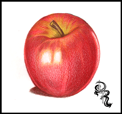
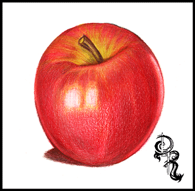
Derrick the Artist: How to Color a Delicious Pink Lady Apple with Colored Pencils

How to Color a Delicious Pink Lady Apple
by Derrick Rathgeber


Thank you for choosing me to help you grow as an artist. I do this all for free because I know how many other artists there who can use them, and it really makes my day to hear the responses about how much they help. Even more so I would like to keep the Art Lessons and Web Comics FREE. Anything you can help with will help me keep that promise. Visit my donation page below to donate, or message me if you can help in other ways. ie. Supplies, publications ect..
Thank you for all your support.
Derrick Rathgeber


RoseArt Colored Pencils we will be using.
White
Golden Yellow
True Orange
Bronze Yellow
Celery
Cardinal Red
Cherry Red
Raspberry
Brown
Black

Welcome to the great drawing lessons here on Derrick the Artist. Today I will be teaching you how to color your very own delicious pink lady apple. In this exercise I will give you tips on how to over lay colors, blend them to create lights and shadows, as well as textures. So let’s get started shall we.

Step 1: If you are comfortable with your drawing skills start off your picture by drawing the apple shape below with the brown colored pencil. Remember your apple does not have to be a perfect shape because no apple is a perfect sphere.
Tips: A PDF version is available if you would like to skip this step and go right into the coloring.Download the printable version by clicking the link below:


Step 2: Using the Golden Yellow make dark to light strokes outlining the shine. Start at the base of the step and define the shape of the apple. This color will act as the base and guide for the rest of the colors to come. Next use the Bronze Yellow and darken the yellow areas on the stem and the area around the stem. This will help blend into the green Celery color in the next step.

Tips: Use more pressure on the pencil at the edges and around the shine areas, then slowly raise the pencil up decreasing the pressure of the pencil.
Step 3: Using the Celery color you will go over the Golden Yellow color on the top of the apple. Start from the base of the stem and create line in arcs to the rim of the apple, then fill them in with the Celery green covering a good area of the top, but leave some areas available for the red to come through. Also add some Celery color to the stem as well.
Step 4: Now it’s time to set the base for rest of the apple. Using the True Orange we will start from the stem base and color the apple almost like a pumpkin. Fill in the top half of the apple leaving small empty spaces along the edge, and along the base of the bottom. Keep a white strip-like area empty along the right side of the apple, as this will act as a reflective shine making the apple look more realistic.
Tips: References are great. If you have an apple at home shine a light on it to see how light shines and reflects on it so you can replicate this effect in your drawing.


Step 5: It’s time to watch your apple come to life. Use the Cardinal Red and cover the apple in nice even strokes with the apple from top to bottom and at a curve. Remember to leave the large shine in the center, and on the right clear. I like to rotate the paper so I can keep my hand still and move only the pencil across the paper. Once the apple is covered evenly begin adding pressure and coloring in areas darker near the edges and the top of the apple. Leave the area near the large shine lightened as shown in the picture.
Tips: Try to keep your pencil stokes in one direction. In this case arc them downward creating the illusion of a round object. After you have covered the area you can crosshatch to darken areas of the drawing.


Step 6: The candy apple read that makes you drool. That’s what we are going for. So let’s add the next layer of red. This time we are using Cherry Red to help fill in gaps, smooth out our fruit, and generate a one of a kind look. Starting at the borders of the apple we are going to go over theCardinal Red and start coloring towards the shine lightening our strokes along the way. Also get the top of the apple, and overlay the red partially over the yellows and greens to pull it all together. When you are satisfied with the look of your apple, move on to the next layer of red in the next step. Yep that’s right Three layers of red.
Step 7: This is the last layer of red I promise. Grab the Raspberry Red colored pencil and use heavy pressure along the areas you want to add shadows to. You can use the image as reference or use your gut. Get the areas close to the edges, and highlight the shine on the top near the stem. At this point your apple will have a realistic shine and reflect the paper it is drawn on. As an option also use this color to create a shadow on the floor. Remember where your light is coming from and color your shadow based on that. In this case I have light coming from the rear and the front so the shadow is outlined as shown.
Tips: If your drawing doesn’t look like the image shown do not worry. If I were to draw this again mine would look different too. Remember to enjoy yourself and take your time.


Step 8: Time to give your apple an earthy look, and finally give that stem some color. Reach for theBrown and fill in the stem from base to top leaving some green color. Remember to color with the stem shape, and for an extra measure of realism sketch some harder lines. Next add a layer of brown across the entire apple, and the shadow. Remember to leave the shines white. Adjust your pressure to the level that you want. This gives the apple some more texture, and colors to capture the eye.
Tip: If you would like to color the apple with other colors you can use these techniques with most fruit and objects. Simple adjust your color palette, and have fun.


Step 9: We are now heading to the final touch ups. Get a hold of the Black pencil and we will finalize the shadows. Start off by coloring over the shadow on the ground. Once you are finished start darkening the left side using the shines as a guide to stop. On the right side of the apple you will start from the white strip and go from heavy pressure to light pressure as you meet in the middle. Then add some dark areas in the stem to show that the apple dips in. Once you are satisfied with your look we will move on to the final step.
Tips: Black is your friend. With colored pencils you can cover other colors without making over shadowing them completely. If you need to go darker simply add another layer.
Step 10: And we are at the finish line! This step is probably one that most people don’t see coming. Go ahead and take the white pencil, and start coloring over the entire apple. You will notice that as you color the colors will not only lighten up but they will blend together and smoothen out. This is probably one of the greatest kept secrets, and now you know. The white colored pencil is probably the most important pencil in your collection.
Thank you for visiting and I hope you enjoyed this lesson. More are available right here on my blog page, and at http://RoseArt.com/Blog. Be sure to check out my website for more updates, and upcoming lessons, and new art at http://DerricktheArtist.com.
Upload your lesson results on my Facebook page. Each month I will giving away great prizes, all you have to do is share your results with me at: http://Facebook.com/DerricktheArtist. Remember to have fun with it. 

Thursday, July 25, 2013

How to Draw Glass with Colored Pencils: Erasing to Add Detail

How to Draw Glass with Colored Pencils: 
Erasing to Add Detail
by Derrick Bruno


Thank you for your Donation & Support!


https://www.pinterest.com/pin/60869032437032180/
Thank you for visiting. In this lesson I will teach you how to draw a believable glass texture. Our subject will be a light bulb so we will be using grey colors for this lesson. You’ll even have a small bonus lesson for the metal texture at the base of the bulb. What you will be learning today is how to use your pencils to color smoothly, and how to take away from your drawing to add more depth and detail. Are you ready to get started?

First off the colors I chose for this lesson are as follows: GreyCool GreyDark GreyBlack and White.  Also we will be using an eraser. Preferable a white one, or gum eraser.


 Step 1: Using the Dark Grey draw out your light bulb. You can opt out the details in the middle if you like they are not necessary for this lesson. You do however want to get the bulb shape, and screw at the base. This lesson is more about coloring and texture than copying the image.

Hint: Any time you are drawing from a reference a good fun trick to do is draw the image upside down. It sounds funny but it tricks your brain into drawing what you see, and not what your brain knows.


Step 2: Using the Grey colored pencil you will fill in the lower area of the bulb using medium pressure. Once completed take your pencil and hold it at a slant so the point is flat against the paper. Lightly begin to shade in the rounded bulb area using rounded strokes back and forth. This will give you a smoother fill. Continue to crosshatch and fill in the top of the bulb, and the base of the bulb until you get a good smooth cover.

Hint: Practice, and do not rush. Remember you’re not in a race, and you won’t get a prize for finishing first. This is a technique that you are trying to learn. Take scratch paper and use the side of your pencil lead to make strokes of different lengths, and pressures.


Step 3: Here is where it gets fun. Find a good size eraser, preferably a gum eraser, or white art eraser. Now you can look at a light bulb for reference or visualize where you will see the shines. You can also use mine for reference. Start erasing away where you want to have the shines. Be sure to follow the shape of the bulb, and do not be afraid to erase the details of the center, that just gives it more character. This gives the illusion of a rounded shape that you can now view start viewing as glass.

Hint: We used grey in this lesson because our background is white. This is only to make the 2D object appear three dimensional. Now if you have the bulb in front of an object or let’s say a yellow wall, you would color the bulb the same color as the background, or slightly lighter color of the background depending on how thick you want the glass to appear.


Step 4: Now we have to make the glass shine more prominent. You can now use the Dark Grey color and start shading around the shines. We are going to add more pressure at the top of the bulb, the base of the glass, and around the erased shines. Be sure to blend the Dark Grey and Grey together by adding layers of color from dark to light. Also if you added the middle detail you will use the Dark Grey to define the glass on the inside as shown.


Step 5: In this step we are starting on the metal base. Simply use the Dark Grey again and fill in the areas as shown. It’s okay to make these areas dark as we are going to add black to it later. You want to show the light bending around the metal object. And this object is smooth.

Hint: When you draw metal objects be sure to pay attention to your light sources, and remember that light comes from behind too, as seen here.


Step 6: Using the Cool Grey color begin shading the base filling in the left side darker, and leaving the right side lighter. This shows where your light source is and keeps the color flowing across the object. You can even color up and down the screw base to ensure you get the same dark to light scale going from left to right. And remember this metal is also smooth so it’s a great way to practice your small smooth strokes.

Hint:  A good tool to help you blend your pencil drawing is a “Blinding stump.” They are highly affordable, and easy to use. If not you can always use your fingers to smudge the colors together. I did before I know they existed.


Part 7: To add our finishing touches on this piece we are going to just define the light bulb, and highlight the shines. So let’s start off by grabbing the Black pencil. Start by outlining the bulb, and shading in areas of the bulb close to the base and around the top. Take a step back and look at your image and you can see where the shadows are coming from. Those are the areas you want to darken.  Next you will use the Black to also darken the shadows on the metal base to really make the metal shine, and stand out from the glass. You can also add a layer of shading to make it darker from the glass bulb.

Finally we are going to use the White pencil to color over the middle of the glass and shines to really make the center pop. Almost like the light is starting to light up. And to finish the drawing off add white to the right side of the metal base, and around the sides to show where the light is coming from.

I hope you enjoyed this lesson. Please email any comments or suggestions to DerrickBruno@HalfEvil333.com. Find my new portfolio page at http://HalfEvil333.com

Sunday, June 30, 2013

The Flight of the Macaw: Colored Pencil Drawing by Derrick Rathgeber

The Flight of the Macaw
by Derrick Rathgeber


The Flight of the Macaw was one of my greatest pictures as an artist. I not only completed this piece in a good time-frame but I used over 40+ colored pencils. Composing this image was no easy feat at all either. The reference shot I had was small and blurry, but the pose fit what I was going for. I used other references such as encyclopedias, and zoology books to get the bone structure, and muscle movements down. In this blog I will be giving you a day by day play into the creation of this piece. 

DAY ONE

And the macaw spreads his wings. There is something releasing about sketching the picture on the paper. It can be difficult to start a new project sometimes, and I know once I start to draw the piece I know it's on. I found a good composition in this image that followed a line of action. It gives the illusion of the birds movement, and flight path which is right off the page. I started to color the head and saw the clock, time for a break. 

DAY TWO

I really jumped right into this piece. I felt an immediate connection, and after the success with the Bird in Bloom piece I really wanted to improve more. I used about 4-5 pencils to get a good bone color in the beak. I started to work on the creases and noticed that after I colored in the eye, I felt him staring right at me with almost a grin. Although the camera I used picked up more white than it should have, you can still see the layers of colors I started to put in. I wanted to give this bird a bit of my personality, and you can see that with the yellow to red flame coloring I put in his feathers. 

DAY THREE

Something happened today that was a bit unexpected for me. I found detail that was not in the reference picture. My dad in Costa Rica took a far away shot of this bird in flight and it was very blurry. You could say that I winged it...pun. Seriously though I stopped looking at the photo at this point and just colored. I saw the form of this beautiful bird and knew where I wanted the muscles to flex, and even more I wanted to feathers to fluff out as if he had just flapped his wings, and you get that hint of back-draft. I also went right into the shading too. I don't usually do this until I shaded all the base colors, but like I said something just came over me today, and I was on fire looking forward to tomorrow. 

DAY FOUR

Back to what I was talking about in day three. The muscle definition. I think that was my primary focus on this piece. Not only did I want to see how many colors I could put in it, but I wanted to see how many feathers I could ruffle, and muscles I could flex. The one small challenge I found was the molted white feathers on the legs and by the wings. With colored pencils you cannot just color white over red and expect white. So I had to color around these areas using negative space, and then using small strokes to add the detail of them being white feathers. I did this with grays and browns. After adding some lights and shadows to this point I think I was done for the day. 

DAY FIVE

Today the macaw started to fly. Can I admit one thing, I actually go so nervous before I started the wings that I took a day or two away from this piece. after I put so much detail into the body I couldn't mess up on the wings. That would be the end of it. So I started on the feet. Believe it or not the feet were harder than the wings. I had to get a movement that made sense as well as give them some texture. The color was interesting to, I would say between the blues, grays and tan colors there were about 7-9 colors in the feet alone. That's why I love colored pencils. Just by adding one more color in a different direction or stroke you change the look and feel of what you are coloring. It may take longer, but you have total control. As for the wings I think the most difficult part was the angle of the feathers and showing the wind pushing down on the top feathers, and lifting the bottom. to do that I added a curve at the end of each feather, and moved them as I visualized the bird in motion. You have to do this, create a line of action and engage the audience. You have one image to capture their imagination, by drawing them into yours. 

DAY SIX

Ah the right wing. This wing was killer. I almost made the mistake of thinking the macaw's feathers were blue on the top and bottom. After looking it over I found they were just a darker color of red. The feathers are actually layered, and their blue feathers are on top. That being said I really thought I would have more blue in this picture, but If I am going to make it believable you have to do your research, even if you are making it your own. Now if you are drawing directly from your imagination, which I love, then all bets are off. This is the funny part I made sure that I placed the blue on the second wing anyways. I changed to composition to have this wing come off the border. It solved two problems for me, One I needed the wings to match up in color, and Two this was a perfect line of action that made this draw much more interesting. Now I was ready to move forward. 

DAY SEVEN

This is the phase where most of artists start to crash. The final lap of the finish line, and you fear finishing. Part of you wants to push harder just to end it, and the other halve just wants to put it away and never finish it because you fear the success or failure of possible messing up. This is where you have to be cautious and take breaks. For me I told myself I would just do the log for the day, and as hard as that was I did it. I added the shadows, and different colors of browns to get the color I wanted. A voice poked in to my head saying just color in the shrubs and be done with it, I know that would have been a big mistake. I was tired, and my wrist was hurting, and I know I would have skipped details, and just rushed it. So I gave it one more day. I originally attempted to draw this 18" x 24" colored pencil piece in 7 days, but I would rather add one more day and be happy with it, than ruin it but trying to hit a deadline that I placed on myself. 


DAY EIGHT

And with the large brush in the background with the skyline, this piece is finally completed. I think this piece cemented me into a good spot as an artist. What I accomplished fore myself was just priceless when I finished this macaw piece. I used over forty colored pencils, and I did it in eight days. It was a good feeling to know I did that, and I wanted to do it again. I continued making new portfolio pieces here on out, and rebuilding everything. If you think about it The Flight of the Macaw was me. I was spreading my wings and letting the wind take me. All the way trough I animated him in my head watching him move, and I think that made the picture take form and move with me. 

Thank you very much for following me on this piece, and remember prints are available at http://fineartamerica.com/featured/the-flight-of-the-macaw-derrick-rathgeber.html

Also if you are in the Riverside, California area between now and August 2013, you can catch The Flight of the Macaw along with three of my other pieces live in the Artscape Gallery located at:

ARTSCAPE
The Riverside County Administration Center
4080 Lemon St.,
Riverside, CA 92501

For more information visit my website at http://derrickr.webs.com
or contact Rachael Dzikonski via email at rachael@riversideartscouncil.com.


In Feed AD