Showing posts with label original art. Show all posts

Sunday, January 11, 2015

Dig Deep and Unleash Your Imagination.

What drives you as an artist? I strongly believe that there is a hidden unleashed artist in all of us. We often feel limited or stuck trying to find ourselves. Have you ever had that image stuck in your head that you cannot seem to escape? It follows you everywhere, at work, doing chores, listening to music, and in your dreams. You try to draw it but find yourself making mistakes and wasting mounds of paper. You can’t figure out why you cannot draw a stick figure to save your life when you have drawn portraits,  and landscapes flawlessly in the past. Well Today in this blog I am going to give you a glimpse into how you can begin to make the changes to unleash your potential.

The biggest problem is finding what medium you feel most comfortable with it has to be an extension of you. For me it just happened to be the pencil. The next thing you have to figure out is your style. Each of us has a unique fingerprint, and in art we each have what I like to call an “Art Fingerprint.” An Art fingerprint is an original style that no one on the planet can replicate, almost like your signature. Sure they may try, but all copies will be just that another copy. You have to let go and find your own style to do that you have to take yourself back to that one point in time when you were really excite to finish a piece of art. It could have been when you were a child, in school, or a week ago, but that moment when you caught yourself off guard paused, and smiled at your picture. It’s that excitement you have to get back, and pull into everything you do.

When did art become work, and competitions, and who can sell the most? It’s a pressure that we all face especially in this age of modern sharing on sites like Instagram, Pinterest, Facebook, and so on. Likes, comments, and shares to the highest bidder. When we don’t see the results we like we fall backwards in fear that our work is maybe not as good as the artist with over 10,000 hits. I will be the first to admit I fell into the category of envy of other artists who hit these numbers because I don’t have the income to pay for ads, or other forms of web advertising. I am going to tell you some wise and great advice that someone very smart once told me… (my wife.) They are just numbers, and do not represent the great artist you are. Remember that as you are fighting an invisible battle online to become viral, because the greatest artists that ever existed were alive WAY before the internet was born.  So do not let competition hold you back. Pressure to succeed in today’s market had me torn, and had me creating art I thought people would like. I changed who I was in the artwork, and it wasn’t me at all. It became only business, and it made me very unhappy. I was un-motivated with no passion to continue drawing the same tired drawings that had no imprint of me in them at all. It was funny how me trying to fit in with the art community and be seen with them was what got me lost in the shuffle. I was just another artist with no originality, and I had lost who I was in the process. I needed to change or I was finished.

So what got me motivated again, the catalyst that broke the mold. It was something as simple as a sketchbook, and freedom. Eliminate the pressure, and just draw. You have to just let loose and let it all come out. No techniques, no references and no hesitation. Just draw the first image that comes to your head. T doesn’t have to be the best image in the world, just enjoy it. You don’t even have to finish it. Then for the next week  I challenge you to do it again, and again. You will start learning how you perceive your imagination. You might even shock yourself a bit, and may be able to find that you had more to show than you thought. The trick is to continue pushing what is hidden within. By just drawing out your thoughts, and experiences you begin to let go of all the pressures the world places on your shoulders.
The next thing you will want to do is refine it. Take the images you drew for the week, and just revisit them all. Ask yourself how you felt when you were drawing them. Find out what motivated you to draw them, this may go deeper in your core than you thought, and bring more than just art out, but I guarantee that you will feel much better when you do.  It may help to write your own journal or blog about each of the seven drawings. Nothing elaborates, but it will help you find out what motivates you to draw, and why you started in the first place. In doing this and remembering your reason for art, you will also come to remember the passion that brought you to art. I want you to carry that passion onto your own new original piece of artwork.

Skin through your artwork in your sketch book and choose your most favorite image. Not the most detailed, but the one that catches your eye. It may be more than one. I want you to incorporate this image into your next large piece. You can even take multiple images new and old from this sketchbook, and compose them into one great image or piece. Take your time on this one, and really enjoy it.  Make it yours and give it your style, your art fingerprint if you will. Place yourself in the scene and picture yourself there. The sights, smells, movements, take it all in and enjoy it. Use references only to refine your image, such as the flowers you drew, or people. Don’t simply copy the image left to right, or up and down like a printer. Move across the paper with randomness, or start from a different spot than you are used to just to get you away from all that technique that locked you down. The point of this is to find out who you are as an artist. In school we learn to look at a picture and make a copy of it, I want you to take that picture right out of your head, and draw it to the paper or canvas.

What it all comes down to is the fear and the challenge. The fear that no one will appreciate your imagination, or understand how you think. To be honest it doesn't matter if they do or don’t. The only person you have to impress is yourself. It’s your art, and your mark on the world. To put it another way do you want to be remembered as the artist who copied other art, or the artist that broke free and decided to do something never before seen. Me I would rather never sell a piece of art and be original and happy doing it, than an artist that just drew pictures that someone else already did. I want you to challenge yourself and bring out the best artist you can be.

 (Then again I would really love to be an original artist and sell artwork too, feel free to check out my website on the links below to find out how you can purchase the originals. :D Cheap plug.)

Thank you, and I hope to see more new great artwork
Derrick Rathgeber-Bruno


Friday, January 24, 2014

Break the Chains That Bind Your Artwork

Breaking boundaries and becoming more creative than you ever thought you could be. That is what today’s blog is all about. I’ll be the first to admit that I changed my entire drawing style to build myself as a professional artist. I honestly felt no one would take me seriously if I kept drawing characters, and creations out of my mind. I tried, I really did. I would post my work online and got nothing back in return. Was this because I wasn’t good enough, or people didn’t like what I had drawn? Now that I look back on it I don’t think so. I think it was because I didn’t believe in myself enough. I held back in a lot of my work and it suffered dramatically. I would spend hours creating a lot of detail in the beginning, and then just tire of the drawing because it wasn’t me. It just didn’t represent me as an artist.

I have felt really chained down as an artist these past few months and as I was looking up a reference shot for my next piece I asked myself why? This picture I am about to draw has already been captured on photograph it’s done. What about all the great pictures in my mind that are trapped in there. I literally had thousands of images screaming to be released onto paper, and I was scared that I would mess them up. There is pressure to create; I always wanted to be original and draw different than everyone else. Even when I would draw from reference I wanted to find a way to change the image, but I really felt bound to make the image look like what I was drawing just because. I know it’s not a good reason but the pressure to be great, and build a portfolio got me thinking I had to make everything believable and real. And then it hit me just the other day why can’t I have the best of both, and make the imagination real and believable.

I found myself with a dilemma. Do I continue to build my portfolio with realistic colored pencil drawings or do I draw for fun. In the end I answered with my gut feeling to do it for me. So my next piece is called Beyond Imagination. At first I started to collect pictures of things I would add to my work I thought to myself that I am doing it again. I was already judging myself, and holding back by using images as a crutch. If I really wanted to release my talent I had to just draw. So in this image I am drawing it from left to right adding all the detail as I go. I started with a dragon, and a witch, and a phoenix. I have no idea what is next, and I don’t care if it makes sense. It’s imagination and fun. I hope you can do the same.

I propose a challenge to everyone. On your next piece, if you want to find out how much you have evolved as an artist, I want you to use everything you have learned to this point and just draw. Lay it all out on the paper. Don’t think about judgment from peers, or from yourself just go. Whatever comes into your mind go for it. The only other rule I ask for is to not use reference shots, photos, or any previous artwork. Make it yours, make it new, and take your time. Sometimes when you hit the professional level you get a following who love your “style.” If so fantastic don’t change. For me although I have gained a lot of praise for my work, it’s time for me to take a step back for a while and brake the chains that bound my imagination. I plan on growing, and releasing all I have to give, I hope you do too. Take the limiters off, and be creative again.

I hope to see some great new creations. Find me on my Facebook page at http://Facebook.com/DerricktheArtist and share them with me.

Thank you for reading,

Remember to Share, Comment, and Subscribe.

Derrick Rathgeber

Wednesday, September 18, 2013

50% OFF! Buy the Original Signed Art Piece Today.


50% off the Original Price! 


Get the original signed art piece #Hraunkot today and 


Save $200! 

Time is running out the sale prices will be available until 

Monday September 23, 2013.

Other great art is also available and on sale. Check it out. 

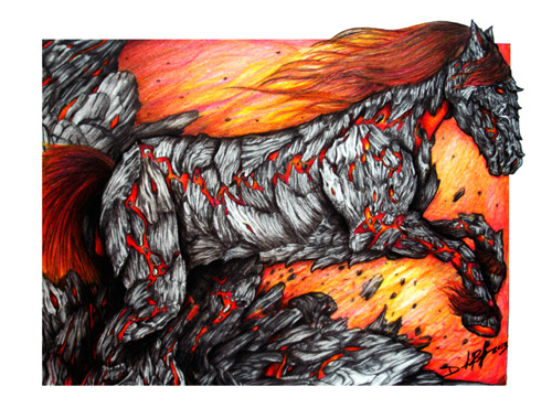
HRAUNKOT: The Horse Born of Fire


Details -
Title: Hraunkot
Artist: Derrick Rathgeber - Derrick the Artist
Medium: Colored Pencils/ Bristol soft 11" x 14"


60 Day same as cash payments available through #PayPal on this purchase.

Friday, September 13, 2013

How to Draw an Autumn Tree with Colored Pencils

How to Draw an Autumn Tree with Colored Pencils
By Derrick Bruno

Http://HalfEvil333.com

Thank you for your Donation & Support!


https://www.pinterest.com/pin/60869032437086265/


Welcome to a new Free art lesson by Derrick the Artist. (Kind of catchy right.) In this lesson I will be teaching you how to draw a tree in time for Fall. The purpose of this lesson is to train your brain how to see lines flowing together to create an image from imagination. We will not use any references, unless you count the examples, and everyone’s tree will look unique. Also I am going to show you some short cuts to give the illusion of a lot of detail with less effort. Pick up your pencils and let us get started.

Step 1: Trees are one of a kind. To start this lesson you have to have some fun. Take the Dark brown and start outlining your tree, the more randomness with each branch the better. Seriously any technical adversities and rules you may have, forget them for just a little bit.


Step 2: We are now going to fine tune the sketch with some details. Add a good knot on the trunk to give the viewer something to look at. Now with each branch you want to start adding more twig like branches. Don’t make them too robotic and repetitive. Place some branches in front and behind. You can also place them on the trunk for added fun. Because this is a “Fall” tree we are going to end each twig with fine crooked points in all directions. For all the twigs you sketched coming off the front of the tree branches, remember to erase where it connects and round it out for a quick 3d effect.


Step 3: In this step you are going to practice your line work. Following the contour of the tree you are going to add a line starting from the base and making your way up the tree changing the form as you go. Add more character by adding knots and curves mid-way, but remember to have the lines flow together like a river. Keep some closer together than others as this will create grooves for shading later. The trick to this is to not over think it. Look at your tree and you will see the lines and where they are supposed to go, just follow the curves, and build from each line you add on.


Step 4: Now that your tree is all sketched out, we will give it some color. Using the Tan colored pencil, find the lines that are closer together and fill them in. Remember to color with the lines, and don’t soften it out too much. Find where two lines meet and darken these areas a bit more such as corners, and deep grooves. This will help with the shadows, and defining the tree more.


Tip: The grainier the color the better for a tree, we are adding textures with the bark so medium paper works well, or just drawing on a wood table or surface works too.

Step 5: Using the Light Brown color lightly color over the entire tree. As you color continue to color in the direction of the lines and get and even coverage over the tree. This will act as the base color of the tree.  


Step 6: In this step we are going to define the front from the back. Using the color Brown find your grooves and darken them in. Begin to go over the lines and add shadows by shading in the lines closer together. Once finished begin to darken the branches in the rear. Shade from dark to light starting from the tree and lighten up your strokes as you get toward the end of the branch.


Step 7: We are getting there. It is time to age the tree for the Fall season. Once again we are going to use the Dark Brown and just like in step seven we are going to finish defining the shadows. Darken the branches in the back further, and add more shadows along the lines as curves. Find your light source and darken the edges tree trunk itself and shade from dark to light. Using a blending tool or your finger bring together all the brown colors.

Step 8: When you thing of drawing a tree what stops you. For me it was the leaves, but after learning a few tricks I learned they are not so bad. Autumn leaves are fading in color and falling. The first color we will use is Sienna. Go through each branch and make small oval type circles. You don’t have to fill each one in because they are so small you don’t have to overwhelm yourself with details.  Keep some leaves together and sparsely across the branches. Once you have a good coverage across all your branches add a few more falling off. Finally the last color to add to the lovely colors of Fall. Using the Yellow Orange add more leaves mixed in with the Sienna leaves. Add some more falling off, and step back and look at the tree as a whole to make sure your tree is not empty in one area, and over filled in another.  Once you are satisfied, your original tree is complete and ready for Autumn.


Thank you joining me here on my blog. I would like to see your results. Share them with me on my Facebook page at http://Facebook.com/HalfEvilProductions 

If you have any questions, comments, or suggestions feel free to contact me. 

Thursday, August 29, 2013

Featured Art - Angel of Death by Derrick Rathgeber (DerricktheArtist)

Angel of Death

Medium: Colored Pencils/ Bristol Smooth 11" x 14"

Original Price: $400.00 -  Click Here to Buy Now. 

This purchase qualifies for 60 days same as cash financing with PayPal.  

Prints are Available:

 
Angel of Death is a tragic illustration of the original poem by my wife. This 11 x 14 colored pencil drawing shows the dancing of death in the pale moonlight in visual that I can't begin to describe as she did in her poetry. The poem Angel of Death by Patricia Rathgeber can be found on her blog page.

http://snsaintalwaysnice.tumblr.com/post/51843925243/angel-of-death-by-patricia-rathgeber-come-dance

Own the original today.

Sunday, June 30, 2013

The Flight of the Macaw: Colored Pencil Drawing by Derrick Rathgeber

The Flight of the Macaw
by Derrick Rathgeber


The Flight of the Macaw was one of my greatest pictures as an artist. I not only completed this piece in a good time-frame but I used over 40+ colored pencils. Composing this image was no easy feat at all either. The reference shot I had was small and blurry, but the pose fit what I was going for. I used other references such as encyclopedias, and zoology books to get the bone structure, and muscle movements down. In this blog I will be giving you a day by day play into the creation of this piece. 
DAY ONE

And the macaw spreads his wings. There is something releasing about sketching the picture on the paper. It can be difficult to start a new project sometimes, and I know once I start to draw the piece I know it's on. I found a good composition in this image that followed a line of action. It gives the illusion of the birds movement, and flight path which is right off the page. I started to color the head and saw the clock, time for a break. 

DAY TWO

I really jumped right into this piece. I felt an immediate connection, and after the success with the Bird in Bloom piece I really wanted to improve more. I used about 4-5 pencils to get a good bone color in the beak. I started to work on the creases and noticed that after I colored in the eye, I felt him staring right at me with almost a grin. Although the camera I used picked up more white than it should have, you can still see the layers of colors I started to put in. I wanted to give this bird a bit of my personality, and you can see that with the yellow to red flame coloring I put in his feathers. 

DAY THREE

Something happened today that was a bit unexpected for me. I found detail that was not in the reference picture. My dad in Costa Rica took a far away shot of this bird in flight and it was very blurry. You could say that I winged it...pun. Seriously though I stopped looking at the photo at this point and just colored. I saw the form of this beautiful bird and knew where I wanted the muscles to flex, and even more I wanted to feathers to fluff out as if he had just flapped his wings, and you get that hint of back-draft. I also went right into the shading too. I don't usually do this until I shaded all the base colors, but like I said something just came over me today, and I was on fire looking forward to tomorrow. 

DAY FOUR

Back to what I was talking about in day three. The muscle definition. I think that was my primary focus on this piece. Not only did I want to see how many colors I could put in it, but I wanted to see how many feathers I could ruffle, and muscles I could flex. The one small challenge I found was the molted white feathers on the legs and by the wings. With colored pencils you cannot just color white over red and expect white. So I had to color around these areas using negative space, and then using small strokes to add the detail of them being white feathers. I did this with grays and browns. After adding some lights and shadows to this point I think I was done for the day. 

DAY FIVE

Today the macaw started to fly. Can I admit one thing, I actually go so nervous before I started the wings that I took a day or two away from this piece. after I put so much detail into the body I couldn't mess up on the wings. That would be the end of it. So I started on the feet. Believe it or not the feet were harder than the wings. I had to get a movement that made sense as well as give them some texture. The color was interesting to, I would say between the blues, grays and tan colors there were about 7-9 colors in the feet alone. That's why I love colored pencils. Just by adding one more color in a different direction or stroke you change the look and feel of what you are coloring. It may take longer, but you have total control. As for the wings I think the most difficult part was the angle of the feathers and showing the wind pushing down on the top feathers, and lifting the bottom. to do that I added a curve at the end of each feather, and moved them as I visualized the bird in motion. You have to do this, create a line of action and engage the audience. You have one image to capture their imagination, by drawing them into yours. 

DAY SIX

Ah the right wing. This wing was killer. I almost made the mistake of thinking the macaw's feathers were blue on the top and bottom. After looking it over I found they were just a darker color of red. The feathers are actually layered, and their blue feathers are on top. That being said I really thought I would have more blue in this picture, but If I am going to make it believable you have to do your research, even if you are making it your own. Now if you are drawing directly from your imagination, which I love, then all bets are off. This is the funny part I made sure that I placed the blue on the second wing anyways. I changed to composition to have this wing come off the border. It solved two problems for me, One I needed the wings to match up in color, and Two this was a perfect line of action that made this draw much more interesting. Now I was ready to move forward. 

DAY SEVEN

This is the phase where most of artists start to crash. The final lap of the finish line, and you fear finishing. Part of you wants to push harder just to end it, and the other halve just wants to put it away and never finish it because you fear the success or failure of possible messing up. This is where you have to be cautious and take breaks. For me I told myself I would just do the log for the day, and as hard as that was I did it. I added the shadows, and different colors of browns to get the color I wanted. A voice poked in to my head saying just color in the shrubs and be done with it, I know that would have been a big mistake. I was tired, and my wrist was hurting, and I know I would have skipped details, and just rushed it. So I gave it one more day. I originally attempted to draw this 18" x 24" colored pencil piece in 7 days, but I would rather add one more day and be happy with it, than ruin it but trying to hit a deadline that I placed on myself. 


DAY EIGHT

And with the large brush in the background with the skyline, this piece is finally completed. I think this piece cemented me into a good spot as an artist. What I accomplished fore myself was just priceless when I finished this macaw piece. I used over forty colored pencils, and I did it in eight days. It was a good feeling to know I did that, and I wanted to do it again. I continued making new portfolio pieces here on out, and rebuilding everything. If you think about it The Flight of the Macaw was me. I was spreading my wings and letting the wind take me. All the way trough I animated him in my head watching him move, and I think that made the picture take form and move with me. 

Thank you very much for following me on this piece, and remember prints are available at http://fineartamerica.com/featured/the-flight-of-the-macaw-derrick-rathgeber.html

Also if you are in the Riverside, California area between now and August 2013, you can catch The Flight of the Macaw along with three of my other pieces live in the Artscape Gallery located at:

ARTSCAPE
The Riverside County Administration Center
4080 Lemon St.,
Riverside, CA 92501

For more information visit my website at http://derrickr.webs.com
or contact Rachael Dzikonski via email at rachael@riversideartscouncil.com.


Thursday, June 27, 2013

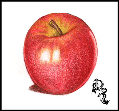
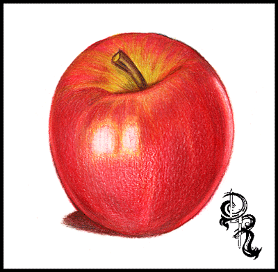
How to Color a Delicious Pink Lady Apple

How to Color a Delicious Pink Lady Apple
by Derrick Rathgeber


RoseArt Colored Pencils we will be using.
·         White
·         Golden Yellow
·         True Orange
·         Bronze Yellow
·         Celery
·         Cardinal Red
·         Cherry Red
·         Raspberry
·         Brown
·         Black

Welcome to the great drawing lessons here on Derrick the Artist. Today I will be teaching you how to color your very own delicious pink lady apple. In this exercise I will give you tips on how to over lay colors, blend them to create lights and shadows, as well as textures.  So let’s get started shall we.

Step 1: If you are comfortable with your drawing skills start off your picture by drawing the apple shape below with the brown colored pencil. Remember your apple does not have to be a perfect shape because no apple is a perfect sphere.


Tips:  A PDF version is available if you would like to skip this step and go right into the coloring. Download the printable version by clicking the link below: 

Step 2: Using the Golden Yellow make dark to light strokes outlining the shine. Start at the base of the step and define the shape of the apple. This color will act as the base and guide for the rest of the colors to come. Next use the Bronze Yellow and darken the yellow areas on the stem and the area around the stem. This will help blend into the green Celery color in the next step.


Tips: Use more pressure on the pencil at the edges and around the shine areas, then slowly raise the pencil up decreasing the pressure of the pencil.

Step 3: Using the Celery color you will go over the Golden Yellow color on the top of the apple. Start from the base of the stem and create line in arcs to the rim of the apple, then fill them in with the Celery green covering a good area of the top, but leave some areas available for the red to come through. Also add some Celery color to the stem as well.


Step 4: Now it’s time to set the base for rest of the apple. Using the True Orange we will start from the stem base and color the apple almost like a pumpkin.  Fill in the top half of the apple leaving small empty spaces along the edge, and along the base of the bottom. Keep a white strip-like area empty along the right side of the apple, as this will act as a reflective shine making the apple look more realistic.


Tips: References are great. If you have an apple at home shine a light on it to see how light shines and reflects on it so you can replicate this effect in your drawing.

Step 5: It’s time to watch your apple come to life. Use the Cardinal Red and cover the apple in nice even strokes with the apple from top to bottom and at a curve. Remember to leave the large shine in the center, and on the right clear. I like to rotate the paper so I can keep my hand still and move only the pencil across the paper. Once the apple is covered evenly begin adding pressure and coloring in areas darker near the edges and the top of the apple. Leave the area near the large shine lightened as shown in the picture.


Tips: Try to keep your pencil stokes in one direction. In this case arc them downward creating the illusion of a round object.  After you have covered the area you can crosshatch to darken areas of the drawing.

Step 6: The candy apple read that makes you drool. That’s what we are going for. So let’s add the next layer of red. This time we are using Cherry Red to help fill in gaps, smooth out our fruit, and generate a one of a kind look. Starting at the borders of the apple we are going to go over the Cardinal Red and start coloring towards the shine lightening our strokes along the way. Also get the top of the apple, and overlay the red partially over the yellows and greens to pull it all together. When you are satisfied with the look of your apple, move on to the next layer of red in the next step. Yep that’s right Three layers of red.


Step 7: This is the last layer of red I promise. Grab the Raspberry Red colored pencil and use heavy pressure along the areas you want to add shadows to. You can use the image as reference or use your gut. Get the areas close to the edges, and highlight the shine on the top near the stem. At this point your apple will have a realistic shine and reflect the paper it is drawn on. As an option also use this color to create a shadow on the floor. Remember where your light is coming from and color your shadow based on that. In this case I have light coming from the rear and the front so the shadow is outlined as shown.


Tips: If your drawing doesn’t look like the image shown do not worry. If I were to draw this again mine would look different too. Remember to enjoy yourself and take your time.

Step 8:  Time to give your apple an earthy look, and finally give that stem some color. Reach for the Brown and fill in the stem from base to top leaving some green color. Remember to color with the stem shape, and for an extra measure of realism sketch some harder lines. Next add a layer of brown across the entire apple, and the shadow. Remember to leave the shines white. Adjust your pressure to the level that you want. This gives the apple some more texture, and colors to capture the eye. 


Tip: If you would like to color the apple with other colors you can use these techniques with most fruit and objects. Simple adjust your color palette, and have fun.

Step 9: We are now heading to the final touch ups. Get a hold of the Black pencil and we will finalize the shadows.  Start off by coloring over the shadow on the ground. Once you are finished start darkening the left side using the shines as a guide to stop. On the right side of the apple you will start from the white strip and go from heavy pressure to light pressure as you meet in the middle. Then add some dark areas in the stem to show that the apple dips in. Once you are satisfied with your look we will move on to the final step. 


Tips: Black is your friend. With colored pencils you can cover other colors without making over shadowing them completely. If you need to go darker simply add another layer.

Step 10: And we are at the finish line! This step is probably one that most people don’t see coming. Go ahead and take the white pencil, and start coloring over the entire apple. You will notice that as you color the colors will not only lighten up but they will blend together and smoothen out. This is probably one of the greatest kept secrets, and now you know. The white colored pencil is probably the most important pencil in your collection. 


Thank you for visiting and I hope you enjoyed this lesson. More are available right here on my blog page, and at http://RoseArt.com/Blog. Be sure to check out my website for more updates, and upcoming lessons, and new art. 

Upload your lesson results on my Facebook page. Each month I will giving away great prizes, all you have to do is share your results with me at: http://Facebook.com/DerrickRathgeber. Remember to have fun with it. 


Sunday, June 23, 2013

Featured Art: The Fallen Angel by Derrick Rathgeber


Featured Art: The Fallen Angel


Title: The Fallen Angel
Artist: Derrick Rathgeber (Feel free to like my Facebook Page at http://Facebook.com/DerrickRathgeber
Medium: RoseArt Colored Pencils/ Strathmore Medium 18" x 24"

The fallen angel was one of those images stuck in my head. I imagined what it would be like for an angel to fall into darkness. Cast out by God, but as he felt remorse and tried to catch him is was too late, the dark already had a hold of him. I drew this when I felt myself slipping into a really dark place in my life, and I was waiting for an answer, I am in that better place now back in his hands.

Visit more of my work at http://derrickr.webs.com/
Prints are available at http://fineartamerica.com/featured/the-fallen-angel-derrick-rathgeber.html

Monday, May 20, 2013

Featured Art - Firestarter - The Grand Cross' New Beginning


Featured Art - Firestarter by Derrick Rathgeber
8 x 10 marker drawing with Photoshop fire effects. 
Looking at this picture reminds me of where my story is going now. At the time that I drew this picture and colored it, I was changing my story into something it wasn’t. I did everything I could to put it out there and make it on tv.
When I contacted Warner Bros. Animation studio they were interested in picking up the Grand Cross story line and characters to put into rotation with their Saturday morning cartoons. The only problem was the content. They didn’t want a cartoon that had Earth, Heaven, and Demons waging war on each other so I had to tone it down. Which I did. I changed the story line to fit the “ demographics.” Unfortunately they wanted more changes. Pokemon was new and popular so they suggested that the characters got their powers from rune beings instead of powers from a dying planet…So I created a special being for each rune power. I even had them merge together. 
Long story short I changed EVERYTHING! Literally nothing was left but the characters, but I was going to have my moment. The Animation new projects director pitched my story and characters to the head honchos, and they loved it. We were in business. Or so I thought. A week later I got a call from the Project Director and he tells me they are changing their line up, and adding a new Super hero animation instead. I joked that all they had left to do with the DC lineup was Justice League….and he laughed and said I guessed exactly right. Then he gave me the usual speech of pitch it again another time, and who knows. 
To me this experience showed me something. As much as I love the cartoon look of my story, I hated the story it became. It wasn’t me, and it wasn’t the great battle it was supposed to be. So I am glad I took it all apart, and rebuilt it all. This time I am doing my own research and writing it for ME! It will be a grand continuation to the war of Man, Heaven and Hell full of plots, and sub plots. And who knows when I publish the comic book, I might just create a following strong enough to have a movie made of it. Till then, I will do this project for me.

Tuesday, May 14, 2013

Featured Art - The Flight of the Macaw


Flight of the Macaw - This one of a kind piece pushes colored pencils to the limit. Over 40 different Rose Art colored pencils went into this piece.

This piece is currently showing live in the Riverside, CA Artscape Gallery.

Visit the Artscape Gallery in
The Riverside County Administration Center
located at 4080 Lemon Street, Riverside, CA 92501

The Original is Available for Purchase

To purchase the original contact Rachael Dzikonski via email at: rachael@riversideartscouncil.com

Dimensions: 18.000″ x 24.000″
Medium: Colored Pencils

Sunday, May 12, 2013

Grand Cross - A Story Long in the Making.


Today was a strong day for me. I not only got a lot done around the house, but I stuck to my plans and I worked on my Grand Cross story. For those that are new to my work, I have been working on my own comic book series. This series will be drawn and colored in pencil with the only Photoshop edits will be to format the color for print, and add special effects such as lightning. I know already I am taking on a big task, especially if the story catches on, and I have to meet demands. I suppose I can cross that road when it comes.

Along the road of coming up with a good story line I ran into some very large blocks. To me it was enough to nearly scrap the project. I have been working on this project so long, and at one point adapted the story line to fit the needs of children’s animation programming, that the story got mangled. It was so far off base from what I intended it to be so I felt like letting it go.

I came across an old list of mine. I think it was a resolution list about things I want to do to make my life better. One item on the list was to finish a project that I started. To me I crossed it off too soon thinking that the large colored pencil piece like “Bird in Bloom,” was considered large enough. But I knew was I was writing about. I didn’t know how I was going to pull this one off because I already had so much on my plate with the kids, bills, making a new website, producing art for a show, adding to my portfolio,  ect… This list went on and on. I had to do something to keep me on track. So I made a weekly work calendar. I found that if I focused on one project for that day, I could get them moving, and it worked. Before I would look at my list, and freeze to the point where I would do nothing, and get nothing from it. But now I am glad to say everything is moving forward.

Now I have something to look forward to in a year’s time. A new comic book, and a brave new concept. In this journey I am going to attempt to do things different than the normal comic book world. First off I am not sure how many colored pencil comics are out there, but I can be sure that there are not many, if any. To me it’s a comfortable medium, and I feel I can draw my panels faster than if I were to draw them in illustrator or Photoshop. Second I am going to make people really question what they believe in. How strong would you be? Would you do the same thing? And a whole lot of what ifs.

Grand Cross is a story based on the bible. My story will involve the relationship of Angels and Fallen Angels with Man and God. At one time the Fallen angels we all know were all close to God, and they loved God. Some had fell into sin, but not all were entirely bad. The first Protagonist you will meet in my stories in one of the Fallen. His name is Lahash. Some of you may know this former angel, but if you don’t I will help summarize. He was the Fallen angel who seized the prayers from Moses’ followers. Their prayers were intended to keep Moses alive to make the journey. But it was Lahash who had second thoughts and intended to return the prayers to God. Unfortunately when he was taking the prayers to God, the angel Samael shackled him in fire and brought him before God to face punishment, and the prayers were lost. He received Sixty Blows and cast out of the inner chamber and labeled a Fallen.

It’s the stories that we miss when we are looking. Lahash means one who interferes with divine will. I cannot tell you too much, but the setting for the story in the future when the worlds of God, Angels, and Man are to collide in the final battle. But does it have to happen? Lahash was able to interfere with Gods will once. Could he actually stop the end of days from coming? What would be the consequences of his actions. Why does the apocalypse have to happen? Could his actions mean the end of heavenly eternity? Would your faith be strong enough to stand by God and his Angels to protect the hope of Eternity in Heaven over life and civilization on Earth. This war could be the end of both.

More to come with pictures, character designs, character profiles, previews and a whole lot more.

Thank you for supporting me and all of my projects big and small. Your support makes everything worth it.

Derrick Rathgeber

In Feed AD