Showing posts with label art prints. Show all posts

Thursday, June 21, 2018

The Flight of the Macaw

The Flight of the Macaw
by Derrick Bruno


The Flight of the Macaw was one of my greatest pictures as an artist. I not only completed this piece in a good time-frame but I used over 40+ colored pencils. Composing this image was no easy feat at all either. The reference shot I had was small and blurry, but the pose fit what I was going for. I used other references such as encyclopedias, and zoology books to get the bone structure, and muscle movements down. In this blog I will be giving you a day by day play into the creation of this piece. 

Prints are available at https://www.halfevil333.com/art

DAY ONE

And the macaw spreads his wings. There is something releasing about sketching the picture on the paper. It can be difficult to start a new project sometimes, and I know once I start to draw the piece I know it's on. I found a good composition in this image that followed a line of action. It gives the illusion of the birds movement, and flight path which is right off the page. I started to color the head and saw the clock, time for a break. 

DAY TWO

I really jumped right into this piece. I felt an immediate connection, and after the success with the Bird in Bloom piece I really wanted to improve more. I used about 4-5 pencils to get a good bone color in the beak. I started to work on the creases and noticed that after I colored in the eye, I felt him staring right at me with almost a grin. Although the camera I used picked up more white than it should have, you can still see the layers of colors I started to put in. I wanted to give this bird a bit of my personality, and you can see that with the yellow to red flame coloring I put in his feathers. 

DAY THREE

Something happened today that was a bit unexpected for me. I found detail that was not in the reference picture. My dad in Costa Rica took a far away shot of this bird in flight and it was very blurry. You could say that I winged it...pun. Seriously though I stopped looking at the photo at this point and just colored. I saw the form of this beautiful bird and knew where I wanted the muscles to flex, and even more I wanted to feathers to fluff out as if he had just flapped his wings, and you get that hint of back-draft. I also went right into the shading too. I don't usually do this until I shaded all the base colors, but like I said something just came over me today, and I was on fire looking forward to tomorrow. 

DAY FOUR

Back to what I was talking about in day three. The muscle definition. I think that was my primary focus on this piece. Not only did I want to see how many colors I could put in it, but I wanted to see how many feathers I could ruffle, and muscles I could flex. The one small challenge I found was the molted white feathers on the legs and by the wings. With colored pencils you cannot just color white over red and expect white. So I had to color around these areas using negative space, and then using small strokes to add the detail of them being white feathers. I did this with grays and browns. After adding some lights and shadows to this point I think I was done for the day. 

DAY FIVE

Today the macaw started to fly. Can I admit one thing, I actually go so nervous before I started the wings that I took a day or two away from this piece. after I put so much detail into the body I couldn't mess up on the wings. That would be the end of it. So I started on the feet. Believe it or not the feet were harder than the wings. I had to get a movement that made sense as well as give them some texture. The color was interesting to, I would say between the blues, grays and tan colors there were about 7-9 colors in the feet alone. That's why I love colored pencils. Just by adding one more color in a different direction or stroke you change the look and feel of what you are coloring. It may take longer, but you have total control. As for the wings I think the most difficult part was the angle of the feathers and showing the wind pushing down on the top feathers, and lifting the bottom. to do that I added a curve at the end of each feather, and moved them as I visualized the bird in motion. You have to do this, create a line of action and engage the audience. You have one image to capture their imagination, by drawing them into yours. 

DAY SIX

Ah the right wing. This wing was killer. I almost made the mistake of thinking the macaw's feathers were blue on the top and bottom. After looking it over I found they were just a darker color of red. The feathers are actually layered, and their blue feathers are on top. That being said I really thought I would have more blue in this picture, but If I am going to make it believable you have to do your research, even if you are making it your own. Now if you are drawing directly from your imagination, which I love, then all bets are off. This is the funny part I made sure that I placed the blue on the second wing anyways. I changed to composition to have this wing come off the border. It solved two problems for me, One I needed the wings to match up in color, and Two this was a perfect line of action that made this draw much more interesting. Now I was ready to move forward. 

DAY SEVEN

This is the phase where most of artists start to crash. The final lap of the finish line, and you fear finishing. Part of you wants to push harder just to end it, and the other halve just wants to put it away and never finish it because you fear the success or failure of possible messing up. This is where you have to be cautious and take breaks. For me I told myself I would just do the log for the day, and as hard as that was I did it. I added the shadows, and different colors of browns to get the color I wanted. A voice poked in to my head saying just color in the shrubs and be done with it, I know that would have been a big mistake. I was tired, and my wrist was hurting, and I know I would have skipped details, and just rushed it. So I gave it one more day. I originally attempted to draw this 18" x 24" colored pencil piece in 7 days, but I would rather add one more day and be happy with it, than ruin it but trying to hit a deadline that I placed on myself. 


DAY EIGHT

And with the large brush in the background with the skyline, this piece is finally completed. I think this piece cemented me into a good spot as an artist. What I accomplished fore myself was just priceless when I finished this macaw piece. I used over forty colored pencils, and I did it in eight days. It was a good feeling to know I did that, and I wanted to do it again. I continued making new portfolio pieces here on out, and rebuilding everything. If you think about it The Flight of the Macaw was me. I was spreading my wings and letting the wind take me. All the way trough I animated him in my head watching him move, and I think that made the picture take form and move with me. 

Thank you very much for following me on this piece, and remember prints are available at https://www.halfevil333.com/art

Monday, July 20, 2015

How to Draw a Red Rose with Colored Pencils

 by Derrick Bruno

Http://HalfEvil333.com

Thank you for your Donation & Support!


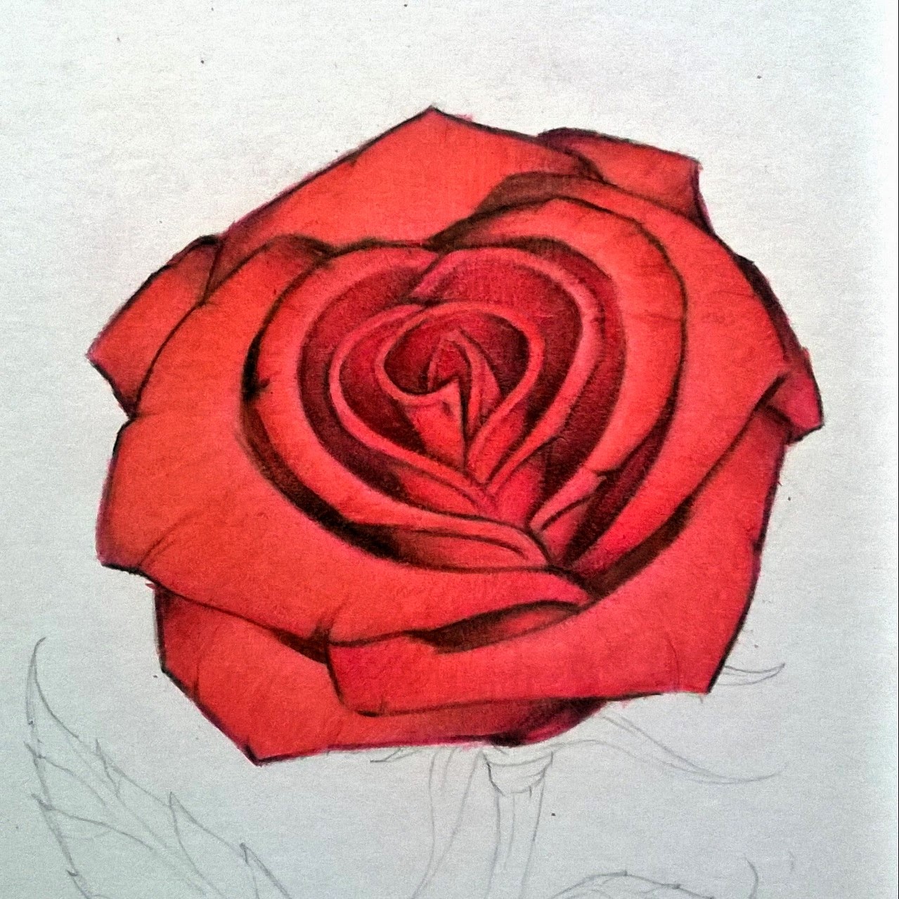
In this lesson I will be teaching you how to create a lovely red rose using some different techniques. We will focus on using colors to add depth and layers into your work to give your artwork that look that has them coming off the page. Another focus we will work on is overlaying colors, and texture shading. I use RoseArt pencils and the colors listed below are what I used for this lesson.

Tip: If you do not have the colors listed below it is okay. You can use 3 shades of red from light to dark, 1 pink, one green, a sienna/yellow color, a brown, and a Black for shadows. 

·         Black
·         Brown
·         Sienna
·         True Green
·         Ruby
·         Cherry Red
·         Red
·         Blush Pink


Drawing the Rose:  We are going to start by lightly sketching out our rose. I like to start at the middle of the flower using spiral curves. As I build the middle I like to braid each side left to right. When I get closer to the edge each petal grows a bit larger. Keep the basic shape of the rose, and use references as needed. Have fun with the stem and add the leaves. I like to have the leaves jagged with curved tips. It gives them character and makes the drawing fun. Remember not to focus on a lot of detail for the sketch and draw lightly. We are going to use this lesson to add details by coloring with the pencils.


Step 1: To start bringing this lovely flower to life we are going to use the Brown first. Lightly shade each area of the rose on the outer edges of each layer. Once you get to the outer layers you are going to shift the direction of your shading to follow the curves of the petals. When you get to the outer larger petals you are going to give them their shaped edges, and details. Start from the edges and draw dark lines where the petals buckle a bit, then starting from one side of the petal and shade from side to side with the curve of the flower towards the center.


Step 2: Next we will define the rose by adding the lightest color. Using the Blush Pink (Pink) We are going to add a layer of pink to the inner area of each petal. You can shade with the curve of the lines from dark to light. We really want the pink to show through because this will help define the shape of the rose and keep the details from getting lost in the layers of red on top of red.
Tip: Keep the pink out because we will use it towards the end to define the highlights & tones.


Step 3: This is the step where you are going to get into the picture. We are ready to add our first touch of red, or in this caseRuby (Darker Red). Start coloring over the brown towards the middle of the flower using medium pressure. If you look at the picture you will also notice that you will want to fill in the corners of the petals and shade from dark to light towards the middle of each petal. By this time you will start to see the flower bloom outward.


Step 4: In this step we are going to fill in the rose with a nice even texture. This is one of two layers on the rose petals that will fill in the vibrant colors. Using the Cherry Red (Medium Red) you are going to use nice even back and forth strokes along the petals. Try to make the lines have some spacing and sketchy this will be filled in with the last shade of red. By keeping them sketchy and the same direction with the flower, you will give the flower a nice texture with little effort. It’s a fun trick, and another reason I love colored pencils.


Step 5: This is one of the shorter steps. We are going to fill in the white area in between the petals with a flat color. Grab theBrown, & Ruby colors and fill in this area. Use as much pressure as you feel comfortable with, but fill it in clean and even using both colors. And with that we move on. I told you it would be pretty quick.


Step 6: We are now going to define the shadows with this step and give our rose a nice clean look. Using the Red Pencil go over the entire flower. Remember to color in the same directions as the other steps. This will fill in any gaps and make the petals solid. Now you will use the Blush Pink and define the highlights around the center of the petals. Now use the Black pencil and begin to really define our Rose. Color nice clean lines along the curves of the inner rose petals as shown in the image above. Start from the center of the rose shade from dark to light on each area. As you move down the flower start shading from petal to petal starting at the sides and shade towards the center. As each petal over laps that is where you will add the shadows from one petal to the other. This will give you a nice layered 3d look. And with that we will begin on the stem and leaves.


Step 7: Using the Brown you will define the lines in the stem. Start with the border, and move inward making wood like lines up and down the stem following the curves. With the leaves you will sketch lines from the center of the leaves to the middle. Make them very sketchy and sparse. We will color over these as we did with the rose petals.


Step 8: In this step we are going to repeat but add to the Brown color to create more of a realistic stem. Using the Sienna(Yellow/Tan) add some more lines up and down the stem, and fill in some areas. With the leaves you will lightly shade from the center to the edges in a back and forth sketchy motion. Don’t fill in the entire leaf with this color you want to leave gaps. Remember you want the color to show through, but not become the dominant color of the stem. What this will do is add layers and make the flower come off the page.


Step 9: Now to make the Flower look young and alive let’s make the stem green. Using the True Green (Green) color the stem from top to bottom with small even strokes. You want to fill in the gaps and color over the other two colors. You will notice how the colors blend together at this point and see your green become a nice blend of earthy colors.


Step 10: Here we are at the final step of our lovely red rose. Using the Black add your final shadows on the stem. Start at the top where the flower petals overlap the stem and leaves. As you go down shade on the left side, and the top of the leaves moving from dark to light. Finally at the bottom add black and move upwards showing the cut stem’s edges. Remember to use your best judgment on the shadows and highlights of your rose. What I like to do is have a light next to me and see how the shadows fall on the page. You can even go one step further and cast a shadow onto the paper from the rose. Make it your own, and have fun.

Tip: Remember the direction of your shading, combined with pressure will give you your textures. This is what you will learn as you go as you begin to develop.

This would conclude our lesson. I want to thank you for visiting and allowing me to help you grow as an artist. Remember if you have any questions feel free to email me at DerrickBruno@HalfEvil333.com and I will answer them the best I can. I would like to see your own roses too.

Feel free to share them on your favorite Social Media Sites Using the Hash tag #HalfEvil333 I would love to see your progress and work.


Monday, June 30, 2014

Huge Summer Special - Prints as low as $5.00!!

Huge Summer Special!!


I am selling all of my artwork at an amazingly low prices this summer. This I feel is the best way to share my artwork with the world and have it on display in homes all over. Enjoy your favorite piece by clicking the link below and ordering your featured art prints today. 


Thank you for your continued support. 

Derrick Rathgeber


In Feed AD