Showing posts with label art lessons. Show all posts

Monday, July 20, 2015

How to Draw a Red Rose with Colored Pencils

 by Derrick Bruno

Http://HalfEvil333.com

Thank you for your Donation & Support!


In this lesson I will be teaching you how to create a lovely red rose using some different techniques. We will focus on using colors to add depth and layers into your work to give your artwork that look that has them coming off the page. Another focus we will work on is overlaying colors, and texture shading. I use RoseArt pencils and the colors listed below are what I used for this lesson.

Tip: If you do not have the colors listed below it is okay. You can use 3 shades of red from light to dark, 1 pink, one green, a sienna/yellow color, a brown, and a Black for shadows. 

·         Black
·         Brown
·         Sienna
·         True Green
·         Ruby
·         Cherry Red
·         Red
·         Blush Pink


Drawing the Rose:  We are going to start by lightly sketching out our rose. I like to start at the middle of the flower using spiral curves. As I build the middle I like to braid each side left to right. When I get closer to the edge each petal grows a bit larger. Keep the basic shape of the rose, and use references as needed. Have fun with the stem and add the leaves. I like to have the leaves jagged with curved tips. It gives them character and makes the drawing fun. Remember not to focus on a lot of detail for the sketch and draw lightly. We are going to use this lesson to add details by coloring with the pencils.


Step 1: To start bringing this lovely flower to life we are going to use the Brown first. Lightly shade each area of the rose on the outer edges of each layer. Once you get to the outer layers you are going to shift the direction of your shading to follow the curves of the petals. When you get to the outer larger petals you are going to give them their shaped edges, and details. Start from the edges and draw dark lines where the petals buckle a bit, then starting from one side of the petal and shade from side to side with the curve of the flower towards the center.


Step 2: Next we will define the rose by adding the lightest color. Using the Blush Pink (Pink) We are going to add a layer of pink to the inner area of each petal. You can shade with the curve of the lines from dark to light. We really want the pink to show through because this will help define the shape of the rose and keep the details from getting lost in the layers of red on top of red.
Tip: Keep the pink out because we will use it towards the end to define the highlights & tones.


Step 3: This is the step where you are going to get into the picture. We are ready to add our first touch of red, or in this caseRuby (Darker Red). Start coloring over the brown towards the middle of the flower using medium pressure. If you look at the picture you will also notice that you will want to fill in the corners of the petals and shade from dark to light towards the middle of each petal. By this time you will start to see the flower bloom outward.


Step 4: In this step we are going to fill in the rose with a nice even texture. This is one of two layers on the rose petals that will fill in the vibrant colors. Using the Cherry Red (Medium Red) you are going to use nice even back and forth strokes along the petals. Try to make the lines have some spacing and sketchy this will be filled in with the last shade of red. By keeping them sketchy and the same direction with the flower, you will give the flower a nice texture with little effort. It’s a fun trick, and another reason I love colored pencils.


Step 5: This is one of the shorter steps. We are going to fill in the white area in between the petals with a flat color. Grab theBrown, & Ruby colors and fill in this area. Use as much pressure as you feel comfortable with, but fill it in clean and even using both colors. And with that we move on. I told you it would be pretty quick.
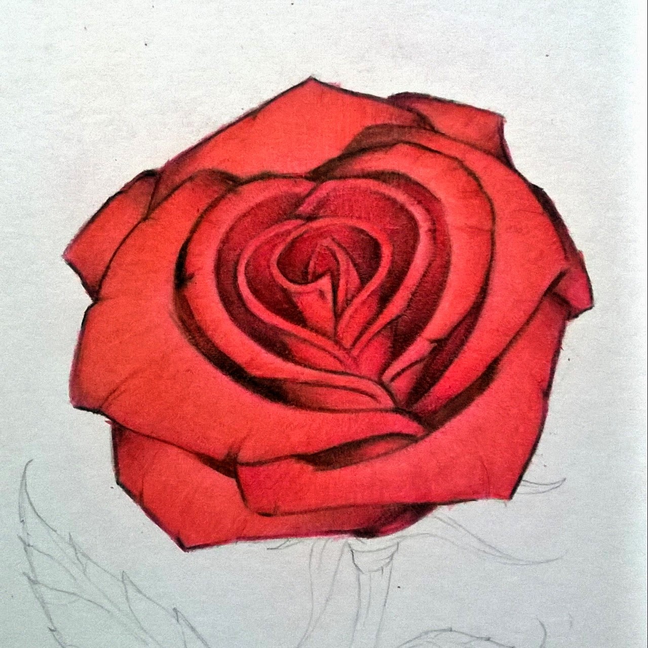

Step 6: We are now going to define the shadows with this step and give our rose a nice clean look. Using the Red Pencil go over the entire flower. Remember to color in the same directions as the other steps. This will fill in any gaps and make the petals solid. Now you will use the Blush Pink and define the highlights around the center of the petals. Now use the Black pencil and begin to really define our Rose. Color nice clean lines along the curves of the inner rose petals as shown in the image above. Start from the center of the rose shade from dark to light on each area. As you move down the flower start shading from petal to petal starting at the sides and shade towards the center. As each petal over laps that is where you will add the shadows from one petal to the other. This will give you a nice layered 3d look. And with that we will begin on the stem and leaves.


Step 7: Using the Brown you will define the lines in the stem. Start with the border, and move inward making wood like lines up and down the stem following the curves. With the leaves you will sketch lines from the center of the leaves to the middle. Make them very sketchy and sparse. We will color over these as we did with the rose petals.


Step 8: In this step we are going to repeat but add to the Brown color to create more of a realistic stem. Using the Sienna(Yellow/Tan) add some more lines up and down the stem, and fill in some areas. With the leaves you will lightly shade from the center to the edges in a back and forth sketchy motion. Don’t fill in the entire leaf with this color you want to leave gaps. Remember you want the color to show through, but not become the dominant color of the stem. What this will do is add layers and make the flower come off the page.


Step 9: Now to make the Flower look young and alive let’s make the stem green. Using the True Green (Green) color the stem from top to bottom with small even strokes. You want to fill in the gaps and color over the other two colors. You will notice how the colors blend together at this point and see your green become a nice blend of earthy colors.


Step 10: Here we are at the final step of our lovely red rose. Using the Black add your final shadows on the stem. Start at the top where the flower petals overlap the stem and leaves. As you go down shade on the left side, and the top of the leaves moving from dark to light. Finally at the bottom add black and move upwards showing the cut stem’s edges. Remember to use your best judgment on the shadows and highlights of your rose. What I like to do is have a light next to me and see how the shadows fall on the page. You can even go one step further and cast a shadow onto the paper from the rose. Make it your own, and have fun.

Tip: Remember the direction of your shading, combined with pressure will give you your textures. This is what you will learn as you go as you begin to develop.

This would conclude our lesson. I want to thank you for visiting and allowing me to help you grow as an artist. Remember if you have any questions feel free to email me at DerrickBruno@HalfEvil333.com and I will answer them the best I can. I would like to see your own roses too.

Feel free to share them on your favorite Social Media Sites Using the Hash tag #HalfEvil333 I would love to see your progress and work.


Monday, May 25, 2015

How to Draw a Feather With Colored Pencils

How to Draw a Feather With Colored Pencils
by Derrick Bruno


Welcome back to my free art lessons page. In this lesson I will teach you a fun way to create feathers with character and color. I had many suggestions on what colors to use and I got an overwhelming amount of purples and blues, but you may choose any combination of colors that you like. We will focus on our strokes, directional shading, and color blending in this lesson this time around. So shall we begin?

Step 1: To start this lesson we are going to create a basic line sketch of our feather. Start with the quill of the feather to create your curve. Once you have the shape of the feather you would like begin sketching from the bottom up to create an outline as shown below. 


Tip: You can also get a bit creative and play with different shapes of feathers or use a reference of a specific feather you would like to draw. I encourage imagination & originality. 


Step 2: In this step we are going to add a bit of character to the feather which will also help us with the coloring. Erase a couple sections in the sides of the feather to add breaks in the feather. Once you are satisfied with the look of your feather add some loose strings to the bottom near the base to show breakage. Once finished, we are now ready to grab some color. 


Step 3: Starting with the color Black we are going to start giving the feather direction and shape. Make sure your pencil is sharpened nicely and start off by shading in a V like pattern up and down the feather like a Richter scale. Once you have this area shaded in re-sharpen your pencil and add in some line strokes through the shading. 


Step 4: It's time to grab our colors and make this feather stand out. For this lesson I will be using shades of Purple, & Blue. My kids wanted me to do an Ice feather, and I thought that would look pretty cool. To start off reach for the Purple colored pencil and starting from the bottom you are going to color in the direction of the feather in a V like pattern. We are going to go over the black colors and overlay this effect to start a blending. Add more sharp stroke lines to pull the purple out across the feather. This will stand out towards the end of the picture. Remember to add some purple to the bottom of the feather for the broken spurs at the bottom.


Step 5: Next we are going to add our blue to the feather. For this portion I used a Royal Blue colored pencil to have a nice bold color to blend into the purple. Color over the purple and black areas and expand the strokes a little further outward to cover more of the feather. Remember to follow the same direction of strokes from the stem to the end of the feather. Create a feathering effect on the border of the feather with small jagged strokes along the edges of the feather. This will give the illusion of individual hairs. Once finished sharpen your Royal Blue color and make individual strokes from the shaft to the edge one by one. This will create a sense of shading across the feather. 


Step 6: For the last step we are going to add the final color and do some clean up work. I used a Sky Blue color to finish this feather off. Using the sky blue you are going to cover the feather completely, but remember to color in the direction of the feather hairs. From the stem to the edge. This is important because if you go left and right or in circles you will lose that illusion of individual strands that we are going for. Once you have the look you are going for we are going to clean up the feather by adding more Black and some Gray for the stem. Begin by going over the black once more to bring it out some more. Add a couple of strokes across the feather and the edges to create some shading. Once you are satisfied, use the gray to shade in the stem to complete the drawing.


This is a fun lesson to repeat in many different ways. You can create some very cool feathers by adding swirl designs, or playing with different colors. Just remember to have fun with it and make it your own drawing. The most important skill you want to take a way from this lesson is the directional shading, and the different strokes you get from a sharpened pencil and a dull one. Both have their advantages. 

I hope you enjoyed this lesson. Remember to subscribe to my blog for more Free art lessons, and Advice on how to get past the many road blocks we face as artists. Have a great day. 

Follow me on Pinterest for a complete set of Lessons with quick links and great images. 


Thursday, March 13, 2014

How to Draw a Rose with Colored Pencils

 by Derrick Bruno

Http://HalfEvil333.com

Support & Donate by clicking the button below.
Thank you Very Much.


In this lesson I will be teaching you how to create a lovely red rose using some different techniques. We will focus on using colors to add depth and layers into your work to give your artwork that look that has them coming off the page. Another focus we will work on is overlaying colors, and texture shading. I use RoseArt pencils and the colors listed below are what I used for this lesson.

Tip: If you do not have the colors listed below it is okay. You can use 3 shades of red from light to dark, 1 pink, one green, a sienna/yellow color, a brown, and a Black for shadows. 

·         Black
·         Brown
·         Sienna
·         True Green
·         Ruby
·         Cherry Red
·         Red
·         Blush Pink


Drawing the Rose:  We are going to start by lightly sketching out our rose. I like to start at the middle of the flower using spiral curves. As I build the middle I like to braid each side left to right. When I get closer to the edge each petal grows a bit larger. Keep the basic shape of the rose, and use references as needed. Have fun with the stem and add the leaves. I like to have the leaves jagged with curved tips. It gives them character and makes the drawing fun. Remember not to focus on a lot of detail for the sketch and draw lightly. We are going to use this lesson to add details by coloring with the pencils.


Step 1: To start bringing this lovely flower to life we are going to use the Brown first. Lightly shade each area of the rose on the outer edges of each layer. Once you get to the outer layers you are going to shift the direction of your shading to follow the curves of the petals. When you get to the outer larger petals you are going to give them their shaped edges, and details. Start from the edges and draw dark lines where the petals buckle a bit, then starting from one side of the petal and shade from side to side with the curve of the flower towards the center.


Step 2: Next we will define the rose by adding the lightest color. Using the Blush Pink (Pink) We are going to add a layer of pink to the inner area of each petal. You can shade with the curve of the lines from dark to light. We really want the pink to show through because this will help define the shape of the rose and keep the details from getting lost in the layers of red on top of red.
Tip: Keep the pink out because we will use it towards the end to define the highlights & tones.


Step 3: This is the step where you are going to get into the picture. We are ready to add our first touch of red, or in this case Ruby (Darker Red). Start coloring over the brown towards the middle of the flower using medium pressure. If you look at the picture you will also notice that you will want to fill in the corners of the petals and shade from dark to light towards the middle of each petal. By this time you will start to see the flower bloom outward.


Step 4: In this step we are going to fill in the rose with a nice even texture. This is one of two layers on the rose petals that will fill in the vibrant colors. Using the Cherry Red (Medium Red) you are going to use nice even back and forth strokes along the petals. Try to make the lines have some spacing and sketchy this will be filled in with the last shade of red. By keeping them sketchy and the same direction with the flower, you will give the flower a nice texture with little effort. It’s a fun trick, and another reason I love colored pencils.


Step 5: This is one of the shorter steps. We are going to fill in the white area in between the petals with a flat color. Grab the Brown, & Ruby colors and fill in this area. Use as much pressure as you feel comfortable with, but fill it in clean and even using both colors. And with that we move on. I told you it would be pretty quick.


Step 6: We are now going to define the shadows with this step and give our rose a nice clean look. Using the Red Pencil go over the entire flower. Remember to color in the same directions as the other steps. This will fill in any gaps and make the petals solid. Now you will use the Blush Pink and define the highlights around the center of the petals. Now use the Black pencil and begin to really define our Rose. Color nice clean lines along the curves of the inner rose petals as shown in the image above. Start from the center of the rose shade from dark to light on each area. As you move down the flower start shading from petal to petal starting at the sides and shade towards the center. As each petal over laps that is where you will add the shadows from one petal to the other. This will give you a nice layered 3d look. And with that we will begin on the stem and leaves.


Step 7: Using the Brown you will define the lines in the stem. Start with the border, and move inward making wood like lines up and down the stem following the curves. With the leaves you will sketch lines from the center of the leaves to the middle. Make them very sketchy and sparse. We will color over these as we did with the rose petals.


Step 8: In this step we are going to repeat but add to the Brown color to create more of a realistic stem. Using the Sienna (Yellow/Tan) add some more lines up and down the stem, and fill in some areas. With the leaves you will lightly shade from the center to the edges in a back and forth sketchy motion. Don’t fill in the entire leaf with this color you want to leave gaps. Remember you want the color to show through, but not become the dominant color of the stem. What this will do is add layers and make the flower come off the page.


Step 9: Now to make the Flower look young and alive let’s make the stem green. Using the True Green (Green) color the stem from top to bottom with small even strokes. You want to fill in the gaps and color over the other two colors. You will notice how the colors blend together at this point and see your green become a nice blend of earthy colors.


Step 10: Here we are at the final step of our lovely red rose. Using the Black add your final shadows on the stem. Start at the top where the flower petals overlap the stem and leaves. As you go down shade on the left side, and the top of the leaves moving from dark to light. Finally at the bottom add black and move upwards showing the cut stem’s edges. Remember to use your best judgment on the shadows and highlights of your rose. What I like to do is have a light next to me and see how the shadows fall on the page. You can even go one step further and cast a shadow onto the paper from the rose. Make it your own, and have fun.

Tip: Remember the direction of your shading, combined with pressure will give you your textures. This is what you will learn as you go as you begin to develop.

This would conclude our lesson. I want to thank you for visiting and allowing me to help you grow as an artist. Remember if you have any questions feel free to email me at DerrickBruno@HalfEvil333.com, and I will answer them the best I can. I would like to see your own roses too.

Feel free to share them on your favorite Social Media Sites Using the Hash tag #HalfEvil333 I would love to see your progress and work.

Tuesday, December 24, 2013

What Is It Worth To You?

What a month it has been. I have had some highs, some lows, really lows, and an incredible high! Where do I begin. As some of you may know I am partially disabled, and my income is quite limited. Even so I found a way through hardcore budgeting to make sure each of my kids were covered with at least 2 gifts each. Nothing huge, but I know it's going to be a great Christmas morning. I really thought I was going to be able to do much more this month as my exposure was through the roof, and the word is finally getting out with all the hard work I have done this entire year. I was really wondering if it was all worth it at all, or if I was just fooling myself. Honestly I am still a bit iffy about having a full time career in the art industry.

A while back I wrote a blog titled Never Give Up, and it was viewed here and there, but no more than any of my other blog posts.Colored Pencil Magazine read it and asked me if they could do a feature about my blog post, and of course I said yes. I really love this Magazine, they have supported me more that any company by posting my comments, art lessons, even my work on their Facebook Page. I was thinking this was going to be a spot light feature including my name and a picture of my work, but to my surprise they decided to give me a two page large print feature. I am still floored, and don't know how to thank them. They made sure they printed my website in the magazine, and featured me again on their Facebook page. The featured image was my  large 22 x 28 inch Bird in Bloom Piece, and I couldn't be more proud of this piece, and now it  was in an international printed magazine. Things were really looking up big time.

Or maybe I just got my hopes up a bit too much. As far as exposure and reaching out to many great artists who enjoyed my article that was a true success. I am very honored to have a lot off the big guns coming to me for advise and help. I cannot wait until I can contribute more. For now I am looking forward to making a sale. But as of right now I am really hurt, by not only the community of artists and collectors, but close family and friends that have made me really question the value of my work.I have put a whole lot of work into creating these large works of art, months for some. I have four children and a two bedroom apartment so to find time to draw alone is a challenge. But I do it. Not only do I do these works for my portfolio I also find the time to draw and write free art lessons and make sure they are available on multiple social media platforms mainly because I know how rough times are and I know many people of all ages can use them. For that I will continue making more. How much more work am I going to put out to realize that no one wants to buy.

Last month for Cyber Monday I had taken off 50% off every original signed piece of artwork I had. Not only that I did the same for prints, commissions, graphic design and well all of it. Here I am with over 7,000 visitors to my blog, several hundred per social media outlet, and I nothing. No sells, no orders, not even a request. I extended it for an entire week. And nothing. I am in a national magazine with thousands of readers. Nope nada. I think the nail in the coffin was a comment made to me last week by a close family friend was that i was asking WAY too much for my artwork. The piece was was talking about was my Bird in Bloom piece. Keep in mind Bird in Bloom won Best in Show in a live judged gallery competition, and is currently being featured in a national magazine. The piece is large for a colored pencil piece and took me several months to create with a wrist that was still healing from a torn tendon. At the time he was interested the piece was half off for the Cyber Monday deals at $350.00... Basically to me he might as well have said it was worthless. Did he really think a drawing of that size was worth a hundred bucks or something? Was it only worth a hundred? Being that I haven't sold anything it kind of made me wonder deep down if I my artwork was worth selling to the point of making a living.

Right now the way I see it is people like that are going to come and go. Sure he hit me hard with that one comment but I know he was wrong. Am I upset.. Sure if your reading my rant here you know I am pretty upset. Something I am going to take from all this is I am not going to let it stop me from enjoying what I do. I am not a rich man now. I have much more hard work to do. I am not getting paid for the work, but you know what I get something else from everything I do. I get the experience. I get to meet people around the world. I get to help young artists find art lessons that they can use to learn how to draw with. FOR FREE! No sign ups, no membership, no fees. If you want to donate feel free, but don't feel pressured. I get to make people laugh again for free. My online comic strip Twisted Fate is also available on my site. And you know what there will be a day, probably sometime next year, where I'll be so busy I am going to wish for the days when I didn't have a job booked. And so will you.

So what is art worth? Honestly I still do not have that answer yet. I have read formulas, went into forums, and asked many many artists, and they all say what's it worth to you? If you have a piece that you won't part with for less that $600.00 then don't. Do not let someone talk you down because they don't understand the time, pain, love, and everything you put into that piece. They don't see the part of your soul that aches just thinking about selling it. A lot of times they are just trying to get you to question your worth so they can save a buck. I am worth more and so are you. Stay busy, stay positive, and step back and price your work to what you want to because in the end you are and artist, which means you are your own boss.

Thank you for listening/reading,

Derrick Rathgeber
http://DerricktheArtist.com
DerricktheArtist@Live.com

Purchase your own printed or digital copy of the December Issue of Colored Pencil Magazine featuring my article Never Give Up by clicking the link below. Thank you for your Support. 

In Feed AD