Wednesday, August 20, 2014

ARTSCAPE RECEPTION & SILENT AUCTION

ARTSCAPE RECEPTION & SILENT AUCTION


August 21,2014 from 5:00 - 7:00pm

Featuring work by Derrick Rathgeber and many more great artists.


Thursday August 21, 2014 5:00 PM - 7:00 PM 
4080 Lemon Street, Riverside, CA 92506 
Admission is FREE.

Please join the County of Riverside & Riverside Arts Council in celebration of the Spring and Summer exhibition.

Selected pieces will be auctioned in support of Artscape.


Visit http://ArtscapeRiverside.com/ for more info.


Wednesday, August 6, 2014

Free Art Gallery Come Show Your Support.

I am proud to announce that I am currently in a new show here in Riverside, California

Artworks Riverside & The Riverside Department of Mental Health are having a free to the public Art Gallery on the 4th floor of the Metro Building. The artwork is for sale with a good percentage going to support Artworks Recovery Innovations and all the great projects they do for Riverside and Mental Health Services. It's all for a great cause and did I mention FREE!

For more information Call (951) 683-1279

Thank you for the Support.


Riverside Metro Building 
3801 University Ave., Riverside, CA 92501

Artwork by artist Derrick Rathgeber ( Derrick The Artist )

American Rustic

Bird in Bloom

Flight of the Macaw

Monday, June 30, 2014

Huge Summer Special - Prints as low as $5.00!!

Huge Summer Special!!


I am selling all of my artwork at an amazingly low prices this summer. This I feel is the best way to share my artwork with the world and have it on display in homes all over. Enjoy your favorite piece by clicking the link below and ordering your featured art prints today. 


Thank you for your continued support. 

Derrick Rathgeber


Thursday, May 29, 2014

Trouble Getting Started? Tips to Get your Artwork Moving.

One of the most difficult things I have trouble with as an artist is just getting started. To me it’s something that drags me down like quicksand. The struggle of pulling myself together is a fight I deal with daily, and the more I fight to get started I find myself procrastinating more. In my case I feel as if I start one project I am neglecting myself of another. As of now I have split my talents into several different locations, that I am completely scatterbrained at times. It’s as if I am stuck in a dark tunnel with ten paths to choose, and rather than take the chance of taking the wrong path I stay in the same spot. Unfortunately choosing the safe spot moves me nowhere and nothing gets done, and every project suffers.


If you are new to my blog, or website my name is Derrick Rathgeber, and I am a husband, father of four great kids, a colored pencil artist, comic strip writer/artist, blog writer, free online art teacher, web designer, graphic designer, and soon I will try my hand at writing a book. All that is true I have done all those things, and you can find them on my website and right here on this very blog page. What the funny part is that I have put my hat in so many pots that I have overwhelmed myself to the point where I don’t know what I want to do. Each of these things are my hobbies, and I really do enjoy them all equally. I love making people laugh with my comic strips, I love designing characters for my story, and I love drawing detailed pictures with my colored pencils. So how do I choose? When I finish one project, how do I choose what to do next? When I start one I put all my energy into it, energy that I could have put into another one.

This was a problem for me for a very long time. I tried different things, and ultimately what worked best was just being down right organized. First of all my greatest enemy is procrastination. That to this day is the hardest enemy to kick in the rear, but you know what I am learning. I’ll start tomorrow, I never do anything for myself, I am tired, I don’t have what I need and so on. Some great tips to help with this little demon are as follows.
  1.  Ask yourself: Is what I am doing now beneficial? What would be more rewarding? How will I feel if I continue to put this off?
  2. Put off Procrastination: It may sound funny but think about it. Turn off any devices that may lure you away from your projects ie. Tv, internet, PHONE! All these things will be there later.
  3. Reward yourself: I always tell myself if I draw today for x amount of time then I get to have x amount of time to do something I like GUILT FREE.
  4.  Break it down: Sometimes we are overwhelmed by a large project. So overwhelmed that we don’t start it. So break it down. Say I am going to sketch it today, color this section tomorrow ect. This also helps you take your time and enjoy your new project.
  5. Share your Success: Let people know how important it is to you. Sometimes we feel guilty for taking time from our friends and family. Sometimes they don’t understand what it means for you to be productive. Let them know, and ask for support. Say don’t call around 2-4pm I will be working, or can you watch the kids for a bit. And once you are finished working thank them by giving them your full attention. 
When it comes to deciding on what to work on next that is another hang up us artists deal with. Do we start on that commission piece? Do we draw that picture your mom has been asking for? Do I dare ignore everyone and draw that image bouncing around in my head? Again it answers the question how do I spend my time and energy? In my case I pulled myself so thin at one point that I just fell apart and did nothing. I had to get focused, and combat this problem because I wasn’t getting anything done. So what I did was I got organized. This was very important for me because I was all over the place. I didn’t even know what projects I had half of the time, or what I finished. So these are some of the things I did, that you can do yourself, to get organized.
  1. Make a list: Write down a list of projects you have. This can be commissions, drawings you would like to do, blogs, website, ect.
  2. Prioritize them: Number these projects from 1-10+ based on which projects you would like to get done, or maybe ones you were putting off that you would like to finish.
  3. Make a Time Table: Next to each item write down how much time you need for each project. If it’s unknown it’s not a big problem. Ones that you can finish fast are good ones to knock off in-between larger projects.
  4. Make a calendar: This is actually fun. Make yourself a weekly calendar giving yourself that day to work on a specific project, and be sure to add a FREE DAY on this calendar to give you the opportunity to work on projects that are behind, to work on whatever you want,  or just take a day off to rest.
  5. Don’t make it Law: If you have to make adjustments it’s okay. Life changes and so can your schedule. So don’t feel guilt about changing the calendar, or missing a day or two. It’s mainly a tool to help you decide on what to work on that day. If your heart is in another project follow it and finish that project, you should never force it.
Once you have everything in perspective you will find your days going much smoother and a lot of guilt that goes along with starting something new will start to pass. You want to get into a good routine of developing yourself as an artist, but also find yourself being productive. Above all try not to make it work. A reason some of us find it hard to start up something new is fear, and worry. We worry that it won’t come out right, or fear that it has become work instead of enjoying it. When you feel that pressure, and fear building up just sketch. Don’t feel obligated to share it, just grab your sketchbook and just draw. This helps relieve that pressure we all feel to be at our very best all of the time. As artists we are our worst judges, and that can do nothing but hold us back.

So today if you are holding back a great new design that can wait, push through the muddiness and get through. Today it’s harder than ever with the many distractions that we face, but we have to close that world off and dive into our imaginations and pull it out. It’s not an easy fight sometimes, but this world of technology needs more creativity. Just remember every time you start a new project you are making the world that much better and more imaginative. That itself is a great reward, and incentive to start today.

Thank you for reading,
Derrick Rathgeber

Feel Free to find me on my website at http://DerricktheArtist.com

Tuesday, April 8, 2014

Traditional Arts: Stepping Away From Technology.

We live in a digital age. A fast paced age. A make more money kind of age. Somewhere along the lines we lost our patience and appreciation for what it can bring us. As I grow more and more as an artist I am finding myself a bit lost in this shift happening in the world of art. We get lost in the new, and forget the old that brought us here. I myself want to take a step back and remember where I came from, and bring it with me. 

All my life I knew I was going to be an artist. In the beginning I drew anything that popped into my head at the moment, wither it be doodles, or characters and creatures. As I grew up as a child I came across these amazing animated movies from Disney's Classic collection, to Fox Animation's Anastasia. And then came a series of films from Don Bluth. I was in a world where people drew pictures and brought them to life. I wanted to do that. I began drawing my own characters, and learning how to move them dynamically on the paper. I even remember creating character models, and story boards at the age of ten. With every new movie I found a respect for these animators that would draw 720 pictures of motion for a minute of film. I even remember training myself to draw faster and faster because I knew I had to. 

Now as an artist this helped me develop really well. I was able to look at an image and visualize it in motion. So when I would replicate it I did not have to copy it off paper, and I could draw the subject in a different form. For example my large piece, The Flight of the Macaw, I studied about 5-6 different shots of the macaw and learned about how the muscles moved, and wings flapped. Then I drew my version of the beautiful bird coming off the paper. It's because of animation that I can picture things moving, and anticipating how they will flow on the paper. I like to use this technique in my artwork so when the audience views my work they find themselves animating the image in their own minds, and feel it come alive. 

Now fast forward a bit further. Now that I am older I found myself at the right level, and age to begin looking for my dream career in the animation field. Can you imagine my disappointment when I find out that Disney Studios is abandoning their traditional animation, and going CG. They claim that the audience did not want to see it anymore. What is even worse is they based this on the strait to DVD Winnie the Pooh films. They laid off 100's of legendary artists and hired computer animators. A growing trend soon followed as studios began popping up all over bringing new CG films across the board. The biggest issue I had with this entire transition is the release of these "special edition" DVDs and Bluerays that feature our classically drawn films "remastered." They digitally painted over all the sketch lines, and backgrounds. How can that be right in any shape or form? Would we digitally clean up the Mona Lisa? Is any art medium safe the the digital world. Disney then goes on to make Princess and the Frog and claim traditional animation is back. They brought in Animators and they were able to hand draw the film. That that is as far as it went. They still used Tablets, and Photoshop for the clean up, effects, and to even digitally paint the backgrounds. 

To me traditional art will always trump CG art. While studios are constantly trying to learn techniques to make emotions more believable in the Computer Generated world, we have already found this emotion in hand drawing this art. I want you to do something for me. Pick up a VCR, and watch a classic film of your choice. A hand drawn, hand painted film. And really watch it. You will notice that no movement is wasted, and no frames are skipped. Traditional animation may take more time, but the result is worth it. Take away the money aspect of it, and really think. Your favorite animated film of all time, and why this movie was so influential to you. The story, the characters, the believably. Moments that stick with you to this day. Moments like Cinderella dropping her shoe, Little Foot chasing his mother's shadow only to find out it was his own, Anastasia dancing with her lost memories in the abandoned ball room. These are the ones that stay with me the most. 

When it comes to art we need to shift our focus from making the most money, and spending less to taking our time, and building a legacy. I hope one day people will respect our traditions of the past more and step away from technology even for a bit. At least just a bit. And if we are truly abandoning Traditional Animation then I hope they leave the legacy intact, and leave the digital out of it. Leave the films how they were created. They were already so beautiful. Every sketch line that wasn't erased from the film showed me how much heart went into making the film. If you have ever watched an animator draw key frames you will know that every frame is important. You will begin to understand that Disney's Sleeping Beauty would not have been a complete masterpiece had 1 page of it's 54,720 images wasn't drawn. 

Thank you for reading, 

Derrick Rathgeber
http://DerricktheArtist.com

Friday, March 21, 2014

It's Imagination that Brings Me Back to Reality

Beyond Imagination 
It's Imagination that brings me back to reality. 

Over the last few years I have been retraining my art style to meet the needs of the art community. I wanted so hard to show that I belonged in the professional world. Growing up when ever someone would introduce me as an artist they would say yeah this is Derrick he draws monsters and characters and stuff. I have heard the phrases weird, odd, strange, goofy, and all I heard was limited. I really felt off because I didn't want to be limited. In a business sense people buy art based on the artist's name. My name was synonymous with the words listed above, and I felt if I was going to sell anything I thought I had to get out of that cage.

I started to draw the large animal pieces like Bird in Bloom, and The Flight of the Macaw using reference shots, and composing them originally. These pieces really hit big with the community, and got my name out. I won my first art show with the Bird in Bloom as best in show, and I was saying to myself, maybe they were right all along. I really limited myself by drawing things I loved all the time. Do I really have to draw from life, and make the images look real to get noticed? Over time I drew more realistic pieces like the Dolphins in the Reef, and I started to feel chained up. It didn't feel like drawing anymore, and I didn't want to do it. I took a good month off of drawing, until I had a vote on my site about what animal I should draw next. The results came in as a horse. As we all know there are millions of horse art all over the web. I was kind of reserved about drawing one, until I had a thought. In my mind I found a glimpse of the image I was going to draw, and I was energized again. I had drawn horses many times before. In my animation class we had to draw hundreds running, and jumping, flying you name it. For my horse I wanted power so I drew Hraunkot a horse born from the lava enriched ground. It was this moment that it dawned on me, I missed my imagination.

I put my foot down with this next piece, and gave myself some rules. Other than looking at my hands and drawing them on the paper, I would draw random images without looking at anything. This piece would be called "Beyond Imagination."

DAY 1: Today I charged in and set up the paper with the border, and the outline placement of the hands. In my head I envisioned an image coming to live born from the paper. To show this I did something a bit different and drew the picture in both pencil sketch, and colored pencils. The first thing that came to mind was a dragon. Something that could be large and small at once just setting the tone for the picture. I drew the dragon climbing off the paper using my arm as a stepping stone, almost like it's getting ready to fly off the paper. To blend the two worlds of art and reality I added a yellow & red burn effect ass the color and grey-scale start to blend together.


Day 2: Each day I like to add just one more subject to the drawing so I can focus on one at a time like each part is it's own piece. Today I decided to throw in a flying witch, who also resembles a sorceress. In my character designs I like to add detail. But it has to be detail that makes since. In this case I added small but intricate designs on her outfit that you may see, and purple is my little three year old's favorite color so that worked out too. I think this part of the picture works nicely because she adds movement to the dragon. Almost saying charge.


Day 3: This is probably my favorite part of the picture. The rising phoenix that comes off the page. Originally I drew the phoenix much different. It was all flames that came out of the clouds in the form of a bird. I looked at it, and said nah it just wasn't me. So I imagined what I thought a phoenix may look like in my imagination and the result is what you see below. You can see the heat coming off the ancient bird, and at the same time the magic. I had the markings look as if they are illuminating, and the feathers glowing on fire. And at the same time it looks like it could fly. You can't see it yet, but I have him flying out of the border as well. It just ties everything together.


Day 4: As I was drawing the left side of the page, I couldn't stop saying "Release the Krakken!" I remember drawing a Krakken as a kid, and it looked something like this, of course a lot less detail then. I wanted to add some adventure to the drawing, something like that of pirate adventure story. In this adventure the Krakken was so big it folded the drawing paper creating a tidal wave. It started to look like a drawing, inside of a drawing....coming alive out of a drawing..while I was drawing...yeah something like that. ( I think I hurt myself.)


Day 5: I love it when a drawing just comes together towards the end. At this point it's really hard not to pull an all-nighter and blaze through it. But that is when you begin to rush and make mistakes. Today I started drawing the paper.on the paper (not that again.) and really defining the stylish clouds. We have all been told to get our heads out of the clouds, and that is why I drew everything in the clouds. From the volcano exploding swirled smoke, to the ocean splashing the cloudy waves against the rocks. It was all dreams and imagination coming to life. And what are clouds without the sky, and a rainbow shooting across the sky. I added a rainbow forming into shooting stars to merge the waves and the night sky. The final touches are all sketched out, and ready for tomorrow.


Day 6: And it's the final day. A good six day project that was a whole lot of fun. Not only did I complete my challenge but I found a lot of me that I lost in the process of creating this drawing. Have you ever had that moment where you were worried about messing up a part of your drawing, and turns out to be the best part? I did, and I am very happy with the hands. You can't see it in this picture, but I got all the little hairs on my arm, and the ring metal was spot on. I even cast the shadow onto the paper using my desk light as a guide. Once finished I moved onto the space area, and the paper. I wanted to make the paper..on the paper (here I go again..) look like parchment. So I used browns and golds in with the grey color. With that final touch it all came together for me, and I am very happy with it. Once I get a better picture of it, I will add it to my shop, and have it ready for prints for all who are interested.


I am really glad to have you all here reading this as I share my thoughts with you all. Each drawing is an extension of you as an artist. A poet writes her thoughts, and puts it all out there. A Photographer uses their camera to show the world how they view it, and writers can pull you into their world. We use pencils, and brushes to build and shape the paper into the world as we see fit. And that's why I came up with the saying, "A World Beyond Imagination is Only a Sketch Away."
I am glad you enjoy my work, and my world of imagination, and I would like to do more pieces like this, as well as commissions, and real life studies. A good balance makes an artist happy. do what you love, and don't get caught up with your love for art becoming work. It can hurt your artwork, and limit your abilities.

This Piece is currently on display during the 
 
Location: Riverside County Administration Center 
4080 Lemon St. 
Riverside, California 92501
You can find my artwork on the Fifth Floor in the Board Room.

Hours: 8:00am - 6:00pm 

Have a great day,

Derrick Rathgeber
Derrick the Artist

Thursday, March 13, 2014

How to Draw a Rose with Colored Pencils

 by Derrick Bruno

Http://HalfEvil333.com

Support & Donate by clicking the button below.
Thank you Very Much.


In this lesson I will be teaching you how to create a lovely red rose using some different techniques. We will focus on using colors to add depth and layers into your work to give your artwork that look that has them coming off the page. Another focus we will work on is overlaying colors, and texture shading. I use RoseArt pencils and the colors listed below are what I used for this lesson.

Tip: If you do not have the colors listed below it is okay. You can use 3 shades of red from light to dark, 1 pink, one green, a sienna/yellow color, a brown, and a Black for shadows. 

·         Black
·         Brown
·         Sienna
·         True Green
·         Ruby
·         Cherry Red
·         Red
·         Blush Pink


Drawing the Rose:  We are going to start by lightly sketching out our rose. I like to start at the middle of the flower using spiral curves. As I build the middle I like to braid each side left to right. When I get closer to the edge each petal grows a bit larger. Keep the basic shape of the rose, and use references as needed. Have fun with the stem and add the leaves. I like to have the leaves jagged with curved tips. It gives them character and makes the drawing fun. Remember not to focus on a lot of detail for the sketch and draw lightly. We are going to use this lesson to add details by coloring with the pencils.


Step 1: To start bringing this lovely flower to life we are going to use the Brown first. Lightly shade each area of the rose on the outer edges of each layer. Once you get to the outer layers you are going to shift the direction of your shading to follow the curves of the petals. When you get to the outer larger petals you are going to give them their shaped edges, and details. Start from the edges and draw dark lines where the petals buckle a bit, then starting from one side of the petal and shade from side to side with the curve of the flower towards the center.


Step 2: Next we will define the rose by adding the lightest color. Using the Blush Pink (Pink) We are going to add a layer of pink to the inner area of each petal. You can shade with the curve of the lines from dark to light. We really want the pink to show through because this will help define the shape of the rose and keep the details from getting lost in the layers of red on top of red.
Tip: Keep the pink out because we will use it towards the end to define the highlights & tones.


Step 3: This is the step where you are going to get into the picture. We are ready to add our first touch of red, or in this case Ruby (Darker Red). Start coloring over the brown towards the middle of the flower using medium pressure. If you look at the picture you will also notice that you will want to fill in the corners of the petals and shade from dark to light towards the middle of each petal. By this time you will start to see the flower bloom outward.


Step 4: In this step we are going to fill in the rose with a nice even texture. This is one of two layers on the rose petals that will fill in the vibrant colors. Using the Cherry Red (Medium Red) you are going to use nice even back and forth strokes along the petals. Try to make the lines have some spacing and sketchy this will be filled in with the last shade of red. By keeping them sketchy and the same direction with the flower, you will give the flower a nice texture with little effort. It’s a fun trick, and another reason I love colored pencils.


Step 5: This is one of the shorter steps. We are going to fill in the white area in between the petals with a flat color. Grab the Brown, & Ruby colors and fill in this area. Use as much pressure as you feel comfortable with, but fill it in clean and even using both colors. And with that we move on. I told you it would be pretty quick.
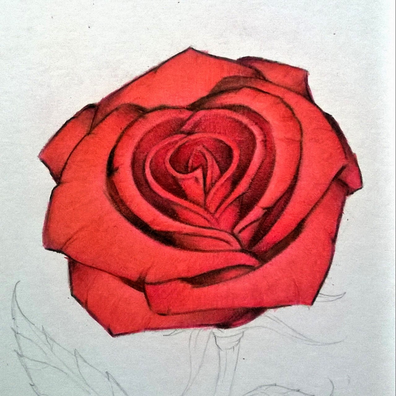

Step 6: We are now going to define the shadows with this step and give our rose a nice clean look. Using the Red Pencil go over the entire flower. Remember to color in the same directions as the other steps. This will fill in any gaps and make the petals solid. Now you will use the Blush Pink and define the highlights around the center of the petals. Now use the Black pencil and begin to really define our Rose. Color nice clean lines along the curves of the inner rose petals as shown in the image above. Start from the center of the rose shade from dark to light on each area. As you move down the flower start shading from petal to petal starting at the sides and shade towards the center. As each petal over laps that is where you will add the shadows from one petal to the other. This will give you a nice layered 3d look. And with that we will begin on the stem and leaves.


Step 7: Using the Brown you will define the lines in the stem. Start with the border, and move inward making wood like lines up and down the stem following the curves. With the leaves you will sketch lines from the center of the leaves to the middle. Make them very sketchy and sparse. We will color over these as we did with the rose petals.


Step 8: In this step we are going to repeat but add to the Brown color to create more of a realistic stem. Using the Sienna (Yellow/Tan) add some more lines up and down the stem, and fill in some areas. With the leaves you will lightly shade from the center to the edges in a back and forth sketchy motion. Don’t fill in the entire leaf with this color you want to leave gaps. Remember you want the color to show through, but not become the dominant color of the stem. What this will do is add layers and make the flower come off the page.


Step 9: Now to make the Flower look young and alive let’s make the stem green. Using the True Green (Green) color the stem from top to bottom with small even strokes. You want to fill in the gaps and color over the other two colors. You will notice how the colors blend together at this point and see your green become a nice blend of earthy colors.


Step 10: Here we are at the final step of our lovely red rose. Using the Black add your final shadows on the stem. Start at the top where the flower petals overlap the stem and leaves. As you go down shade on the left side, and the top of the leaves moving from dark to light. Finally at the bottom add black and move upwards showing the cut stem’s edges. Remember to use your best judgment on the shadows and highlights of your rose. What I like to do is have a light next to me and see how the shadows fall on the page. You can even go one step further and cast a shadow onto the paper from the rose. Make it your own, and have fun.

Tip: Remember the direction of your shading, combined with pressure will give you your textures. This is what you will learn as you go as you begin to develop.

This would conclude our lesson. I want to thank you for visiting and allowing me to help you grow as an artist. Remember if you have any questions feel free to email me at DerrickBruno@HalfEvil333.com, and I will answer them the best I can. I would like to see your own roses too.

Feel free to share them on your favorite Social Media Sites Using the Hash tag #HalfEvil333 I would love to see your progress and work.

In Feed AD