Friday, May 31, 2013

The Angel of Death - by Derrick Rathgeber


The Angel of Death - by Derrick Rathgeber

The colored pencil illustration of my wife's beautiful poem. She really does bring out the best in me, and inspires my best work. Enjoy her poetry below.

Angel of Death
By Patricia Fernandez-Rathgeber

“Come dance in the moonlight, little sister.” He calls
The blades sheen reflects off my pale skin
His shadow grows up against the dark walls
As we dance, the darkness blends and I don’t know where he ends and I begin
A tear against the flesh gives way to liquid crimson
The blood, it streams down to the ground
I watch my life melt away, a stream that glistens
The silence is so loud even though there is no sound
He turns me, dips me and I feel faint
I float like a feather, so light weight
He kisses me, my metallic Saint
The taste of his victory over me, I’ve met my fate
The nirvana of the spins makes me drunk as I slowly lose life
His wings spread wide like a bird of prey with meat in his sight
I can’t refuse his kiss, no strife
Growing weak, I no longer put up a fight
I allow myself to fade in his arms
Taking it all in, my memories flash by so fast
Soaking up all his whispery charms
His kiss, the sin, is my very last.

Visit me on Facebook at http://Facebook.com/DerrickRathgeber

Thursday, May 30, 2013

The Angel of Death - Day 4


The Angel of Death - Day 4

With the wings added the picture is already telling the story. Today I will be adding the background, and get to the lighting of the moon. The wings were a blend of black, dark grey, metallic silver, and white. I wanted to give it a dark feathery look, while adding the  glimpse of shape and personality to the wings. 

Visit http://derrickr.artist.cm for more. 

Monday, May 27, 2013

Success is not a Dollar Amount

I have come a very long way since I have started drawing again. I have a new website, my own blog page, and my artwork has been seen all over the world, and I am currently in a gallery here in Riverside until August.  To me I feel like I reached the top as an artist. The only thing that would make my journey complete would to be able to live off of my artwork. Being that I have yet to sell more than one print, I can honestly say that is not going to happen. In my entire art career I have only sold one original drawing, and one signed print for $20. Does that make my career in art a large failure?

The answer is heck no. I am sure there are plenty of artists out there who place their work on the web in hopes it will go viral, and sell 1,000s of prints, but only get 5 likes. And maybe you have placed your work in a showcase in hopes people will buy your piece, only to take your card and lose it. Believe me you are definitely not alone. I have found that there are a lot more artists in your position than you think. And each one is more discouraged and ready to quit than the next.  I know I wanted to quit myself quite a few times because my art just wasn’t selling like I wanted to.

Then I woke up one day realizing that I almost quit doing what I love because someone didn’t give me money for it. I felt like an idiot. I almost gave up a talent that others strive for because I was selfish and wanted money. All the new upcoming artists that came to me for help and questions were going to be sent away, and the people that subscribed to my website, and blog, social media sites because they enjoyed my work were no longer going to see it anymore. I almost let my kids down who look up to me because in their eyes I am the best artist in the world. To me that almost made me sick to my stomach that money became that important to me. Has the world broken me down so bad that money took a place hire than a talent that no money could ever buy?

So I decided that I would no longer see success measured with a dollar amount. And no one should. Have I made millions of my artwork? No. Have I hit over 100,000 likes on Facebook? Far from. What I have done is inspire young artists to continue bettering themselves. I made someone laugh with my Twisted Fate comic. My work has been seen by people all over the world without spending one dollar in advertising. I have shown people what you can do if you put your trust and patience in yourself, and really enjoy what you do. That is my greatest successes as an artist. If I can keep going, and push myself to finish piece after piece, comic after comic, share my drawing lessons online free, and just help others, then I feel I have reached a level that I didn’t know existed.

What defines you as an artist? Ask yourself why you started? Why do you love it so much? Why do you or did you want to quit? For me I started because I really enjoyed taking my imagination, and thoughts, then just laying them out all over the paper.  I love it now because I can see things that other people cannot. A gift to see colors that did not exist before and I can share them with all of you. It makes my day. I wanted to quit, well for a reason that wasn’t good enough because I am still here. I am still here drawing, coloring, and sharing it all with all of you, and I hope that as long as I continue to share what I have to give with you, that you return the favor .  I want to see all of your talents, because art, poetry, words, stories, imagination, it makes the world a much better place to live in and enjoy.  

"You are already successful because you picked up the pencil,  and made the world that much more beautiful."

Thank you for reading,
Till next time my friends.


Monday, May 20, 2013

Featured Art - Firestarter - The Grand Cross' New Beginning


Featured Art - Firestarter by Derrick Rathgeber
8 x 10 marker drawing with Photoshop fire effects. 
Looking at this picture reminds me of where my story is going now. At the time that I drew this picture and colored it, I was changing my story into something it wasn’t. I did everything I could to put it out there and make it on tv.
When I contacted Warner Bros. Animation studio they were interested in picking up the Grand Cross story line and characters to put into rotation with their Saturday morning cartoons. The only problem was the content. They didn’t want a cartoon that had Earth, Heaven, and Demons waging war on each other so I had to tone it down. Which I did. I changed the story line to fit the “ demographics.” Unfortunately they wanted more changes. Pokemon was new and popular so they suggested that the characters got their powers from rune beings instead of powers from a dying planet…So I created a special being for each rune power. I even had them merge together. 
Long story short I changed EVERYTHING! Literally nothing was left but the characters, but I was going to have my moment. The Animation new projects director pitched my story and characters to the head honchos, and they loved it. We were in business. Or so I thought. A week later I got a call from the Project Director and he tells me they are changing their line up, and adding a new Super hero animation instead. I joked that all they had left to do with the DC lineup was Justice League….and he laughed and said I guessed exactly right. Then he gave me the usual speech of pitch it again another time, and who knows. 
To me this experience showed me something. As much as I love the cartoon look of my story, I hated the story it became. It wasn’t me, and it wasn’t the great battle it was supposed to be. So I am glad I took it all apart, and rebuilt it all. This time I am doing my own research and writing it for ME! It will be a grand continuation to the war of Man, Heaven and Hell full of plots, and sub plots. And who knows when I publish the comic book, I might just create a following strong enough to have a movie made of it. Till then, I will do this project for me.

Saturday, May 18, 2013

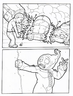
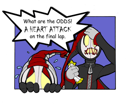
Twisted Fate: Dumb Luck by Derrick Rathgeber

Twisted Fate Comics 
by Derrick Rathgeber

Dumb Luck


 Some people have all the luck. Or is it something else. Till next time my friends

To catch up on the past and present adventures of the Twisted Fate comics visit them here on Pinterest.com. 


Tuesday, May 14, 2013

Featured Art - The Flight of the Macaw


Flight of the Macaw - This one of a kind piece pushes colored pencils to the limit. Over 40 different Rose Art colored pencils went into this piece.

This piece is currently showing live in the Riverside, CA Artscape Gallery.

Visit the Artscape Gallery in
The Riverside County Administration Center
located at 4080 Lemon Street, Riverside, CA 92501

The Original is Available for Purchase

To purchase the original contact Rachael Dzikonski via email at: rachael@riversideartscouncil.com

Dimensions: 18.000″ x 24.000″
Medium: Colored Pencils

Sunday, May 12, 2013

Grand Cross - A Story Long in the Making.


Today was a strong day for me. I not only got a lot done around the house, but I stuck to my plans and I worked on my Grand Cross story. For those that are new to my work, I have been working on my own comic book series. This series will be drawn and colored in pencil with the only Photoshop edits will be to format the color for print, and add special effects such as lightning. I know already I am taking on a big task, especially if the story catches on, and I have to meet demands. I suppose I can cross that road when it comes.

Along the road of coming up with a good story line I ran into some very large blocks. To me it was enough to nearly scrap the project. I have been working on this project so long, and at one point adapted the story line to fit the needs of children’s animation programming, that the story got mangled. It was so far off base from what I intended it to be so I felt like letting it go.

I came across an old list of mine. I think it was a resolution list about things I want to do to make my life better. One item on the list was to finish a project that I started. To me I crossed it off too soon thinking that the large colored pencil piece like “Bird in Bloom,” was considered large enough. But I knew was I was writing about. I didn’t know how I was going to pull this one off because I already had so much on my plate with the kids, bills, making a new website, producing art for a show, adding to my portfolio,  ect… This list went on and on. I had to do something to keep me on track. So I made a weekly work calendar. I found that if I focused on one project for that day, I could get them moving, and it worked. Before I would look at my list, and freeze to the point where I would do nothing, and get nothing from it. But now I am glad to say everything is moving forward.

Now I have something to look forward to in a year’s time. A new comic book, and a brave new concept. In this journey I am going to attempt to do things different than the normal comic book world. First off I am not sure how many colored pencil comics are out there, but I can be sure that there are not many, if any. To me it’s a comfortable medium, and I feel I can draw my panels faster than if I were to draw them in illustrator or Photoshop. Second I am going to make people really question what they believe in. How strong would you be? Would you do the same thing? And a whole lot of what ifs.

Grand Cross is a story based on the bible. My story will involve the relationship of Angels and Fallen Angels with Man and God. At one time the Fallen angels we all know were all close to God, and they loved God. Some had fell into sin, but not all were entirely bad. The first Protagonist you will meet in my stories in one of the Fallen. His name is Lahash. Some of you may know this former angel, but if you don’t I will help summarize. He was the Fallen angel who seized the prayers from Moses’ followers. Their prayers were intended to keep Moses alive to make the journey. But it was Lahash who had second thoughts and intended to return the prayers to God. Unfortunately when he was taking the prayers to God, the angel Samael shackled him in fire and brought him before God to face punishment, and the prayers were lost. He received Sixty Blows and cast out of the inner chamber and labeled a Fallen.

It’s the stories that we miss when we are looking. Lahash means one who interferes with divine will. I cannot tell you too much, but the setting for the story in the future when the worlds of God, Angels, and Man are to collide in the final battle. But does it have to happen? Lahash was able to interfere with Gods will once. Could he actually stop the end of days from coming? What would be the consequences of his actions. Why does the apocalypse have to happen? Could his actions mean the end of heavenly eternity? Would your faith be strong enough to stand by God and his Angels to protect the hope of Eternity in Heaven over life and civilization on Earth. This war could be the end of both.

More to come with pictures, character designs, character profiles, previews and a whole lot more.

Thank you for supporting me and all of my projects big and small. Your support makes everything worth it.

Derrick Rathgeber

Saturday, May 11, 2013

The Angel of Death


Day 1: The Angel of Death - Pencil sketch. 

I started the drawing last night and finished the sketch late this afternoon. Today is usually my Free Day but I wanted to have this sketch ready to start coloring on Monday. This drawing is based on the original poem "Angel of Death" by Tricia Rathgeber. I cannot wait to see the color make this story come alive with emotion.

Like my Facebook page for updates on this piece. Http://Facebook.com/DerrickRathgeber

Friday, May 10, 2013

Featured Art - Hraunkot

Featured Art

Hraunkot – 11 x 14 colored pencil piece. A good name for a strong Horse bursting from Lava, and jumping right off of the page. In this colored pencil drawing I wanted to illustrate strength, power, and beauty with the stroke of a pencil. I formed rock texture, and the fire using different techniques, and patience with each part.


Purchase the original and prints at Http://derrickr.artist.cm.

Thursday, May 9, 2013

Twisted Fate - Don't Bet on Fate

Twisted Fate - Don't Bet on Fate
Don’t Bet on Fate - The new comic in the Twisted Fate comic strip by Derrick Rathgeber.

Thanks for stopping by. 
Be sure to follow all of the action and new comics to come on Pinterest!

How to Color a Daisy With Colored Pencils


How to Color a Daisy With Colored Pencils
By Derrick Rathgeber


Welcome to the next lesson in colored pencil drawing. In the last lesson we learned how to layer different colors to create a solid multi-colored pink lady apple. In this lesson I will teach you how to train your brain to see your drawing as different individual pieces. The perfect way to do this is with the daisy. We will focus more on directional shading and coloring in this lesson, and how to obtain textures using different strokes.

Grab your box of RoseArt Colored Pencils out and grab the following colors; Pale pink, Pink, Cerise, Ruby, Light Brown, Golden Yellow, Grass Green, Black, and White. These will be the 9 colors we will be using for this lesson.

Tip: If you would like to change the color of your flower, you may substitute the petal colors (Pale Pink, Pink, Cerise, & Ruby) to another four colors. Just make sure you go from light to dark. For example a purple flower you could use Light Lavender, Lavender, Purple, & Orchid. 

Step 1: Lightly draw your daisy using faint strokes of a pencil, or light grey colored pencil. Start with the circle in the middle of the flower. Follow that with about six individual petals all roughly the same length, but different characteristics. If you note each petal has two fold lines going down the, and the ends are jagged. Behind these petals you will draw more petals. Continue layering your petals until you are satisfied with the shape of your daisy. Now use the Grass Green colored pencil and draw two curved lines for the stem.

Tip: If you would like to skip ahead and focus on the coloring lesson. You may download the sketched out image seen below. Click the link Below. 


Step 2: We are going to put down the base color for the flower. Take the Pale Pink Colored Pencil and start coloring in each petal. Now to do this we are going to use a fun technique. The reason I chose a daisy is because it’s a circle shape. You will want to color in the direction of each petal; to do this can get frustrating because you have to contort your hand into uncomfortable positions. So what we are going to do is keep our hand in the same position and rotate the paper. Use light gentle strokes across each petal evenly, and use more pressure on the lines, and towards the center of the flower. Continue rotating the paper and coloring each petal until they are covered.


Step 3: Practice Makes Perfect. Find a petal to start with, and start adding the next layer of color. Using the Pink we will start off at the base of the petal and color in the direction of the petal. Color only the base of the petal and the center area of the petal. Again rotate the paper as you go and color in a position that is most comfortable for you and your wrist. This will allow smoother lines and more control.


Tip: Treat each petal as a new drawing. Taking your time and giving attention to each one will allow your brain to see shapes that you would otherwise over look. Remember to draw comfortably, take breaks when you need them, and just have fun.

Step 4: Using the Cerise you will continue adding more color and depth to the flower. We are going to start adding some shadows and curves to the petals. Color from the base of the petal with more pressure and lighten your strokes as you reach the end of the petal. Define the shadows for the petals underneath by using darker strokes where the top petals overlay.


Step 5: We are going to fine tune the shadow by adding one more red color. Using the Ruby Colored Pencil we will once again add more depth the flower petals. Rotating the paper as you go of course, sharpen your lines toward the base of each petal around the circle. Then define the lines of each petal using the Ruby color. Now as you rotate the paper use back and forth strokes to really get the dark Ruby color to make an even shadow on each petal towards the center of the flower to make it look like the petals fold inward.

Step 6: Now we are going to get into the middle of this flower. Don’t worry no more rotating the paper for this one, unless you want to of course. This part is actually kind of fun for me. Making a realistic pollen look is easier than it looks. Using the Light Brown find the center of your circle and make a much smaller circle. This will be your starting point. Now continue making small circles around this circle, and continue until the center is full. Once you get to the edge of the petals, use the Light Brown to fill in any gaps between the flower center and the petals. Now add some of this brown to the stem with some lines dark lines, and we will move on to the next step.


Step 7: Now it’s time to add some color to the center. Using the Golden Yellow make even circular strokes to fill in the center area. Continue going over it until you get a nice even color. Once you are finished use the same Golden Yellow color and very lightly go over the base of each petal. We do this because light reflects colors onto nearby objects. Sometimes it’s not noticeable, but just enough will make your drawing look that much more realistic. Then to finish off this step add some more light stroke lines onto the stem to give it an earthy browning like color when we go over it with the green.


Step 8: Probably the easiest step of the drawing. Take the Grass Green color, and color the entire stem. Be sure to color right over the Golden Yellow and Light Brown colors. Remember to color along with the shape of the stem in the same direction. You can even rotate the paper to give you a comfortable position and clean lines. Color the area by the flower darker show the shadow of the flower covering the stem.


Tip: By now I hope rotating the paper comes to you as a reflex. This will help you draw strait lines and curves, and can be used to draw all sorts of shapes and objects. Draw smarter not harder.

Step 9: Now to cast the final shadows. Use the Black Colored Pencil and outline the base of each petal and the flower center. Next begin shading the top petals lightly just enough to show that they curve inwards towards the center. Add some more black color to the petals underneath using the top petals as a guide. Next tilt the black pencil to the side a bit, and give a shadow to the center of the flower. Use crosshatching strokes towards the bottom of the circle to make it look like a sphere. Finally cast the shadow on the top, and down the side of the stem to finish up the shadows.

Step 10: To finish up our flower take the White Colored Pencil and color the edge of each petal. Next blend together the light and the dark colors by coloring from the edge of the petal down to the middle of each petal. This will even out your colors, and help cast light onto your drawing. Next add white to the cent of your drawing, and to the stem. And there you have it a beautiful flower.


Tip: Find your light source. Sometimes when I draw I will cast a light over my drawing and see which way the paper casts a shadow. Use this as a guide for your shading.

That does it for this lesson. I would love to see your work. Send it to us and we would be glad to share your results on my Facebook page at Http://Facebook.com/DerrickRathgeber.

Be sure to come back here for more lessons, I think I might have us draw a nice reflective shiny vase to put our flowers in. If you would like to ask a question or make a suggestion for a drawing lesson email me at Derrickr333@gmail.com.

Thank you for coming.
Derrick Rathgeber

Visit my website at Http://derrickr.artist.cm

How to Color a Delicious Pink Lady Apple With Colored Pencils


How to Color a Delicious Pink Lady Apple With Colored Pencils
by Derrick Rathgeber


RoseArt Colored Pencils we will be using.
• White
• Golden Yellow
• True Orange
• Bronze Yellow
• Celery
• Cardinal Red
• Cherry Red
• Raspberry
• Brown
• Black

Welcome to the great drawing lessons here on my webpage. Today I will be teaching you how to color your very own delicious pink lady apple. In this exercise I will give you tips on how to over lay colors, blend them to create lights and shadows, as well as textures. So let’s get started shall we.

Step 1: If you are comfortable with your drawing skills start off your picture by drawing the apple shape below with the brown colored pencil. Remember your apple does not have to be a perfect shape because no apple is a perfect sphere.


Tips: A PDF version is available if you would like to skip this step and go right into the coloring.Follow this link to download the image  here:
http://www.4shared.com/office/H4G4z-BY/How_to_Draw_an_Apple_001.html

Step 2: Using the Golden Yellow make dark to light strokes outlining the shine. Start at the base of the stem and define the shape of the apple. This color will act as the base and guide for the rest of the colors to come. Next use the Bronze Yellow and darken the yellow areas on the stem and the area around the stem. This will help blend into the green Celery color in the next step.


Tips: Use more pressure on the pencil at the edges and around the shine areas, then slowly raise the pencil up decreasing the pressure of the pencil.

Step 3: Using the Celery color you will go over the Golden Yellow color on the top of the apple. Start from the base of the stem and create lines in arc shapes to the rim of the apple, then fill them in with the Celery green covering a good area of the top of the apple, but leave some areas not covered with the green for the red to show through. Also add some Celery color to the stem as well.


Step 4: Now it’s time to set the base for rest of the apple. Using the True Orange color we will start from the stem base and color the apple almost like a pumpkin. Fill in the top half of the apple leaving small empty spaces along the edge, and along the base of the bottom. Keep a white strip-like area empty along the right side of the apple, as this will act as a reflective shine making the apple look more realistic.


Tips: References are great. If you have an apple at home shine a light on it to see how light shines and reflects on it so you can replicate this effect in your drawing.

Step 5: It’s time to watch your apple come to life. Use the Cardinal Red and cover the apple in nice even strokes with the apple from top to bottom and at a curve. Remember to leave the large shine in the center, and on the right of the apple clear. I like to rotate the paper so I can keep my hand still and move only the pencil across the paper. Once the apple is covered evenly, begin adding pressure (making darker pencil strokes), and coloring in areas darker near the edges and the top of the apple. Leave the area near the large shine spot lightened as shown in the picture.


Tips: Try to keep your pencil stokes in one direction. In this case arc them downward creating the illusion of a round object. After you have covered the area you can crosshatch to darken areas of the drawing.

Step 6: The candy apple red that makes you drool, that’s what we are going for. So let’s add the next layer of red. This time we are using Cherry Red to help fill in gaps, smoothen out our fruit, and generate a one of a kind look. Starting at the borders of the apple we are going to go over the Cardinal Red with Cherry Red and start coloring towards the shine, lightening our strokes as you reach the shine spot. Also get the top of the apple, and overlay using the Cherry Red partially over the yellows and greens to pull it all together. When you are satisfied with the look of your apple, move on to the next layer of red in the next step. Yep that’s right Three layers of red.


Step 7: This is the last layer of red I promise. Grab the Raspberry Red colored pencil and use heavy pressure along the areas you want to add shadows to. You can use the image as reference or use your gut. Get the areas close to the edges, and highlight the shine on the top near the stem. At this point your apple will have a realistic shine and reflect the paper it is drawn on. As an option also use this color to create a shadow underneath the apple. Remember where your light is coming from and color your shadow based on that. In this case I have light coming from the rear and the front so the shadow is outlined as shown.


Tips: If your drawing doesn’t look like the image shown do not worry. If I were to draw this again mine would look different too. Remember to enjoy yourself and take your time.

Step 8: Time to give your apple an earthy look, and finally give that stem some color. Reach for the Brown and fill in the stem from base to top leaving some green color. Remember to color with the stem shape, and for an extra measure of realism sketch some harder lines. Next add a layer of Brown across the entire apple, and the shadow. Remember to leave the shines white. Adjust your pressure of your coloring pencil to the light or hard coloring pressure that you want. This gives the apple some more texture, and colors to capture the eye.


Tip: If you would like to color the apple with other colors you can use these techniques with most fruit and objects. Simple adjust your color palette, and have fun.

Step 9: We are now heading to the final touch ups. Get a hold of the Black pencil and we will finalize the shadows. Start off by coloring over the shadow on the floor underneath the apple. Once you are finished start darkening the left side using the shines as a guide to where to stop. On the right side of the apple you will start from the white strip and go from heavy pressure to light pressure as you meet in the middle. Then add some dark areas in the stem to show that the apple dips in. Once you are satisfied with your look we will move on to the final step.


Tips: Black is your friend. With colored pencils you can cover other colors without making over shadowing them completely. If you need to go darker simply add another layer.

Step 10: And we are at the finish line! This step is probably one that most people don’t see coming. Go ahead and take the white pencil, and start coloring over the entire apple. You will notice that as you color, the colors will not only lighten up but they will blend together and smoothen out. This is probably one of the greatest kept secrets, and now you know. The white colored pencil is probably the most important pencil in your collection.


Check back here on Http://derrickr.artist.cm for more drawing tips and lessons by Derrick Rathgeber. These lessons are also available on Http://RoseArt.com/Blog

If you have any questions or comments I would love to answer them for you. Contact me at derrickr333@gmail.com. 

Thank you for visiting. 
DerrickRathgeber 

Selling Tragedy for Likes

The advertising game has changed in the last 10 years. I have moved merchandise for several companies in my life, and worked on advertising campaigns that were very successful in a multitude of business’. It used to be so much different. You would create a creative slogan, or do mass mailings, possibly a banner on the highway to improve the number of people who see your product. Now it’s all about social media. and public relations.
When I was younger there was a thing called business ethics. The way you would promote yourself and your company would represent your character as an organization or company. In this day and age that concept seems to go right out of the window. One of those examples is the way Blogs, and some business’ promote themselves on Facebook. I have seen several Facebook pages use a tactic that is completely un-ethical, and deceitful  I feel this practice needs to be regulated more, and seen as spam and illegal.

When I am scrolling along my feed I too often come across very disturbing images of a child with a serious illness, or being seriously abused, and the worst I have seen was an open casket of a deceased infant. Sure you see these images everywhere in the news and on the web, but what makes these images more disturbing is the pages that post them are soliciting likes from these disturbing images. For example the image below is stating that if you like this picture it equals 1 prayer for the child.


It sounds like a very enduring act. But in reality it’s the most deceitful ugly way to promote your Facebook Page, blog, and or business. Facebook uses a feature called “Edge Rank” which is used to increase the likelihood that your products or services will appear. Edge Rank is increased by adding “Weight” to your page. Weight is a word for anything you post that enables an interaction such as a like, or comments. So lets say someone has a website that sells goods/ services, and they want to promote something new. Before they would start promoting the new item/service They would need to add weight to my page. So will they do this is the ethical question. In this case a blog posted a child in pain, still at the hospital in the attempt to recieve more likes on their Facebook page. I have seen others use abused children, and worse. These companies are profiting on the suffering of others.


A good majority of the companies and bloggers that use this practice don’t even own the picture. In one instance the child in the photograph(Seen Below), who was attacked by another child at her pre-school nursery. The photograph of the child was apparently stolen from the Daily Mail article or elsewhere on the Internet and reused in this utterly pointless protest message without the permission of her family. They went on to spread the image across the net asking for likes to stop abused children. This in no way fights abused children anywhere, all it did was increase this criminals page rank and set them up to increase sales or hits on their blog.

These individuals need to be stopped. They are distributing these children's photos across the internet, and in many cases lying about the situation in the picture. In one case an infant was just born, and the doctor was holding her up for the camera and all you saw was his hands holding him/her up. In the caption it claimed the baby was being choked, and asked for likes to stop abuse. They took a happy moment and turned into a nightmare and gained over 500,000 comments and 50,000 likes on their page. What a joke. It's disgusting, and does not need to continue. To them someones pain is opportunity, and that is the lowest form of advertising. 

So what can we do about it. Well first off do not respond to these posts. That means do not comment or anything. Instead report them to Facebook as abuse. Something else we can do is gather together and ask for Facebook to implement stricter guidelines on images, and create rules banning this practice. I hope to see more action, and less of these images. If you are too, let Facebook and other media outlets know. 

Thank you for reading I hope I have been some help.

Derrick Rathgeber

Doubt is a Dangerous Thing


As an artist the worst thing you can face is doubt. Doubt is that nagging fear, or voice in the back of your head that tells you you’re not good enough, or you’ll never reach the level of the other artists on the web. It can come at you in ways that will make you want to quit and burn your artwork. I can honestly say I to this day face doubt strait in the face, and sometimes I do want to quit.

I recently got back into drawing again after a very long hiatus. I had a torn tendon in my drawing wrist that was never allowed to recover properly. When I got injured on the job I was given a brace and set right back to work. Over the years I tried to sketch here and there and my work suffered. My hand would shake, I would drop the pencil, my fingers locked up, and sometimes my wrist felt like it was being torn right off. I couldn’t draw anymore and that sent me into a very angry and dark place. The one thing I thought I was good at was taken from me, and I couldn’t do a thing about it. I doubted that I was ever going to draw again.

One day I found myself digging out my old drawings. I kept a box of my work that survived the rain and the move. I did what I normally would do, and that was pull them out of the box, look at them all and them place them back in the box. To me this was a way of looking back at something I couldn’t get back, and believe me I tried. I would draw out some new drawings, and I was upset that they were out of proportions, and very sketchy. I couldn’t get the look I used to anymore let alone what other artists could do. I think my wife saw me, or heard me because a short time later as a gift she got me a nice sketchbook. She only had one rule that I sketch out whatever comes to my head, and do not share it with anybody, just draw for yourself she said. And I think she was on to something.

Over the next year I did just that. I just started drawing small faces or, weapons, characters and random trees. All short small non detailed drawings, but each one got better. It wasn’t until last year in 2012 that I started rebuilding my portfolio. Something in me snapped and just woke up. I grabbed the largest pice of paper and all the colored pencils I had and created A “Bird in Bloom.” Believe it or not this very large 22×28 piece took me three months to complete, but to me it felt like one of the fasted drawings I have ever done. I was enveloped into getting back to where I used to be as an artist, yet somehow by the end of this piece I was better than I ever was. To put it in perspective the last award I won for a piece of my artwork was in 1999. It was now 2013 and I took this one piece of art and entered it into a show against painters and sculptures. Somehow my RoseArt colored pencil strokes won me Best in Show. This was not a cash prize win, but it was enough to convince me that I was on the right track.

I continued making large pieces and smaller pieces, and I think it wasn’t until the great feedback on the Macaw piece that I found that I may be able to have a career in this. I pushed and shared my work online, and joined various art sites to sell my work. I had high hopes that since I couldn’t work and I wasn’t getting paid by the insurance company that this could be my way of providing. When several months go by and nothing sold DOUBT attacked me again. Every time I would open my email and see all the artists who sold their work, or got a great commission, I would definitely get very envious. Here I am thinking I was good enough to win a juried show, and write lessons for RoseArt; and I cannot even sell one piece of art for my family. It hurt. Sometimes it still does I won’t lie. So Doubt hit again, very hard.

You know what brought me back this time? What keeps me going is all of you. I don’t mean to sound cheesy, but you are at home and you chose to read this. Zillions of things on this internet to laugh at and watch and you choose to read the rantings of a beat up colored pencil artist. I appreciate that. When you message me, or write me to congratulate me, or ask me of all people for advice. It pushes me. When I see you struggle in the same ways that I do, and still succeed. I know doubt is a huge waste of time.
Each of us have a story, and in our stories we have a doubt or fear of succeeding. We cannot let this doubt to come into our artwork, because as an artist you know when you erase too much, or overwork the piece it will be ruined. Take a break and draw something you love in a sketch book that you don’t have to share with the world. Do what you love because you love it, and all that doubt will go away.

I have only one more thing to say and this is the most important piece of advice I can give you.
-When you wishing that you had the ability to draw like that great artist you see posting their masterpieces, somewhere there is an artist looking at your masterpieces wishing they could draw like you. Please support and help each other.

Thank you,
Derrick Rathgeber

Visit me at Http://derrickr.artist.cm

In Feed AD